
by Foster D. Coburn III | May 30, 2016 | E-Commerce, Web Design, WordPress
There are many elements that go into a successful e-commerce Web site. Yes, it needs to look great. Sadly there are many sites that are in dire need of a makeover. It also needs to be mobile friendly as more and more visitors are using mobile devices. Plus Google will penalize sites in the search rankings if they aren’t mobile friendly. There are also a lot of logistics involved and it can be important to have someone with experience help you through the maze. Let’s go through some of the important decisions that need to be made.
No matter what you site is selling, it must be displayed in an attractive manner. If we are dealing with physical products, having quality photos of the product is very important. Don’t be like the pizza place that had stock photos of food they don’t offer! Even if you don’t have physical products, you need an attractive graphic to represent the virtual product or service you are offering. Bad photos will scare away many visitors!
Maybe you only have a handful of products or services that can easily be listed on a single page. Other businesses will have hundreds, if not thousands, of products. In those cases it is important to organize everything into categories and/or sub-categories. Make it easy for visitors to navigate to the products of interest. Of course you’ll also want search functionality that can take visitors directly to whatever interests them the most.
For some businesses, the Web site doesn’t sell directly. You want the site to encourage buyers to e-mail, call, fax (does anyone use fax anymore?) or come to your location. There are still decisions to make about phone service, e-mail service and more. If this is how buyers reach you, you have to make sure you have reliable services.
I suppose that there could be someone who never wants to be paid for what they offer. Even a site for a non-profit will want want to be paid. PayPal is a very simple option for many sites. The ability to directly process credit cards is also helpful, though this makes it very important to also have an SSL certificate. You can take checks or wire transfers. Some businesses require buyers to only pay in person.
You need to know your potential customers and payment method(s) that will allow you to get the most sales. It could be there are laws or regulations you must follow. For one client, this meant they could not legally receive payment online, only in person.
Once the cash register is ringing, you need to fulfill the order. If you offer physical products, you need to get them to the buyer. Will you ship it directly? What shipping methods will you offer? Is it something you can drop-ship? Will buyers pick it up?
Virtual products need to be downloaded. How big are the files? Will you host them on your Web server? Will they be stored in the cloud? How do you protect the files from theft? Is there an outside service that can handle fulfillment for you?
Maybe you offer a service that needs to be fulfilled. Given the wide array of services that are possible, the methods for fulfilling that service are just as varied. You’ll want to know the exact process for fulfilling the service before it is offered.
Having someone with experience work through all these decisions and the implementation of them makes the process much easier. It also eliminates mistakes that could be costly or could severely hamper your success. If you want help with developing or improving your e-commerce Web site, allow Web Design Solutions Unleashed to develop a solution that exceeds your needs!
by Foster D. Coburn III | Apr 13, 2016 | Makeover, Web Design, WordPress
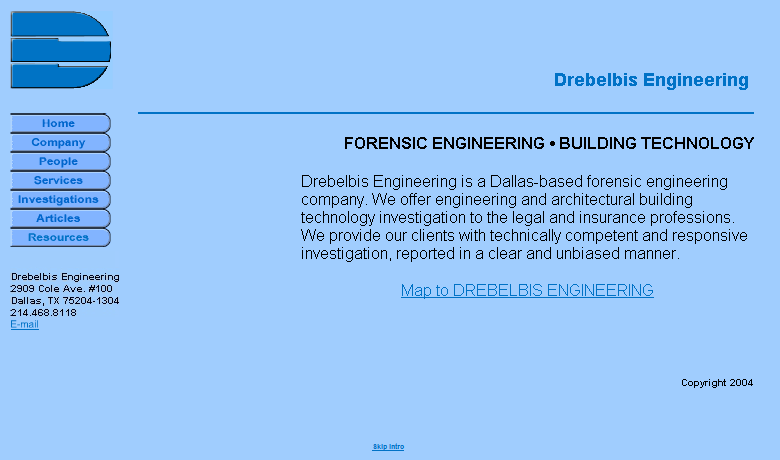
There are some clients that have been with Unleashed for a very, very long time. Someone who attended one of our seminars backs in the early 90s has kept in touch over the years. Most recently it was to update a Web site that hadn’t changed much in years. Below is the old home page and the only real graphic is the logo. You’ll also note that the copyright claims 2004.
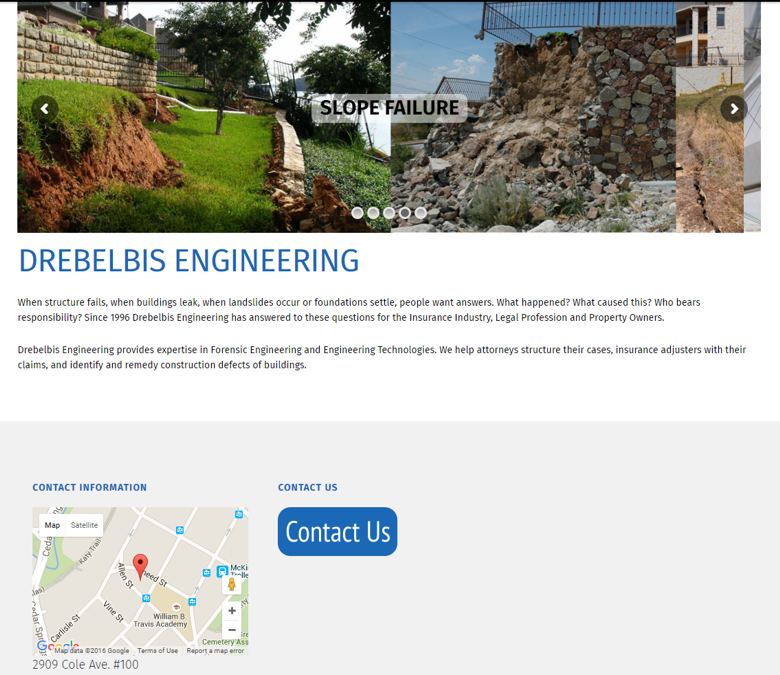
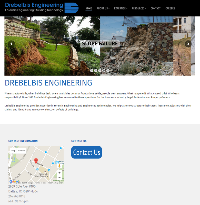
Given that the seminar the client had attended was all about graphics, the site was definitely in need of more graphics. It also needed an updated look that included responsive design. The new home page shows off the business better and is much more inviting to visitors as you can see below.
With this type of consulting business, the person doing the consulting is extremely important. The old resume (below) was monochromatic other than the profile picture.

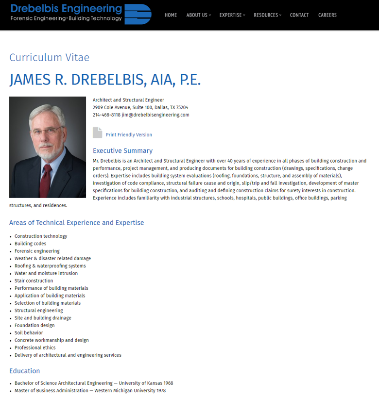
After the makeover, the curriculum vitae has a much fresher look and even offers a PDF version for download.
This is a type of business where a lot of the work is very technical and probably doesn’t look interesting to someone outside the industry. Even looking at a list of services can leave those outside the industry a little confused. On the old site, there was nothing more than a basic list of services (see below).
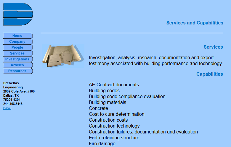
The new page (below) has the updated look, but each of the services links to a dedicated page with detail information on that specific service.
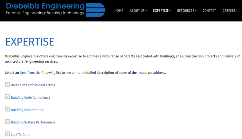
Now when people need to understand a little bit more, they can click on an area of expertise to learn more about it. In addition to the updated pages, new pages were added to explain expertise to visitors as well as past projects and their conclusions.
One thing that helped keep the costs lower for the client was their graphics expertise. We provided specifications for various graphics and they provided us with a file ready to use on the Web site. Make sure to visit the new Drebelbis Engineering site to see all that was done. When you are ready for us to give your site a makeover, contact us with an overview of your needs.
by Foster D. Coburn III | Mar 13, 2016 | Makeover, Web Design, WordPress
Many years ago Foster was involved in a philanthropic organization in Phoenix for men under 40. While in that group, he befriended another member who was an up and coming television journalist. That was more than fifteen years ago and they only kept in touch via social media in recent years.
Jim Heath is that journalist and he had built a popular blog focusing on the “circus” of politics in the United States along with a book detailing his coverage of the previous two Presidential elections.
The previous blog page had a real problem with formatting of posts in the sidebar as you can see in the screenshot below.
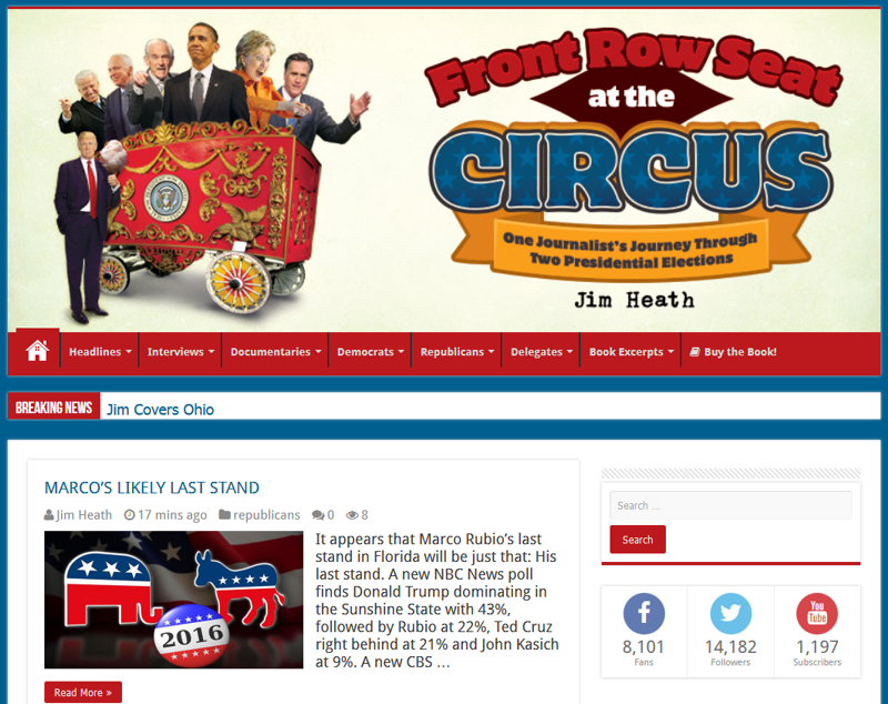
Notice how some of the lines are text are only a single character which makes it nearly impossible to read and limits the number of posts that are visible. We were able to import all of the old posts (Jim did the actual import with our direction) in only a few minutes. He put a little polish on them to make them look better on the new site and the result is shown below.
This is a huge visual and functional improvement over the old site and should allow his readership to increase greatly, especially since he is covering the latest election cycle.
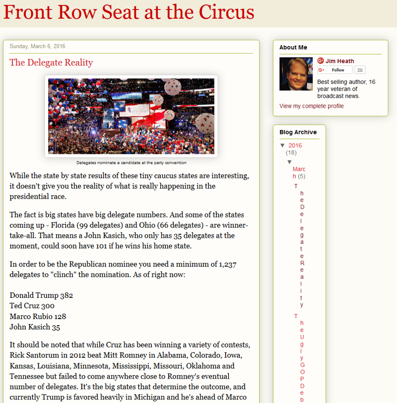
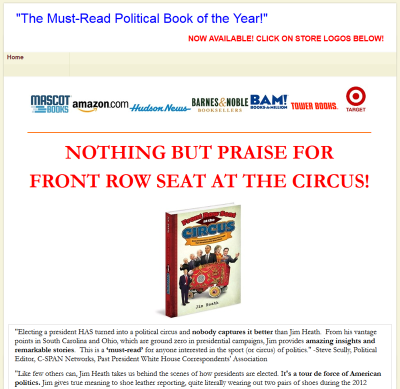
Previously his book sat on the dedicated frontrowseatatthecircus.com domain and it was only a single page site. While the old page didn’t have the visual problems found on the blog, it still left a lot to be desired as you can see below.
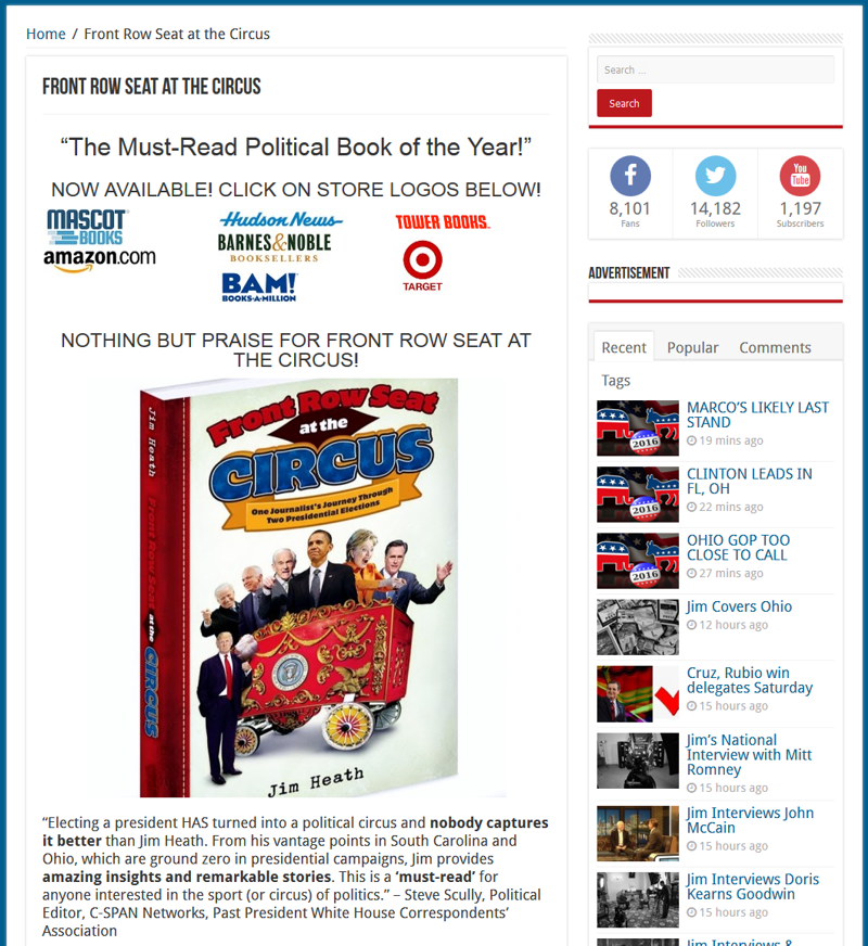
We didn’t make a lot of changes to the content of the page during the transition other than being part of the overall look of the new site. Just because it is together with all of his blog content, the book should get a lot more exposure. Below is the updated book page.
This was another project that was turned around in just three days time. Given the election news cycle, it was very important to makeover the site as quickly as possible so that Jim could benefit from the new site in the heart of this year’s election.
Now that the blog and book sites have been combined and made over, Jim is working on adding even more content to the site for those who love his political coverage. We’re happy to help him continue to build his platform into a political news force.
by Foster D. Coburn III | Mar 6, 2016 | Makeover, Web Design, WordPress
Each project we undertake has a different flavor. The latest project has two parts to the makeover and today the first part will be discussed. We were originally contacted by the client on a Monday and the project was discussed. Things were finalized on Tuesday and we were ready to start on the makeover. Then came the bombshell, the current hosting was expiring in a week and the point person on the project was leaving on vacation on Friday. So we basically had three days to harvest information from the old site and get a new VJ Properties site launched.
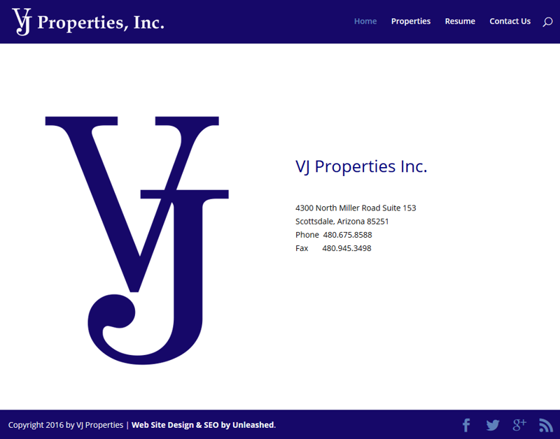
Because of the very tight timeframe, the first part of the makeover was simply moving the site. Once the point person returns from vacation, we’ll improve the looks of the site and update the information. The original home page had very little information and was composed entirely of a single Flash element. Flash is out of favor and losing support so some visitors would see absolutely nothing. Those who had Flash support would see the home page below.
It was visually OK for those who could see it. But with all navigation built into the Flash element, some visitors wouldn’t even be able to navigate to other pages. One of the other complications was that the company did not have the logo in a vector format. Part of the project then came converting the logo from bitmap to vector so we could use it in various parts of the site. The new home part is still very basic (shown below), but it will evolve in the second phase of the makeover.
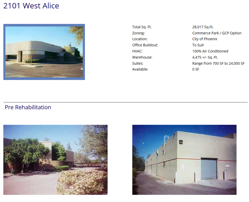
As the company deals with commercial properties, featuring those properties is of utmost importance. The old site had the properties page shown below.
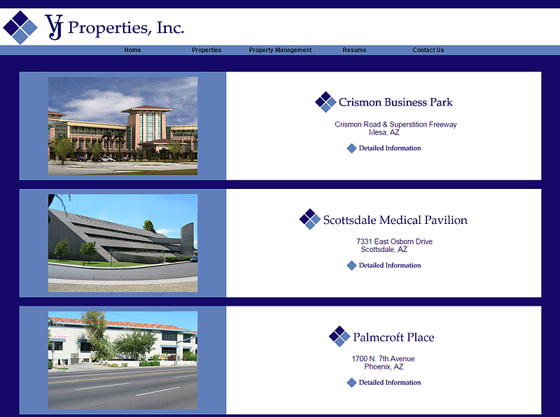
After the makeover, there isn’t a huge difference on the main properties page. We didn’t spend a lot of time on this aspect of the site yet as the list of properties is likely to change completely in the second phase of the makeover. Where we did focus was on the details page for each of the properties (shown below).
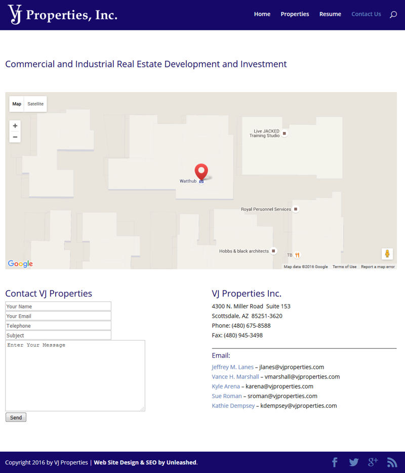
The old Contact Us page was very blah with nothing but text and no interactive elements. We added a nice map and a contact form in addition to the list of employees (see below).
While it may not be immediately visible from the examples shown here, the biggest upgrade is that the site is now responsive and works great on mobile devices. Before we started, the site didn’t work well on mobile devices at all. We’re looking forward to starting on the second phase of the makeover and making the site even better!
by Foster D. Coburn III | Feb 8, 2016 | Makeover, Web Design, WordPress
With most Web site makeovers, a company is simply seeking to improve their online presence. In the case of Kenn Cross Concepts, the business had also changed from interior and landscaping design services to one that also featured a furniture store. The goal was to provide a single site featuring the services as well as the new store.
There was an existing site that was attractive (see screen shot below). But it was not a responsive site that would render differently based on the device viewing the site. As such, it was hard to read on a mobile device. It was also designed so that everything fit into a small area and no scrolling was required.
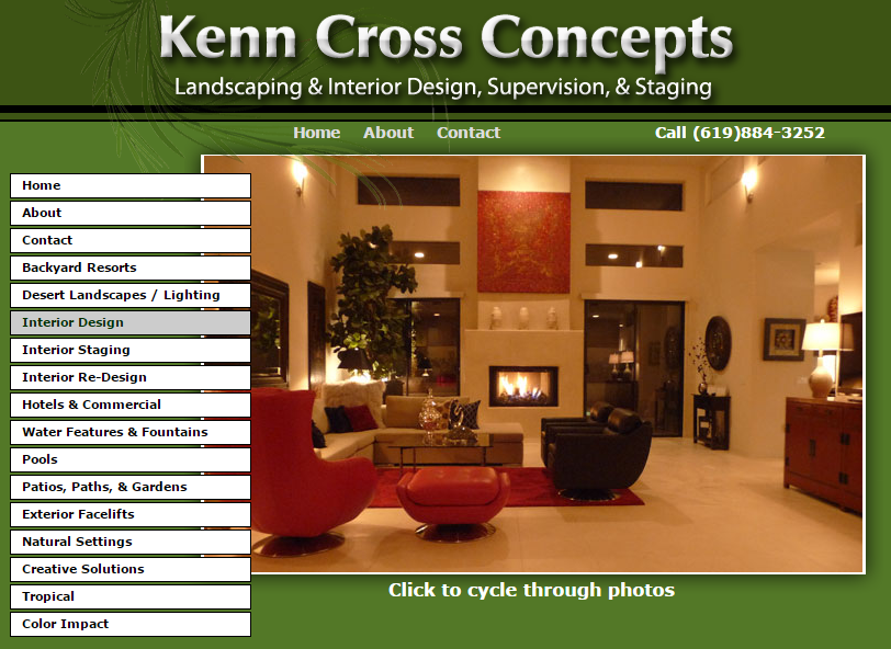
In talking with the client, there was still a desire to have a site that required no scrolling. In general, horizontal scrolling is bad and vertical scrolling is a good thing. The right answer changes for each page based on the content on that page. We also had to suggest the client have more than simply a series of photo galleries that automatically cycle through pictures.
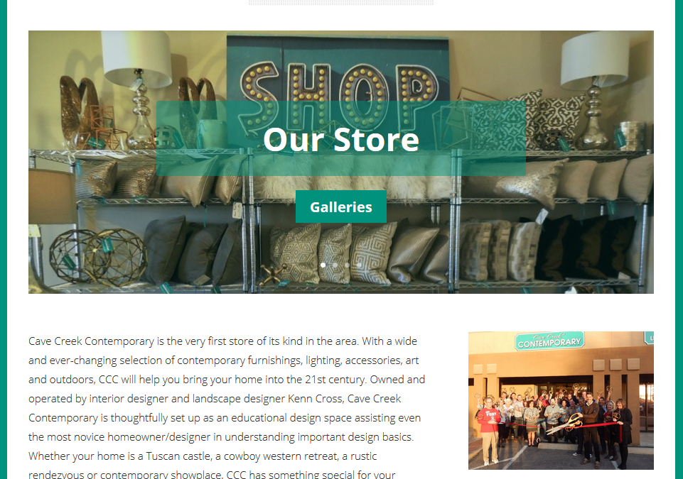
On the new home page (see below), there is a slider with photos that link to photo galleries of projects and the furniture store. But there is also information on the business. Lower on the page (not shown) is more information and a footer with a map, contact form and a connection with the company’s Facebook page.
The view shown here is what is seen on a computer. View the site on a tablet or phone and the view changes to fit the device’s screen. With the rising usage of mobile devices, this is extremely important. While there are pages of photo galleries, there are also pages (see below) that tell the story of the owner and the business.
Great photos are certainly important. But integrating text with photos is just as important. Search engines can see the file names of photos and “alternate text” attached to those photos. Yet the text displayed on the page can also help a page and a site perform better in search rankings. Plus it can help answer visitors questions and encourage them to become customers. With the makeover, the site now blends text and graphics into a a compelling integrated story.