by Foster D. Coburn III | Apr 20, 2020 | Makeover, Web Design, WordPress
I was enjoying dinner at the neighborhood wine bar last December when the owner approached and asked me a few questions about their Web site. It was originally built using GoDaddy’s Website Builder and now they were having trouble making changes to it. Some ideas were bounced back and forth to come up with a plan for a makeover. Let’s first look at the old home page.
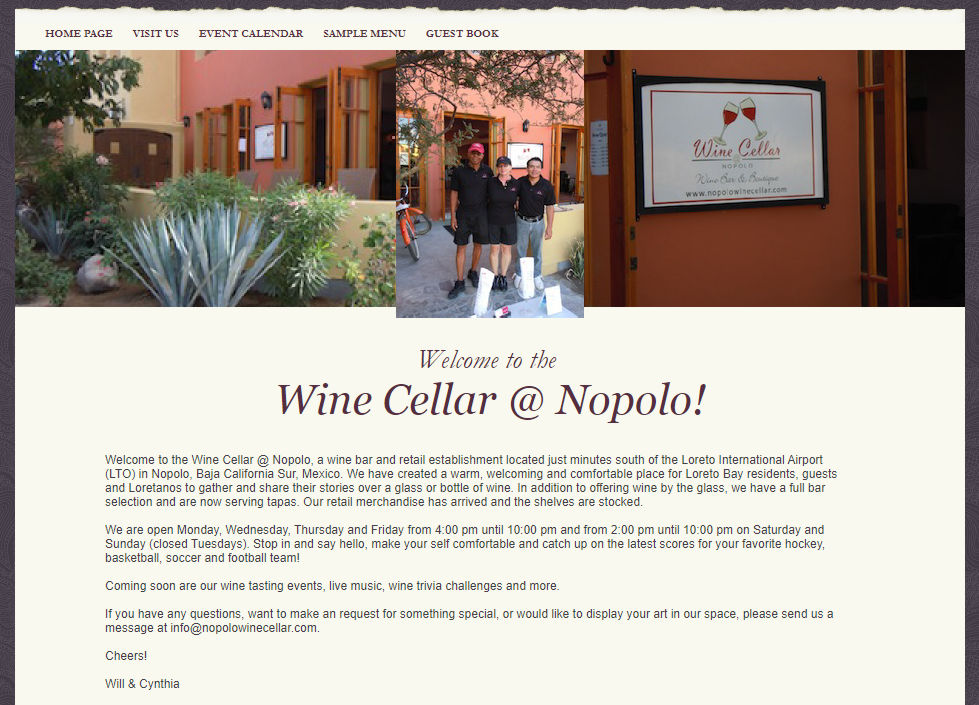
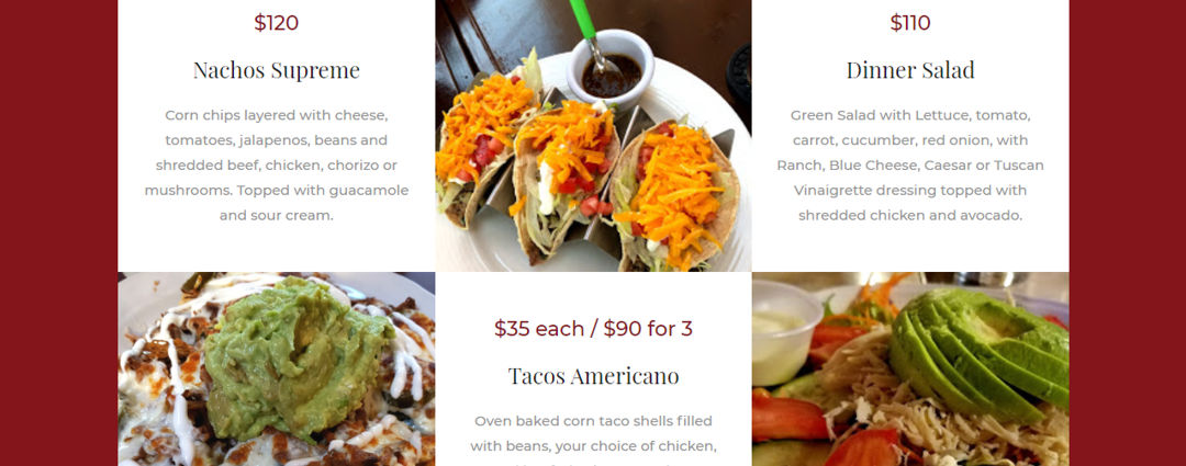
While it didn’t look horrible, there were definitely ways we could freshen up the look. Unfortunately the information was outdated and the site didn’t work well on mobile devices. Given that it is also a popular spot for dinner, it was also important to show off some of their most popular dishes. Below is a portion of the new home page with updated info and photos that make you hungry. For those outside of Mexico, note that the prices are in pesos!
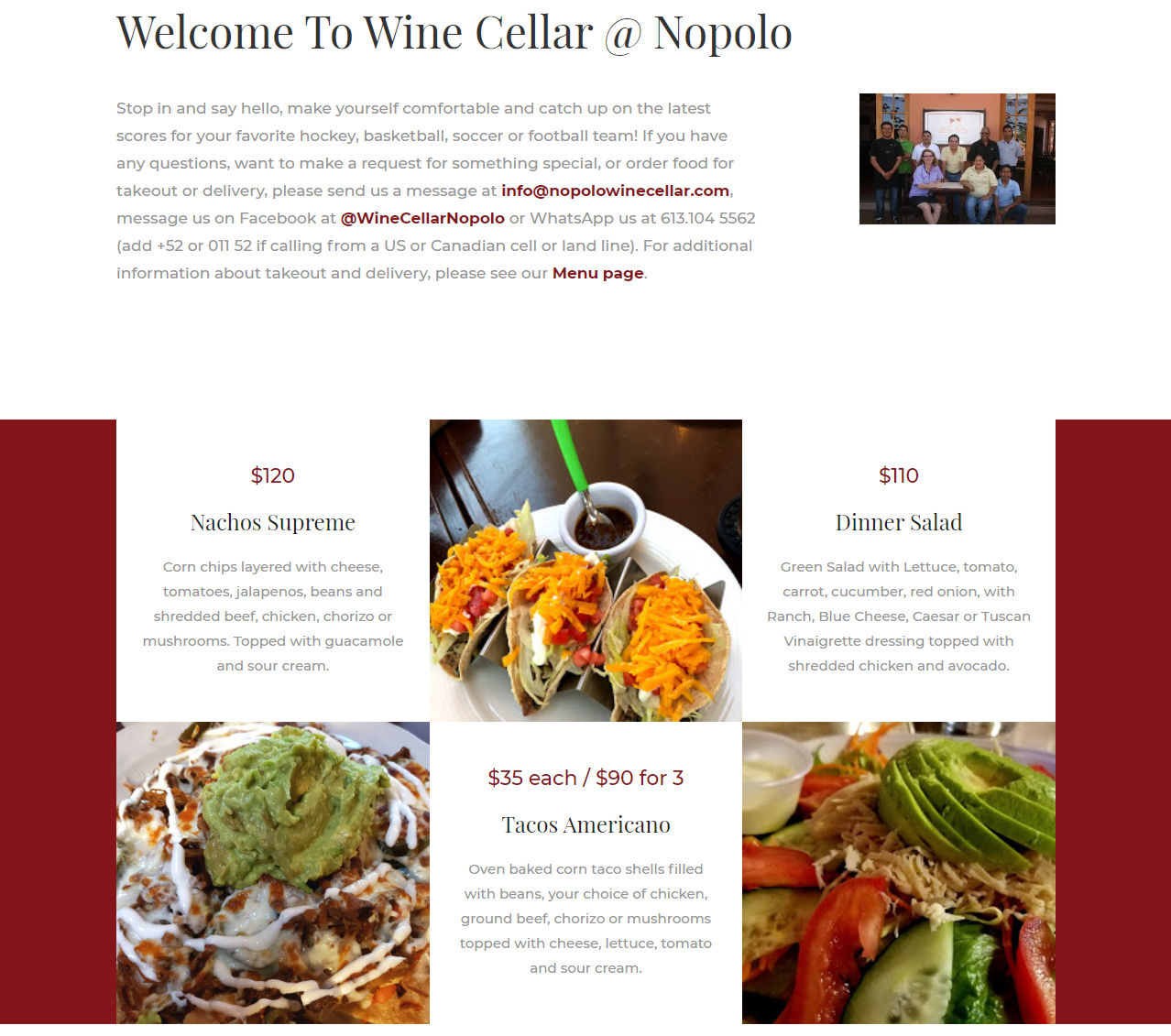
Not only does the new design look better, it was designed so that it works every bit as well on mobile devices. This is important for good Google rankings, but also important to the many people who browse on their phones.
Previously only a portion of the menu was available on the site and the prices had changed since their were posted. Below you’ll see a portion of the old menu page.
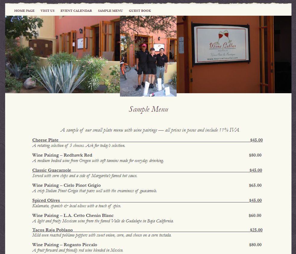
There are actually multiple menus that need to be presented. Food menus are available in both English and Spanish. Wines have two menus, one by the bottle and the other by the glass. What we didn’t know when the makeover plan was implemented was that COVID-19 would require all food to be carry-out or delivery.
Thankfully everything was designed in a way that made the transition easy. We simply needed to add a little information about changes in the law and more contact links. Below is the top part of the new menu page and each page of the menus are displayed below this on the site.
For those of us living in the neighborhood, we know exactly where to find Wine Cellar. But that isn’t always the case for someone coming from outside of the area. Their previous design had a couple of versions of the map. One zoomed way out the show the location of Loreto and another showing how to get to the restaurant.
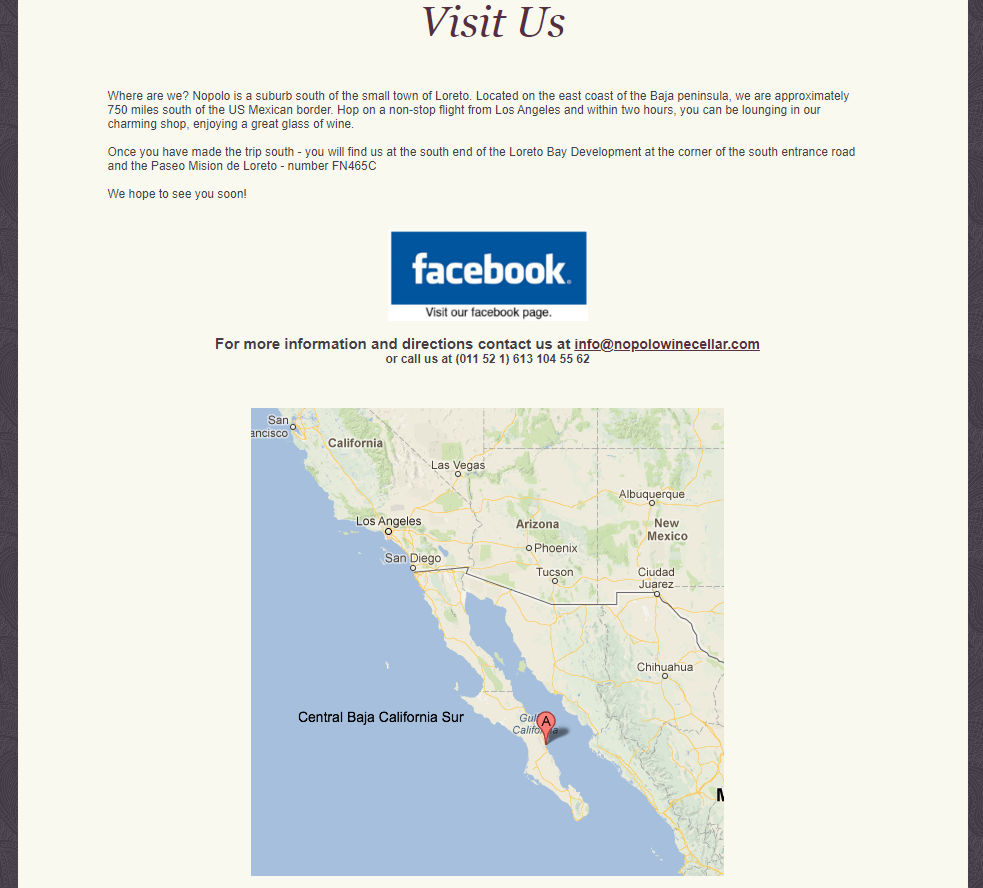
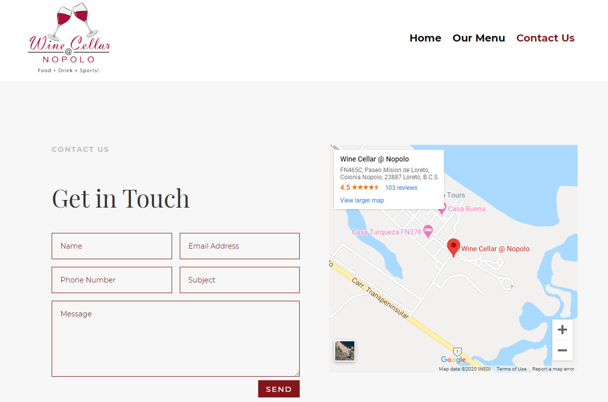
Yes, the map was very important and we decided to embed a live Google map into the new site so visitors were able to zoom in and out as needed. A side benefit is that it links to the Wine Cellar’s Google My Business page. A contact form was also included so questions could be asked or orders could be placed for carry-out and delivery.
Once a site is released, some clients prefer to make minor changes themselves. Ofter designers will cringe as those attempts at changes can change the look of the site or even break it. Even though this client had zero WordPress experience, I was pleasantly surprised that they were able to change some of the text when local laws changed. This was at least in part because the site was designed so that even a novice could find what they needed to change.
This site was a very small project, but the timing of the makeover couldn’t have come at a better time. It allowed the restaurant to keep food coming as the locals were practicing social distancing. Give the new site a look and stop in the next time you are in the neighborhood.
If your site is in need of a makeover, reach out with the details and maybe we can help you!
by Foster D. Coburn III | Mar 30, 2020 | Makeover, WordPress
Before we talk about the makeover, I need to tell the story of how this project happened. Roll the clock back to 2015 and I saw a post on Facebook about a free book written by Jinx Schwartz. That was around the time I started to read books on Kindle so a free book was very appealing. Even better that the story sounded fun to me. I read the book, Just Deserts if you’re curious, and really enjoyed it. At the end of the book was a link to the author’s Web site and let’s just say it needed some help.
 Soon after I’d read the book, I started using the Divi theme to build WordPress Websites. I wanted to build a site where I could learn Divi and try out new things. For me, building a site for Jinx Schwartz was an obvious choice. Once I had the first draft of the site finished, I sent her a link. While she was interested in using the site I’d build, nothing happened. Every now and then I’d try out something new on the site. If there was a problem, it really wan’t a problem since nobody knew about the site.
Time passed. I’ve now read more of the books (I’ve now read 12 of them). Occasionally Jinx and I would trade an email about making the site live. She was the writer, her husband Mad Dog was the tech person so I’d need to work with him. He fell ill in 2017 and passed away that March. Jinx kept writing books, but the Website was on the back burner for a bit. Then as I’m walking the streets of Loreto in December of 2018, I ran into Jinx. It was the first time we’d actually met in person!
The project got back on track, but we still had a major issue. Like with many clients, she wasn’t sure hot to login the the registrar for her domain name. Until we solved that, nothing could be done. More time passed and we finally got it done in 2020. Within hours, the new site finally went live.
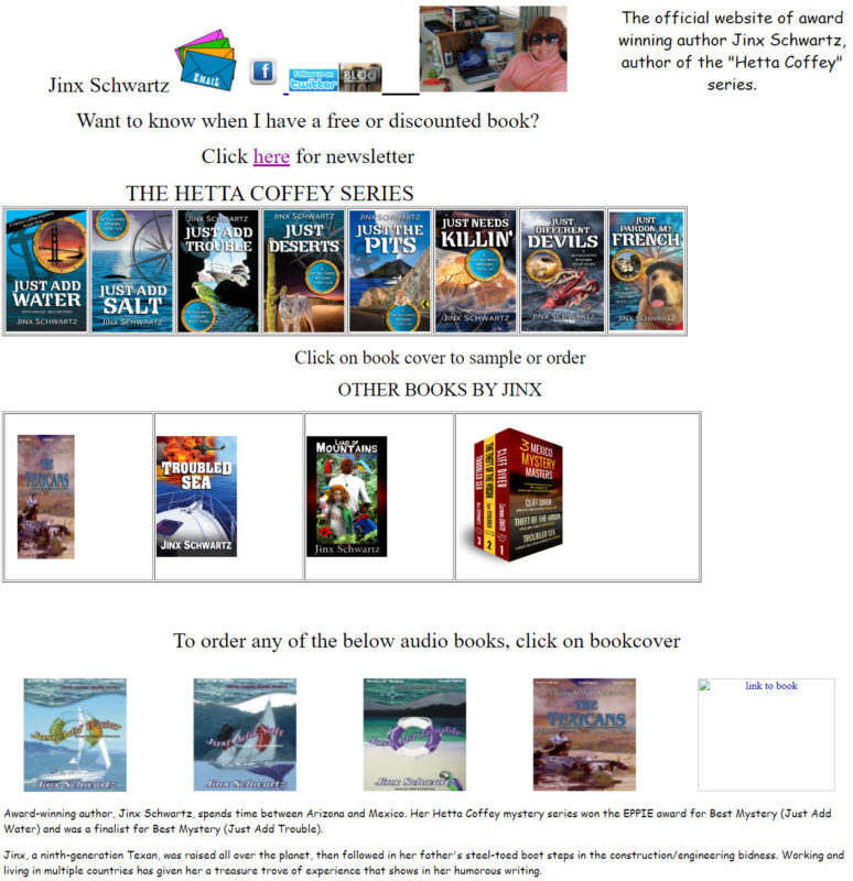
The Old Site
The screenshot below was taken just a few hours before the new site went live. Four of her books weren’t on the site at all and one book had a broken graphic. The design also left a lot to be desired.
The New Site
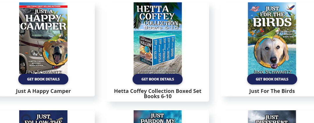
First and foremost, the new design had to put her books front and center. I wanted to make sure the new books would automatically appear on the home page from newest to oldest. The new site had to work well on all devices, specifically phones and tablets. I also thought it would be good to have a dedicated page for each of the books showing the cover, the description and a link to get the book from Amazon. Divi’s project feature was perfect for this!
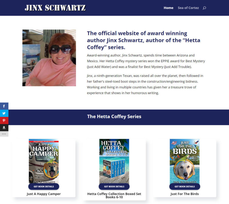
Mission accomplished! Check out the new site and get yourselves copies of Jinx’s books. They are a fun read!
by Foster D. Coburn III | May 21, 2018 | E-Commerce, Makeover, WordPress
Last summer a relative was visiting and we decided to go into the local olive oil store. It was an eye opening trip for me and I’m always looking for local businesses in need of a Web site. When I got back to the office, I gave their existing site a look and knew that I could be a big help to them. Below is a screenshot of the top part of their old home page.
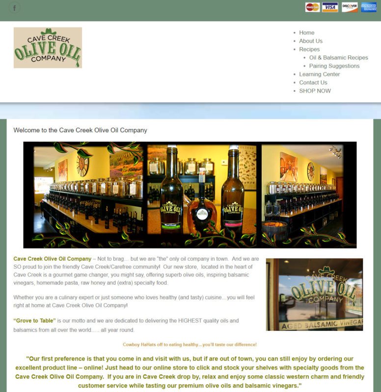
One of the first things I typically do with a site is see how it works on a phone. This one didn’t work well at all as there was no navigation. It was about the fifth time I looked over the site that I realized it had a store and you had to click on the credit card icons to get to it. Plus, it just needed a design makeover.
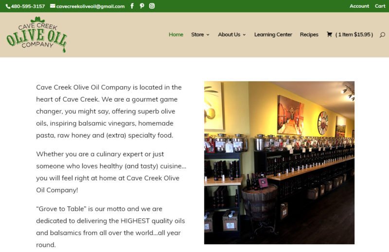
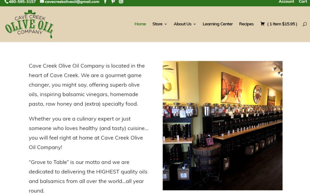
Once we were done, the top of the home page had a new look and it works great on mobile. The very first elements are the phone number and email address. On a phone, a visitor can click the phone number and it will dial the store. Menus have a cleaner look and they translate well to a phone. While not shown on this screenshot, there are also featured products and a box for signing up for their mailing list.
Social media was barely visible on the old site with a somewhat hidden Facebook icon. The new site features prominent icons for Facebook, Instagram and Pinterest as well as recent posts embedded throughout the site.
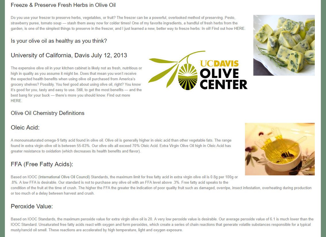
Some visitors to the site and store will be very knowledgeable about olive oil. While I know it tastes good and has health benefits, I don’t know much more. That’s a perfect reason for the site to have a section labeled Learning Center. On the old site, it wasn’t very inviting and it was easy for me to overlook. Below is an example.

Everything was stuffed on a single page. We broke out each topic into an individual lesson and gave the page a more appealing look. Not shown in the screenshot below is the sidebar promoting other parts of the site or the navigation shown in the earlier shot.
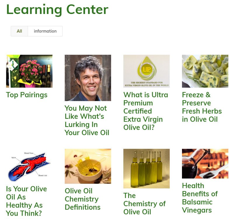
Now visitors can easily see the title of each lesson and click on it to learn more. Now learning about olive oil is more appealing and can help direct visitors to products they can purchase.
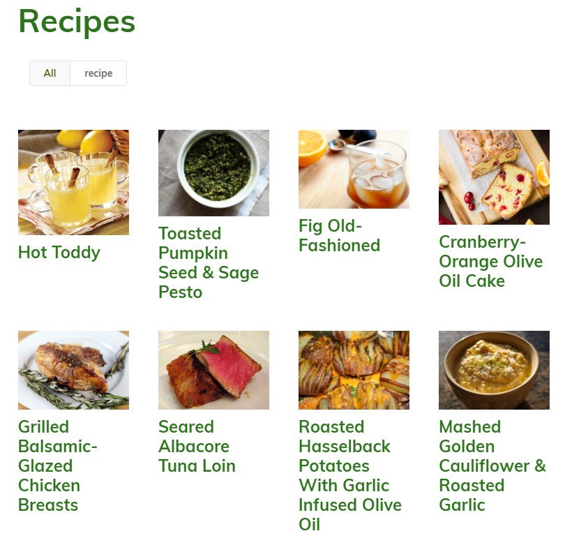
One of the most popular types of site on the Web are recipes. The old site had some recipes though they weren’t presented in a way to draw in visitors. Below is a screenshot of the old site.
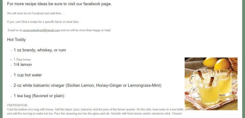
Just as with the learning center, all recipes were on a single page. We felt it important that each recipe be laid out similarly to the popular recipe sites. The main recipe page simply has links to each of the individual recipes as shown below.

When you click on one of the recipes, it takes you to a detail page. Having all of the distinct pages also gives search engines more content to rank so the site will be found more often. Below you can see how the recipe is laid out and we even included links for purchasing the products needed by the recipe.
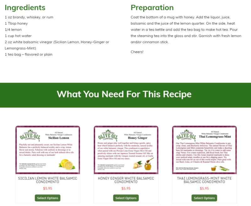
What isn’t shown in the screenshot is a slider that links to all other recipes so that visitors can easily navigate through all of them if they like.
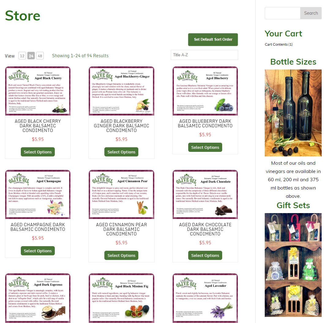
Of course the ultimate goal of the site is to provide a way for visitors to purchase products. While the old site had a store, it wasn’t obvious to visitors. Once you got to the store, you were presented with links to some general categories as shown below.
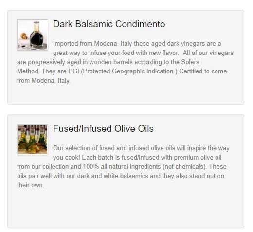
Clicking on a category led to another page with products and more clicks were required to add a product to the shopping cart. This was a very inefficient process and their online sales weren’t living up to their potential. We truly integrated the store into the site as you already saw on the recipe page. Below is the main store page also showing the sidebar.

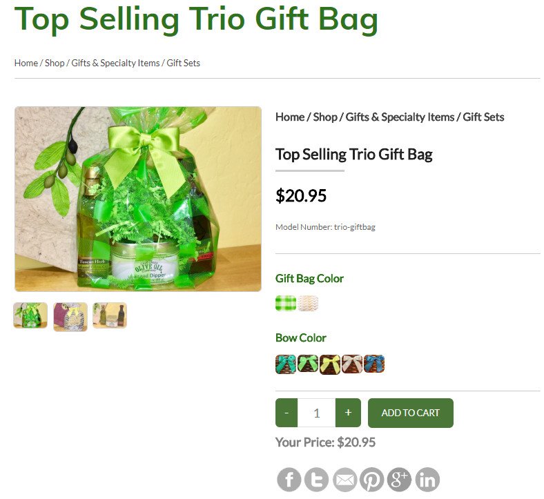
In addition to the main store page, we also have dedicated pages for each category of products. Some of the products are added directly to the shopping cart, while others have options to select. Below is a product page that allow you to select the gift bag and bow color.
Early in the project I was asked by the owner if I felt this would increase their sales by 10%. I smiled and said I would be very disappointed if we only saw a 10% increase. I’m fully expecting their online sales to double with the new site.
Want to see all the changes? Visit the Cave Creek Olive Oil site and pick up something tasty while you’re there! Want our help in designing a site for you or giving your site a makeover? Send us a note and tell us how we can help.
by Foster D. Coburn III | Dec 19, 2016 | Makeover, Web Design, WordPress
Recently we were asked to makeover a site for a company that does custom embroidery. While there were some aspects of the old site that the client wanted improved, some of the requested changes were related to security.
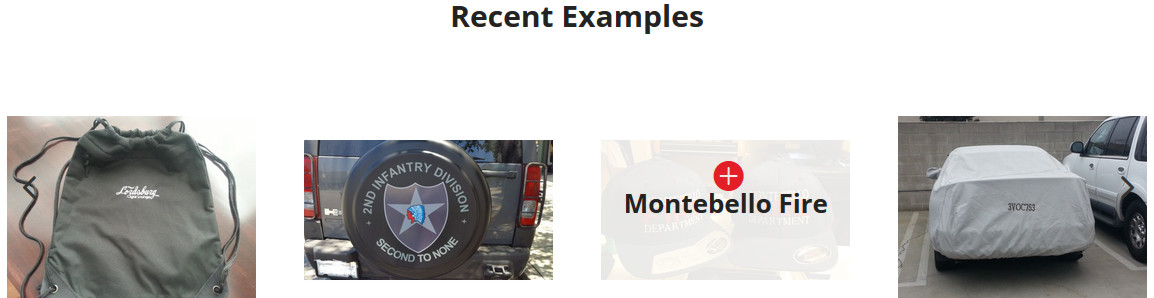
Let’s go through some of the visual changes. The company certainly wants to show off their past projects. On the home page, they had quite a few graphics depicting projects and it was somewhat difficult for them to update what was shown.
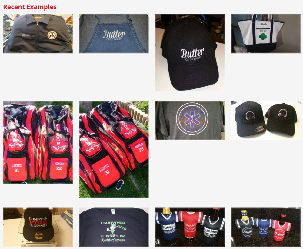
Not only was it hard to update, it took up a large amount of space. The graphic above does not show all of the projects. We decided to simplify it by putting the projects into a slider. This took up a lot less space and cycled through all projects. If you hover over any of the projects (as shown below), it tells you the name of the project and a click takes you to a page of project details.
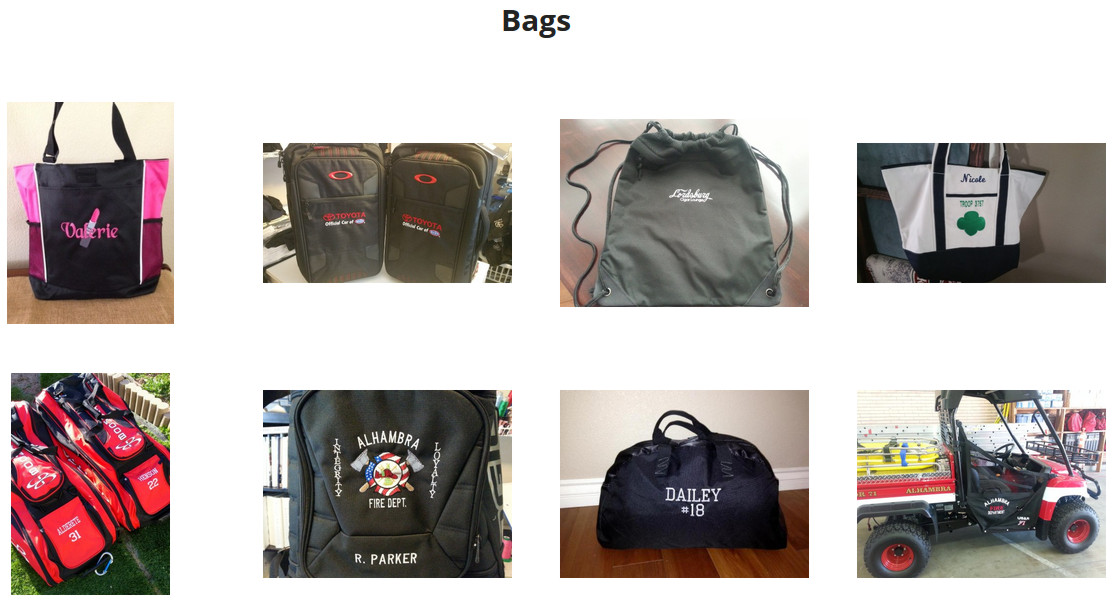
They also have dedicated pages for each type of project. These pages were also difficult to update. Below is the old page showing bags.
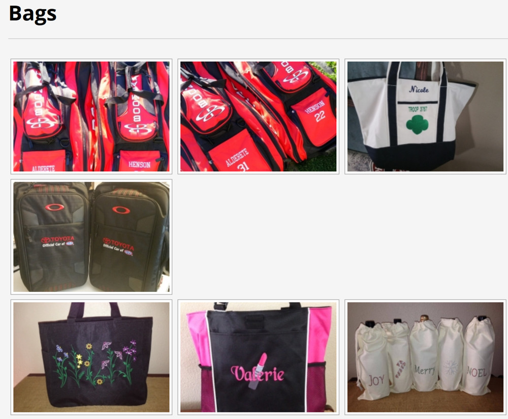
While the new page doesn’t look drastically different (see below), it updates automatically as new bag projects are added. Once again, hovering over any of the bags will show the name of the project and clicking on one of them takes you to the details of the project.
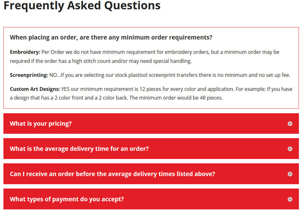
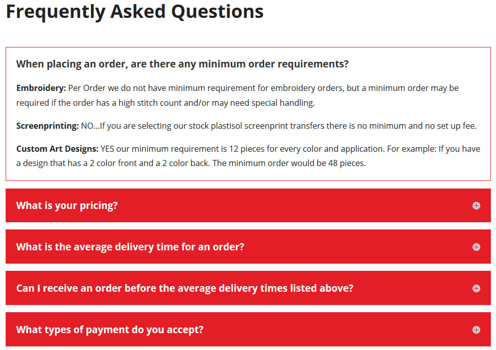
Many Web sites included frequently asked questions (FAQs). Unfortunately visitors rarely read them. This site had just such a page, but it was a wall of words that could be easily ignored (see below).
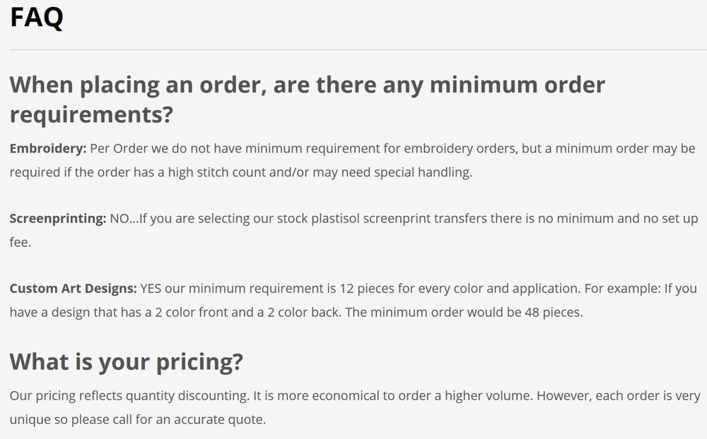
We cleaned it up so that each of the questions was prominently featured (see below). Clicking on a question expands just the answer for that question. This makes it easier for visitors to find just the information they need.
There were numerous other changes made behind the scenes to make the site faster and more secure. Best of all, it will be easier for either Web Design Solutions Unleashed or the client to make future updates. Does your site need a makeover of either looks or functionality? Visit our Contact Us page and let us know how we can help!
by Foster D. Coburn III | Dec 8, 2016 | Makeover, Web Design, WordPress
A friend called and asked if I could fix a couple of things on his Web site. The first issue was an error message in the sidebar where news should appear. There was also a problem receiving information submitted by the contact form. As I hadn’t built the site, there were some unknowns in first finding the errors and then correcting them.
I gave the site a quick look and noticed that it was not the least bit mobile friendly. This is a big deal as 64% of small businesses have a Web site, but only 33% of them are optimized for mobile viewing. Yet it is the way that the majority of visitors see most sites. There was a great article in The Wall Street Journal recently, The Key to Making a Mobile Site Customers Want, that should be read by anyone with a Web site.
I proposed that I could give the site a quick makeover in about the same amount of time it would take me to diagnose and fix the errors on the site. So that was the direction we took. First, let’s look at the old site and one of the ugly errors.
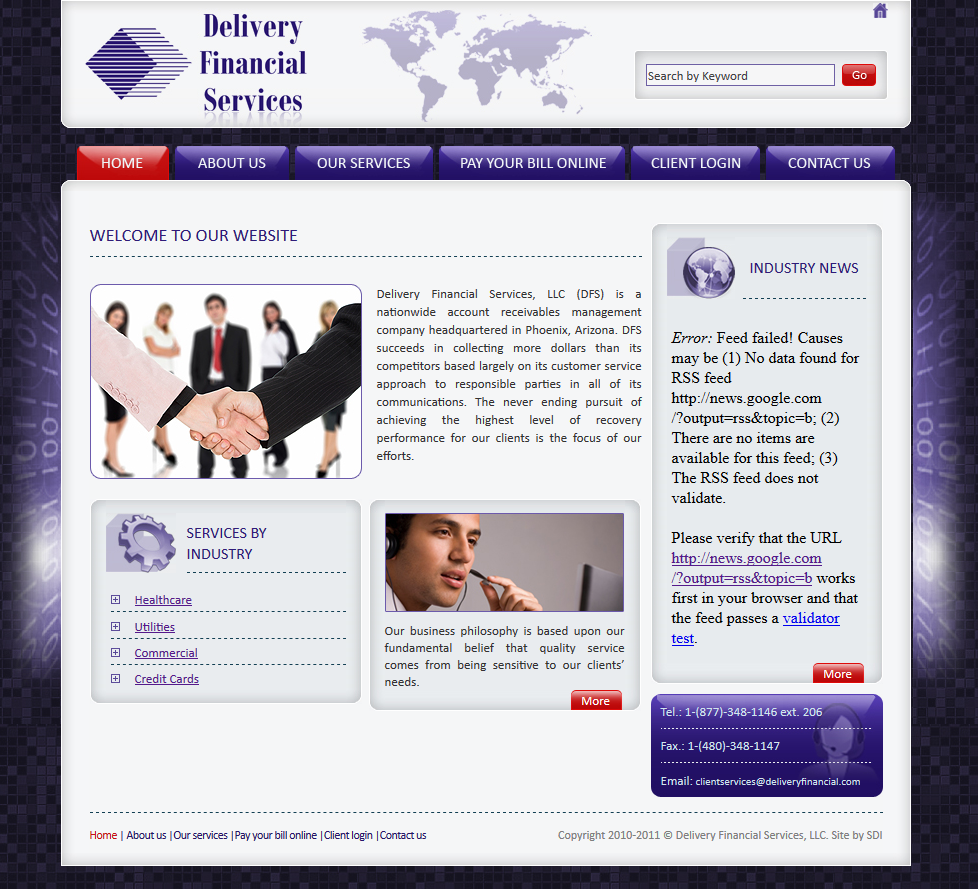
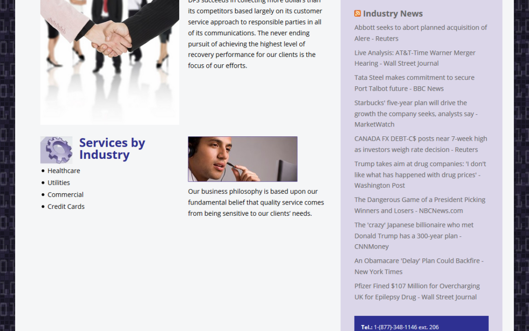
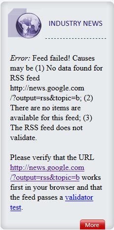 Above you can see the entire home page from the old design and at right is just the sidebar with the big, ugly error message. The best part about the error message is that it provides the address of the feed that should appear. I tested the feed and it worked perfectly, so clearly there was a coding error.
The original site was not built with WordPress so I first set up a brand new WordPress site and copied all of the content from the old site. As there were only five pages, it didn’t take long to build a replica site. One of the tougher challenges was creating a background with the “binary numbers” on top of tiles.
We could use the old binary graphic as it was only two strips for each edge of the main content area. The new design had to be setup so that it would scale to all screen sizes. It was easy to keep the tiles and I created a new binary overlay so the entire background was seamless and would scale to any size screen.
While it may have been quicker to fix just the two items mentioned, it didn’t take much longer to makeover the whole site. The result is a site that is without the errors of the previous site and it works on all devices. Should any future changes need to be made, they can be easily integrated. Below is a screen shot of the new home page.
Do you need a site updated, made over, fixed or changed in any way? We’d love to help! Please visit Web Design Solutions Unleashed for more information and then send us a note telling us something about your project.