by Foster D. Coburn III | Apr 13, 2026
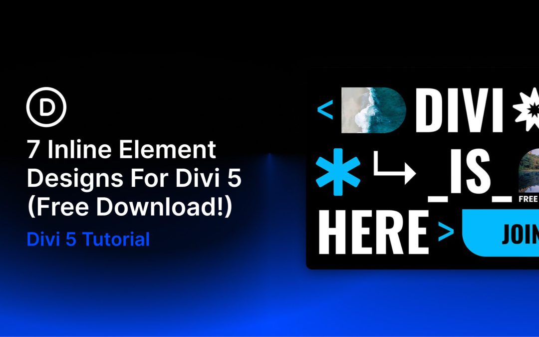
Divi 5 makes it easy to add bold, eye-catching design details without overcomplicating your layout. In this free pack, you’ll get 7 Inline Element Designs created for hero sections, promo blocks, featured announcements, CTA areas, and other content that benefits from decorative shapes, stylish text treatments, and layered visual accents. Drop one into any page, swap the content, and you’re ready to go.
by Foster D. Coburn III | Apr 12, 2026
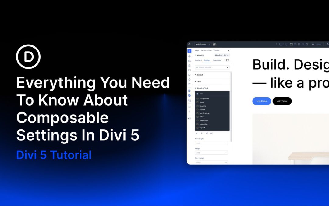
One of Divi 5’s new features is Composable Settings, which lets you enable additional design option groups for module sub-elements directly inside the Visual Builder. Instead of being limited to a fixed set of controls, you can add the settings you need to elements such as titles, buttons, images, icons, and body text without relying on custom CSS for common styling gaps.
In this post, we’ll explain what Composable Settings are, why they matter, how they work, and how to use them more effectively in real projects. We’ll also cover practical use cases and workflow tips so you can build faster while keeping your settings organized.
What Are Composable Settings?
Composable Settings allow you to enable additional design option groups for a module’s sub-elements, such as the title, button, image, icon, or body text inside a module like Blurb or Testimonial. In earlier versions of Divi, each sub-element came with a fixed set of design controls. In Divi 5, you can expand those controls on demand by hovering over a sub-element option group in the Visual Builder and clicking the Toggle Options icon.
After you enable an option group, it appears instantly as a nested settings group inside that sub-element panel. This gives you more control exactly where you need it while keeping the interface cleaner by default.
by Foster D. Coburn III | Apr 11, 2026
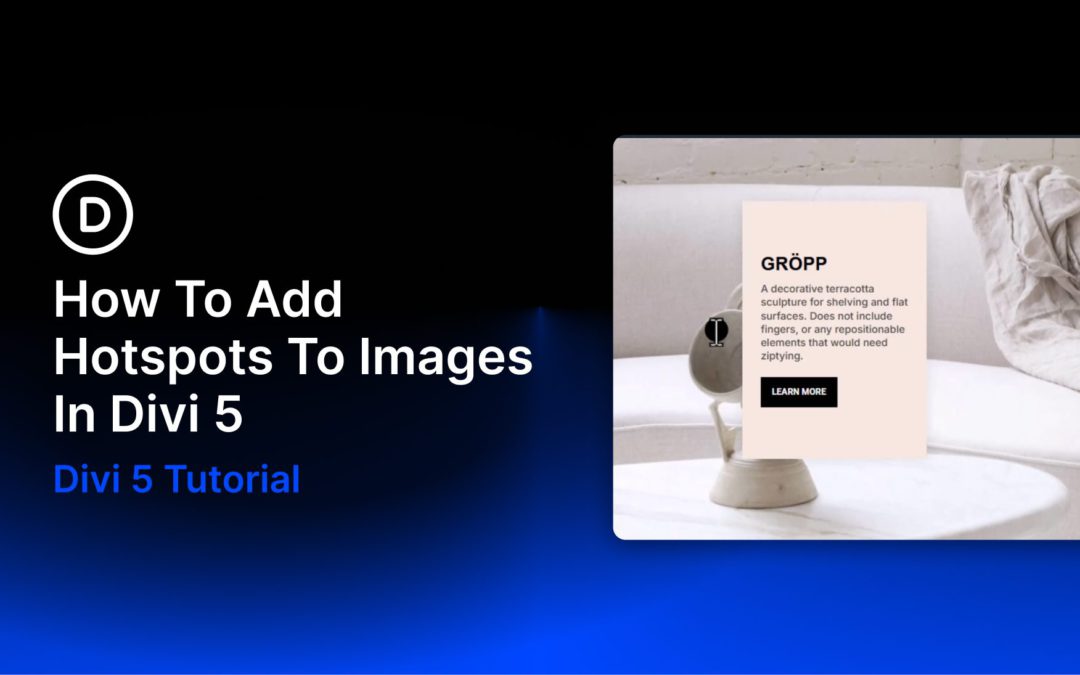
Showing less is sometimes how you say more. Put every detail on the page at once and visitors tune out. Strip back too much and you lose the context that builds trust. Hotspots solve that by hiding detail behind small, clickable markers placed exactly where attention already is.
With Divi 5, you can build hotspots visually using Interactions, Module Groups, Canvases, and the Canvas Portal Module. No custom code required.
What Are Image Hotspots?
Hotspots are clickable or hoverable zones layered over an image, graphic, or section background. Each marker sits at a precise point, and when a visitor interacts with it, supporting content appears right there: a short label, a tooltip, a product card, or a richer content panel.
by Foster D. Coburn III | Apr 10, 2026
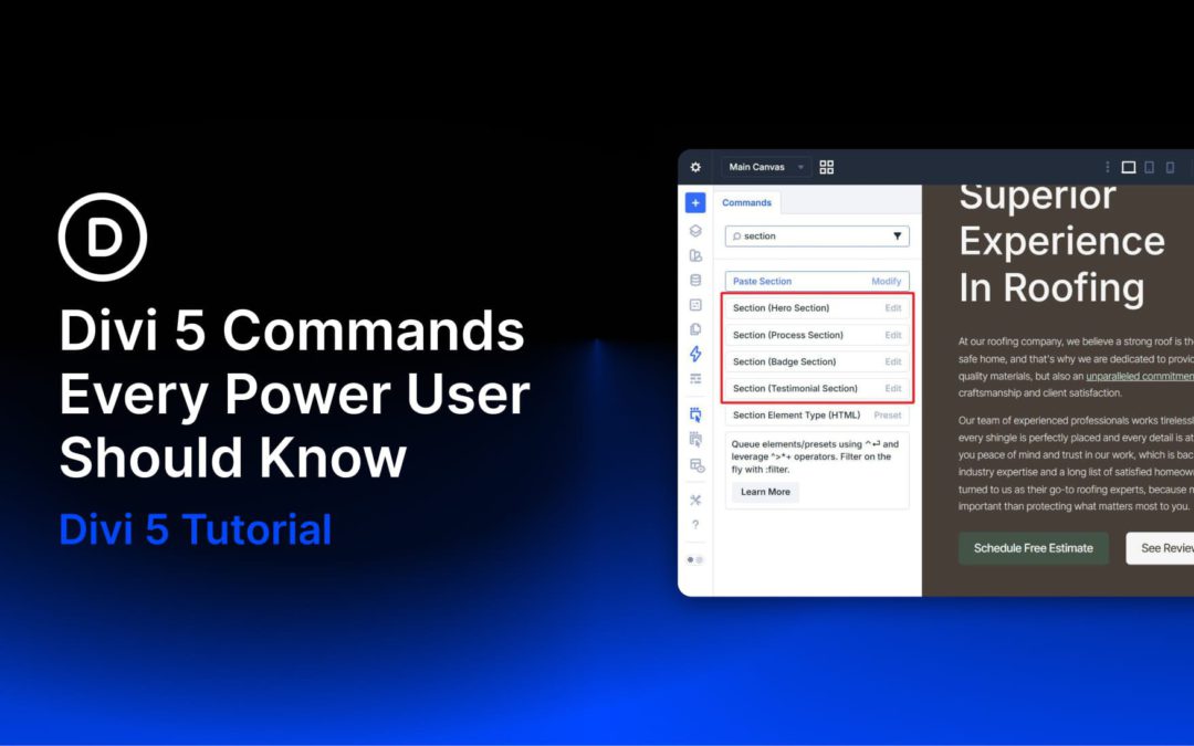
The Divi 5 Command Center is one of those features that does not seem like a big deal until you build with it for a few hours. Press CMD+K on Mac or CTRL+K on Windows, type what you want to do, and press Enter. No digging through menus, no scanning sidebars, and no breaking your flow to find the same panel again and again.
What makes it especially useful for power users is not just speed. The Command Center gives you one searchable place to run builder actions, jump to settings, open panels, and navigate around your site. That means less interface friction and fewer unnecessary clicks during a long build session.
This post breaks down five Command Center commands that are especially worth knowing. Not every command in the system, just the ones that are most likely to save time during real work.
by Foster D. Coburn III | Apr 9, 2026
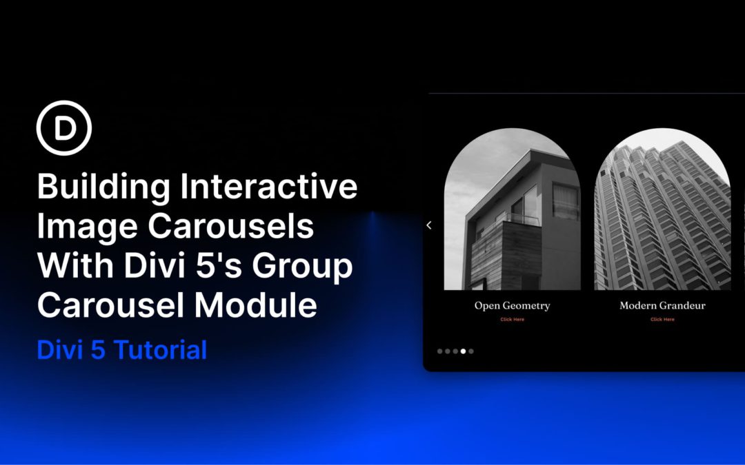
Adding a title or a link to an image card sounds simple, but fitting everything in without crowding the layout is where it gets tricky. Put all the content outside the image and the card can feel busy. Leave the image on its own and the layout can feel unfinished.
In this tutorial, we’ll build an interactive image-card carousel in Divi 5 using the Group Carousel module. Each card starts clean, then reveals its title and call to action when a user hovers over it. We will pair that reveal with a subtle image scale effect using Divi 5’s Interactions system.
What We’re Building
This design example uses Divi 5’s Group Carousel module, with each slide acting as a container for a layered image card. A parent Group holds the card, an Image module provides the visual base, and a nested content Group holds the heading and button. That structure matters because Divi 5 Interactions can target labeled elements independently, letting you control the reveal without affecting the rest of the slide.
By default, each card shows only the image. On hover, two things happen at the same time: the image scales slightly inside its container, and the hidden content fades into view. Both behaviors are handled with Divi 5’s built-in Interactions and Transition settings.