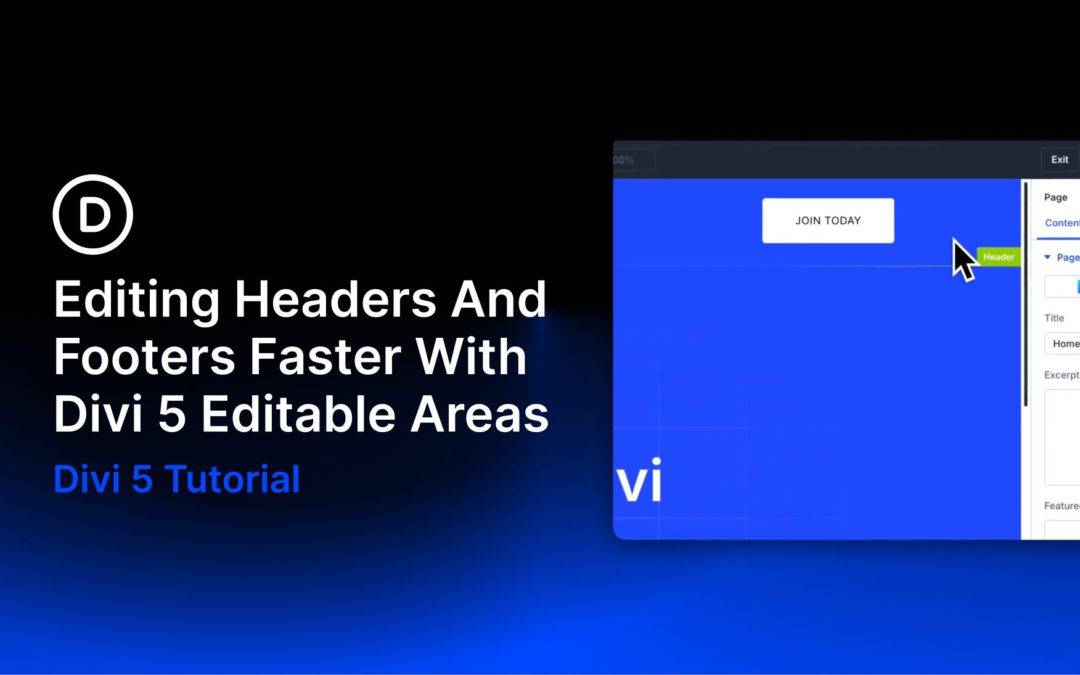
Headers and footers appear across multiple areas of your site, so they are some of the templates you will revisit most often in Divi 5. A logo update, refreshed contact details, a new footer link, or a quick style adjustment are all small changes, but they used to interrupt your workflow by sending you back to the Theme Builder.
Editable Theme Builder Areas in Divi 5 offer a cleaner way to work. Instead of editing page content in one place and global templates in another, you can edit the assigned header, footer, and template body from the front end in a single builder session. That is especially useful when you want to make fast global updates without breaking your focus.
The Problem With Context Switching
Divi’s Theme Builder handles the global parts of your site, including headers, footers, post templates, product templates, and archive templates. Build them once, assign them where needed, and Divi applies them automatically.
That separation is useful for organization, especially on larger sites. But it also creates friction when you notice a global issue while working on a live page. Maybe your footer address is outdated, your header CTA needs new copy, or your logo sizing needs adjustment. In older workflows, fixing that meant leaving the page, opening the Theme Builder, finding the right template, making the change, and then returning to what you were doing.
On busy projects, that extra back-and-forth slows you down more than it should.
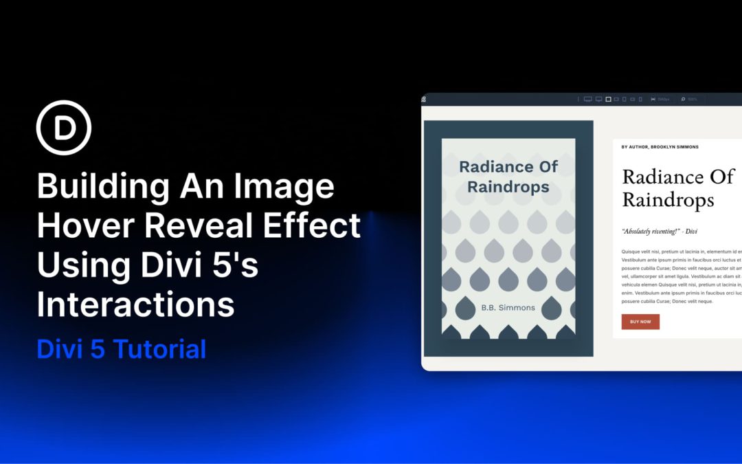
Images almost always share space with supporting content, such as titles, short descriptions, and links. A static layout can handle that well, but even a small hover interaction can make the entire composition feel more responsive. Instead of showing everything at once, the layout reveals extra content only when someone engages with it.
In this tutorial, we’ll use Divi 5 and its Interactions system to build exactly that: a layout where hovering over an image reveals additional content and shifts the surrounding text into a secondary state, all without custom code.
Divi 5 makes it easy to build cohesive layouts with a smarter, more flexible color workflow. In this free pack, you’ll get 4 color adjustment design examples designed to show how powerful Divi 5’s design variables can be in real layouts. Instead of manually styling every element one by one, each example starts with a global color in the Variable Manager and then uses HSL-based adjustments throughout the design to automatically create lighter, darker, softer, and deeper variations.
The result is a collection of polished sections that feel intentional and consistent while still being easy to customize. Change the base color variable, and the entire section updates with it. That’s what makes this pack especially useful for client work, fast prototyping, branded landing pages, and anyone who wants a more system-driven approach to design in Divi 5.
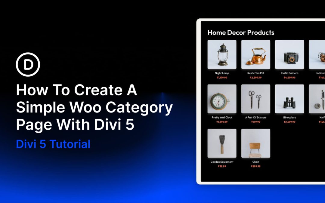
The new Woo Modules in Divi 5 give you much more control over how WooCommerce category pages look and function. Instead of relying on WooCommerce’s default archive layout, you can build category templates visually inside Divi’s Theme Builder.
In this tutorial, you’ll learn two practical ways to create a simple Woo category page in Divi 5. The first uses the Woo Products module to generate a dynamic product grid quickly. The second uses individual Woo modules to build a more custom product card layout for curated products or featured sections. We’ll also show when it makes more sense to use Divi 5’s Loop Builder for a fully dynamic custom archive.
What Are Woo Modules In Divi 5?
WooCommerce category pages work out of the box, but the default structure is restrictive. Product grids, card layouts, spacing, typography, and button styles are mostly controlled by WooCommerce and your theme, so deeper customization often means editing templates or writing CSS.
Divi 5 changes that by turning WooCommerce elements into visual building blocks. We released new Woo Product Modules for Divi 5, covering product and category page design while keeping compatibility with WooCommerce’s core functionality.
That means you can place product-related elements exactly where you want them and style them with the same design controls you already use throughout Divi.
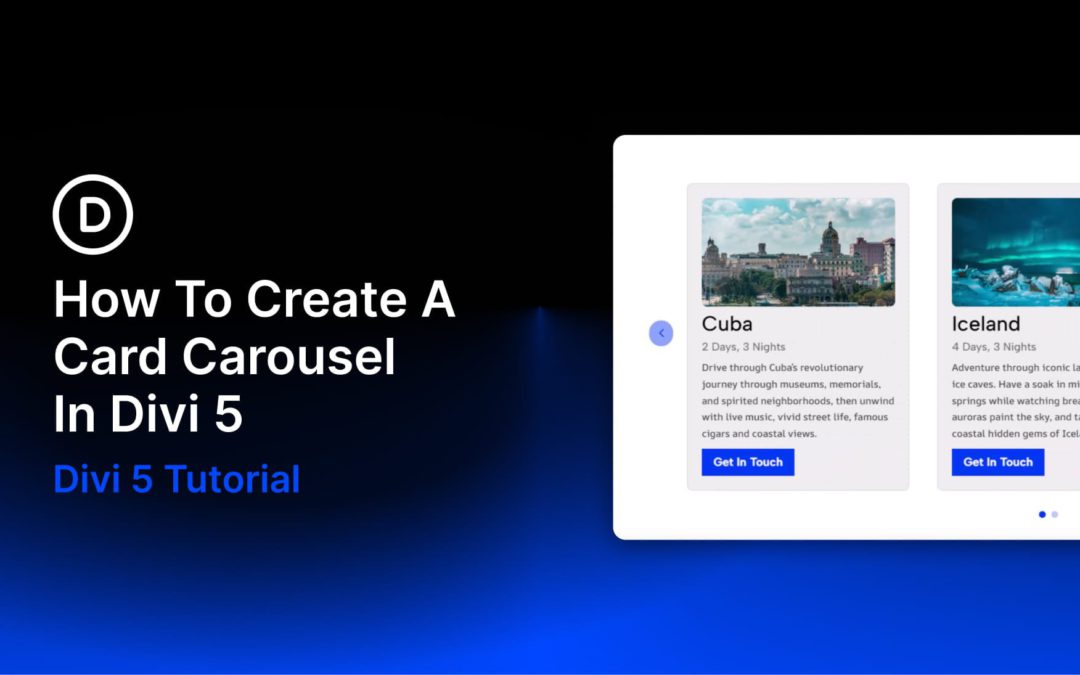
Card carousels look deceptively simple: a row of cards, some navigation controls, and a bit of motion. But getting the structure, spacing, responsive behavior, and active-state styling right takes more work than it seems. With Divi 5, you can build this layout natively without relying on a workaround or extra plugin.
Divi 5’s Group Carousel module was built for layouts like this. Once you understand how Groups, carousel settings, and responsive controls work together, building a polished card carousel becomes much more straightforward. In this guide, we’ll go from setup to styling to responsive refinement, with a few best practices that will save time as your carousel grows.
Receive the latest WordPress, Divi, SEO and design news in your inbox for FREE from Web Design Solutions Unleashed.
We use cookies to ensure that we give you the best experience on our Web site. If you continue to use this site we will assume that you are happy with it.