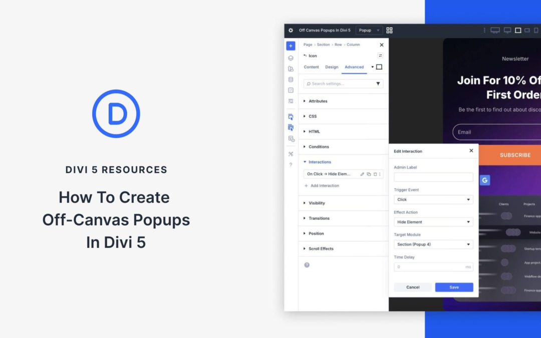
Off-canvas popups are one of the most effective ways to capture attention, grow email lists, announce offers, or guide visitors without cluttering your main page layout. In the past, creating them in Divi required using third-party plugins or custom code. With Divi 5, that all changes. Using the powerful combination of Divi 5 Canvases and Interactions, you can now build fully custom, native off-canvas popups directly in the Visual Builder.
In this post, you’ll learn exactly how to use these two features to create beautiful off-canvas popups.
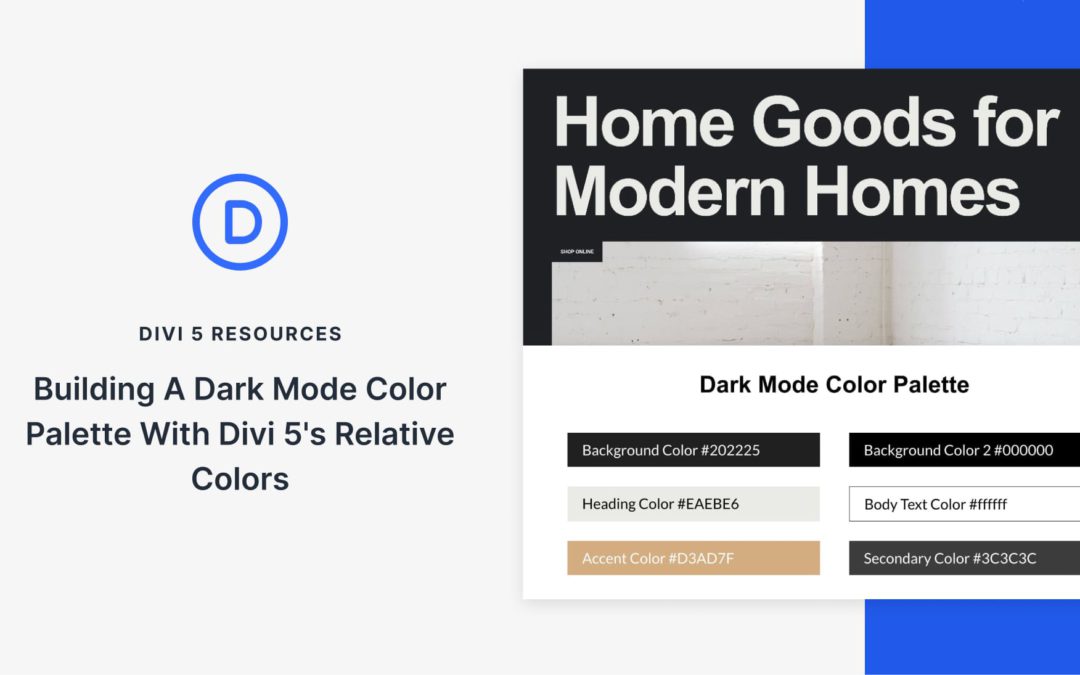
With Divi 5, dark mode doesn’t have to be a fragile set of overrides. You can design light and dark layouts side by side, using the same structure and a shared color system that stays easy to adjust.
We’ll start with a light-mode layout, then build a dark mode palette for it. We’ll build a dark mode version inside a Canvas, and apply the palette using Divi 5’s Color System and Design Variables. At the end, we’ll adjust a few HSL values and watch both layouts update instantly, without touching individual modules.
A Practical System For Building Light & Dark Mode Layouts In Divi 5
Divi 5 makes it easier to manage color decisions at the system level, rather than updating modules one at a time. You can define a small set of rules, apply them consistently, and adjust them later without hunting through a layout.
That approach is especially useful when light and dark modes need to coexist. In this walkthrough, we’ll build a dark mode palette that stays in sync with the light layout and remains easy to refine.
We’ll use three features together to do this.
The Color System For Defining Color Roles
The Color System lets you assign clear roles to your colors. You can define a primary color, a secondary color, heading text, and body text. Once defined, those colors can be applied consistently across modules, sections, buttons, borders, and icons.
What makes this useful is that once a color is set, it can be reused throughout your layout. Update it later, and every element that uses it updates automatically. Your design stays consistent without manual rework.
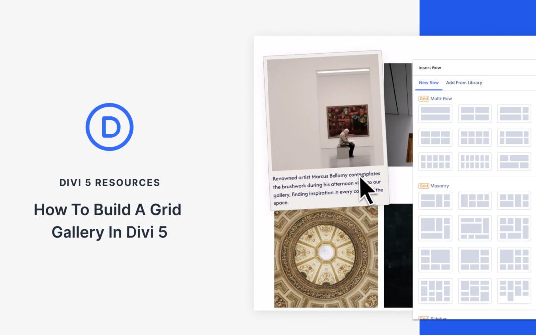
Photos tell better stories when they sit in clean, organized grids. In Divi 5, you can get there in two ways: use the Gallery Module for a fast, familiar setup, or use CSS Grid controls in the Visual Builder when you want more layout freedom. Grids handle the structure for you, and Divi gives you the design tools to turn a simple collection of images into a polished, responsive, and interactive design.
In this post, you’ll learn how to configure grid settings, style your images, and build galleries that look great on every device, including hover effects, captions, and reusable presets. Here’s the breakdown.
Grids In Divi 5
CSS Grid controls rows and columns simultaneously, unlike Flexbox, which is designed for a single axis at a time (row or column). With a grid, you can manage both horizontal and vertical placement simultaneously.
Grid typically requires custom CSS and can be challenging to master. But not inside Divi 5. Divi 5 bakes CSS Grid directly into the Visual Builder.
Sections, rows, columns, module groups, and modules all function as grid containers, and any module you drop inside becomes a grid item that follows the grid structure.
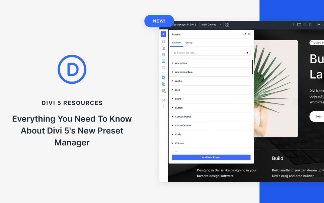
Presets are among the most powerful tools in Divi 5, enabling you to build consistent, efficient, and scalable designs across your entire website. Whether you’re building a cohesive brand style, speeding up repetitive tasks, or managing complex projects, presets let you define them once and apply them everywhere.
We’ve taken the system a step further with the Preset Manager. It puts you in control of your presets by consolidating them in one convenient location, ready for you to browse, create, edit, and organize.
In this post, we’ll explain what the Preset Manager is, explore its key features, and show you how to use it.
What Is The Preset Manager In Divi 5?
The Preset Manager is a dedicated feature in Divi 5 that gives you a single, centralized view of all presets on your site. Whether you’re working with Element Presets or Option Group Presets, everything appears neatly organized in one powerful interface.
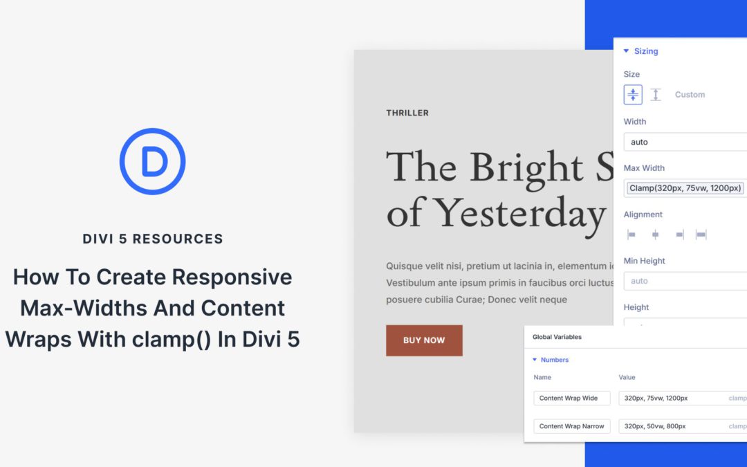
Content needs boundaries. Without them, paragraphs stretch across 3000px-wide monitors, and line length turns into a chore. So you set a max width, test a few screens, and call it done.
Then the in-between devices show up. Tablets, small laptops, and everything that sits between your breakpoints. The layout is technically responsive, but the text feels either too wide or too cramped. You add another breakpoint to patch it, and suddenly, a simple content wrap has four different width values to manage.
That is where clamp() helps. In this guide, we will build responsive content wraps with clamp() in Divi 5 so your layouts remain readable across all screen sizes.
Why Fixed Container Widths Can Create Problems Across Devices
A 1200px container width looks clean on desktop monitors. Open that same page on a tablet, and the numbers don’t line up anymore. Your max width is set to 1200px, but the viewport is only 1024px. Something has to give.
Most builders solve this with breakpoints. Desktop gets 1200px. At your tablet breakpoint, you drop to 900px. Mobile devices under 768px get full width. Three breakpoints, three values, problem solved.
Except tablets don’t all measure 1024px.Some iPads are 810px wide in portrait, and iPad Minis can be narrower. Mid-sized screens land between breakpoints. Smaller laptops often max out at around 1280px. Your three breakpoints cover the theoretical ranges but miss the actual devices.
Receive the latest WordPress, Divi, SEO and design news in your inbox for FREE from Web Design Solutions Unleashed.
We use cookies to ensure that we give you the best experience on our Web site. If you continue to use this site we will assume that you are happy with it.