
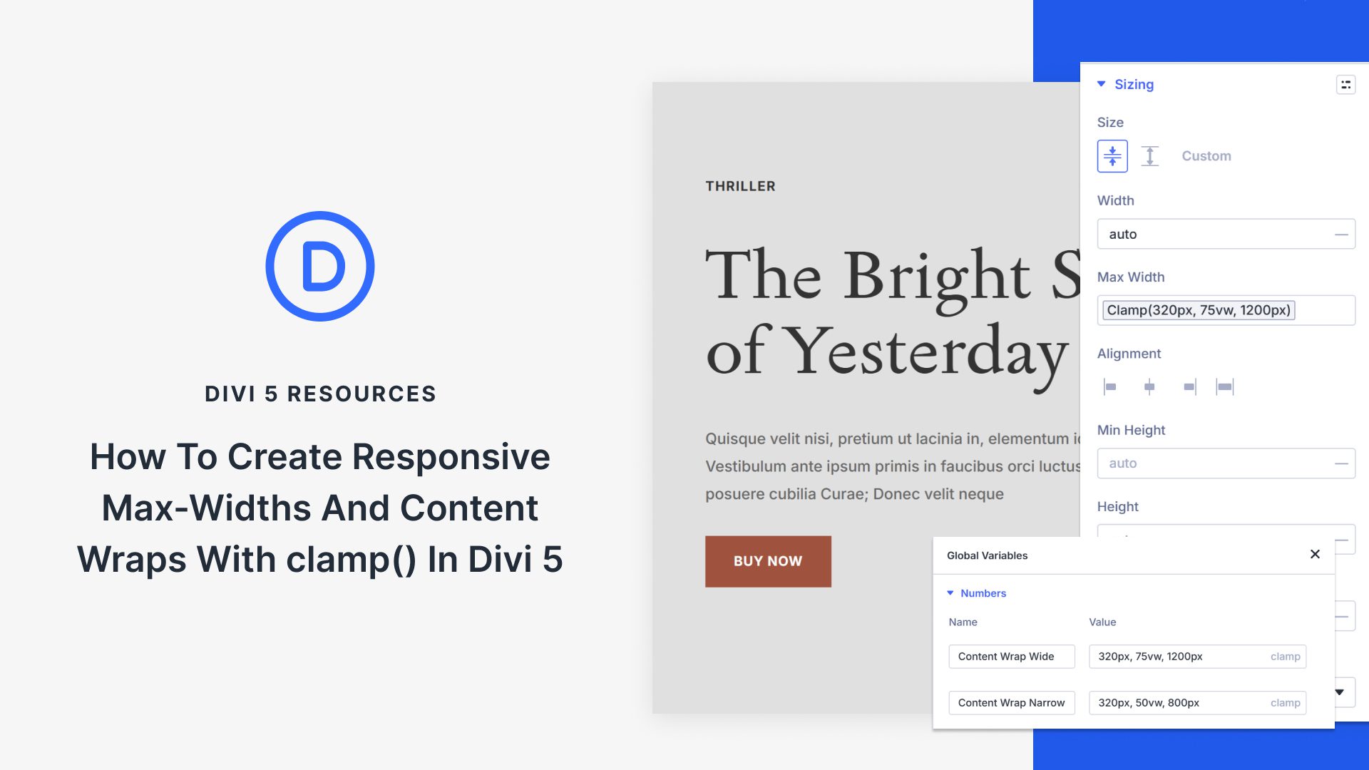
Content needs boundaries. Without them, paragraphs stretch across 3000px-wide monitors, and line length turns into a chore. So you set a max width, test a few screens, and call it done.
Then the in-between devices show up. Tablets, small laptops, and everything that sits between your breakpoints. The layout is technically responsive, but the text feels either too wide or too cramped. You add another breakpoint to patch it, and suddenly, a simple content wrap has four different width values to manage.
That is where clamp() helps. In this guide, we will build responsive content wraps with clamp() in Divi 5 so your layouts remain readable across all screen sizes.
Why Fixed Container Widths Can Create Problems Across Devices
A 1200px container width looks clean on desktop monitors. Open that same page on a tablet, and the numbers don’t line up anymore. Your max width is set to 1200px, but the viewport is only 1024px. Something has to give.
Most builders solve this with breakpoints. Desktop gets 1200px. At your tablet breakpoint, you drop to 900px. Mobile devices under 768px get full width. Three breakpoints, three values, problem solved.
Except tablets don’t all measure 1024px.Some iPads are 810px wide in portrait, and iPad Minis can be narrower. Mid-sized screens land between breakpoints. Smaller laptops often max out at around 1280px. Your three breakpoints cover the theoretical ranges but miss the actual devices.