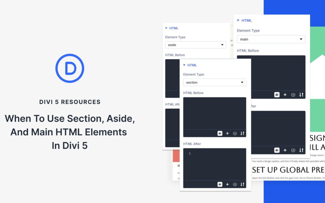
Search engines and assistive technologies rely heavily on your page’s HTML structure to understand what each part is for. When everything is wrapped in generic <div> elements, they get less structural context, which can make your content harder to interpret and navigate.
Using <main>, <section>, and <aside> can clarify your page structure and improve navigation for screen reader users. It also gives search engines a clearer context about which content is primary versus supporting.
So when should you use each one? In this post, we’ll break down how these elements work and how Divi 5 makes it easy to assign semantic elements to any part of your layout. Let’s get into it.
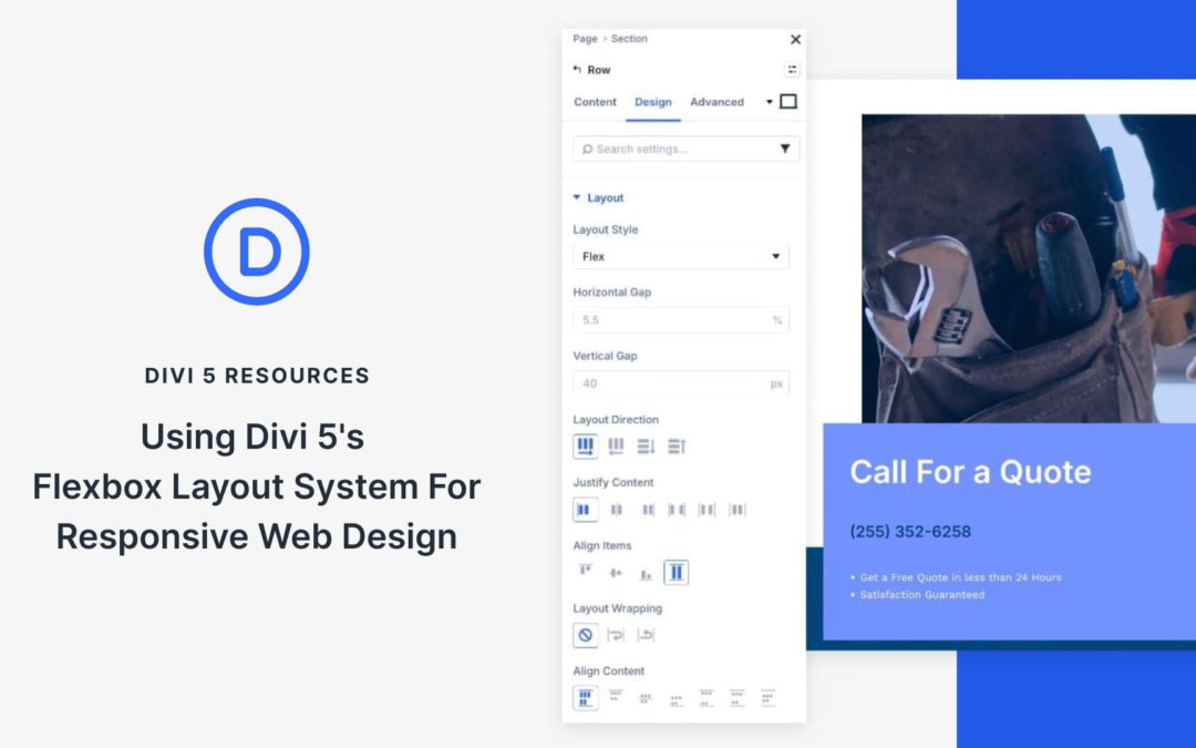
Responsive design often comes down to controlling how elements shift, wrap, and space themselves across different screens.
Divi 5 introduces Flexbox as its core layout system, giving you control over layout flow and alignment at the container level. While block-style layouts lock you into fixed columns and floats, Flexbox adjusts to available space, making responsive behavior more predictable.
In this post, we’ll look at how Flexbox works in Divi 5 and walk through a simple layout to show how these tools come together to create a clean, responsive design with fewer adjustments.
What Is Flexbox In Divi 5?
Flexbox is a modern way of arranging elements so they automatically adapt to available space. Think of it like organizing items on a shelf: you decide how they should sit, how much room they need, and what happens when you run out of space.
Rather than locking modules into fixed columns, Flexbox treats a section or container as a flexible space and gives you control over how its items should behave as the screen size changes.
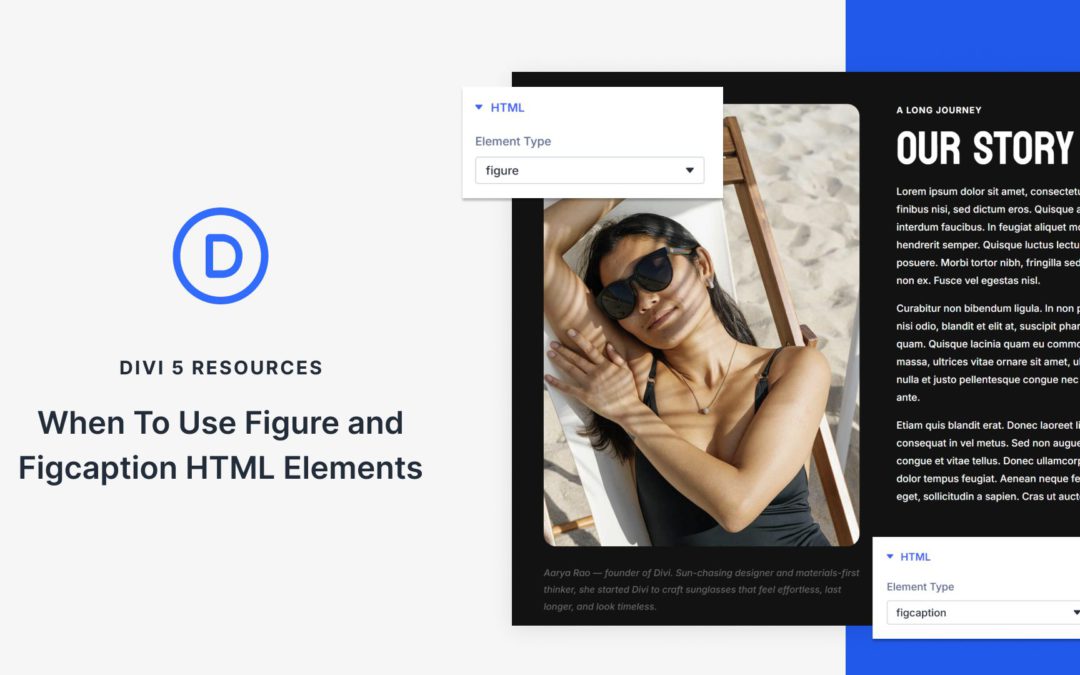
Most images on your site need nothing more than what Divi already does. Add an Image Module, style it, and you’re done. But there are times when you want to group an image with a caption in a way that your HTML explicitly defines as a single unit.
That’s where figure and figcaption come in. These HTML elements create a built-in semantic relationship that plain image-plus-text layouts often don’t express as clearly. The question isn’t whether they’re better, it’s when they’re worth using. Divi 5 makes adding these HTML wrappers straightforward when your content needs that extra structure. Here’s how to decide.
Understanding The Figure And Figcaption Elements
Both elements come from HTML5 and work together to mark up content that benefits from a visible caption. Before you can decide when to use them, you need to know what each one actually does and how they interact with browsers and assistive technology. Let’s break down each element separately, then look at why their relationship matters:
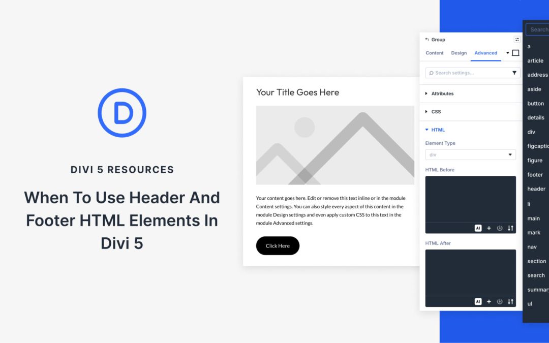
Header and footer elements are commonly understood as page-level structure. A site has one header, one footer, and the rest of the layout lives in between. Most people stop there. In HTML5, though, <header> and <footer> go further. They can describe structure within individual sections of content, beyond page level.
Divi 5 makes it easy to apply semantic elements to any layout component. This post walks through the specific scenarios where adding header and footer elements to your layout actually improves clarity.
What Are Semantic HTML Wrappers In Divi 5?
Semantic HTML gives your website’s structure a vocabulary that browsers and assistive technologies can understand. A generic <div> doesn’t carry inherent meaning about what’s inside. But a <header> tag signals “this introduces a section,” and a <footer> tag says “this wraps things up.”
Divi 5 includes this capability directly in the builder through Custom HTML wrappers and Custom Attributes. Any section, row, column, or module can be rendered with a semantic tag instead of a generic div element. You can do it without custom code or template modifications. Just pick the tag from a dropdown, and Divi handles the rest when your page loads.
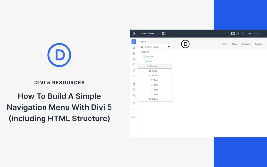
Divi’s Menu module handles many navigation needs, but sometimes you want more options and control. Custom header designs, unique hover effects, or specific semantic HTML requirements can push you beyond what the Menu Module offers. Divi 5‘s semantic elements and HTML wrappers let you build navigation from scratch using basic modules while outputting valid, accessible HTML.
This tutorial demonstrates how to build a navigation menu using an Image Module for the logo, Text Modules for the text-based nav links, and a Button Module for a call to action. The result is a semantic <nav> structure with proper <ul> and <li> elements that browsers, screen readers, and search engines interpret correctly.
Why Build Custom Navigation?
The Menu Module works for out-of-the-box navigation, but custom-built navigation offers advantages in specific scenarios. Using individual modules gives you access to their full styling options. You can use CSS Grid or Flexbox to control your own layout within the navigation (instead of the Menu Module’s predefined layout). You can also include a styled button as part of the navigation itself — semantically inside the <nav> element where it belongs — rather than floating outside it.
Divi 5’s semantic element settings make this a viable and legitimate technique. You control what HTML tags each module outputs, ensuring your custom navigation remains fully accessible and semantically correct.
Receive the latest WordPress, Divi, SEO and design news in your inbox for FREE from Web Design Solutions Unleashed.
We use cookies to ensure that we give you the best experience on our Web site. If you continue to use this site we will assume that you are happy with it.