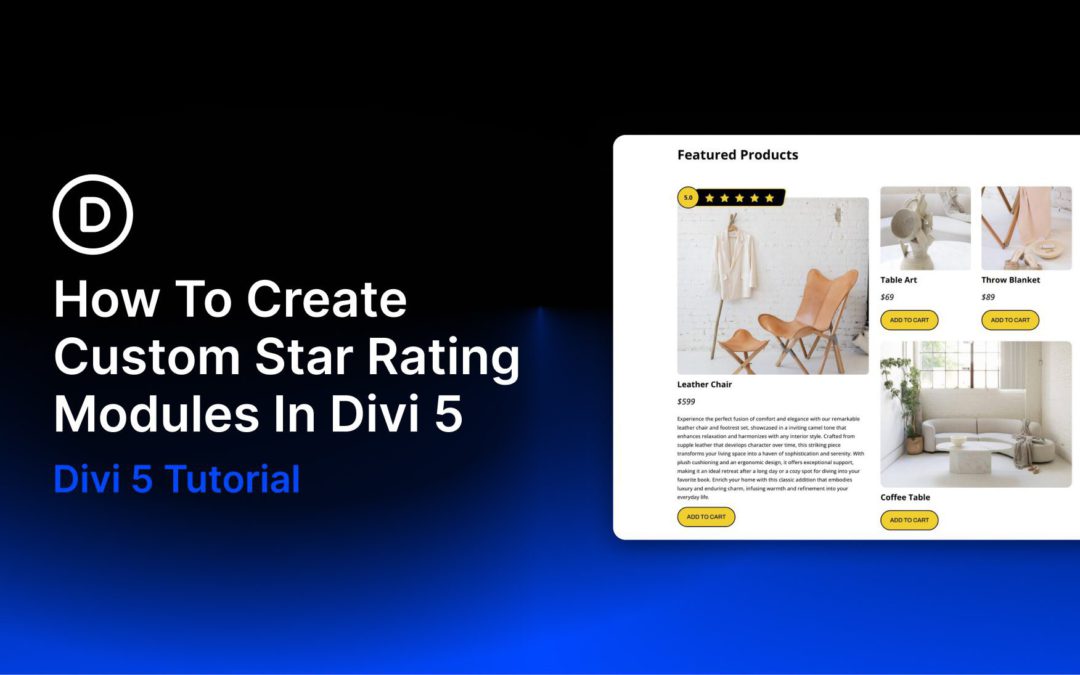
Star ratings are one of the quickest ways to communicate trust and perceived quality on a website. Whether you are highlighting product reviews, service testimonials, or customer feedback, a well-designed star rating adds instant visual context. The challenge is making it look polished, reusable, and responsive without overcomplicating the build. In Divi 5, that process is much easier.
One of the most useful tools for this kind of custom component is Module Groups. Groups let you bundle multiple modules into one manageable unit, which makes it easier to build repeatable UI elements such as badges, review summaries, pricing callouts, and custom star ratings.
In this post, we’ll walk through how to create a custom star rating module in Divi 5 using Groups and Flexbox. By the end, you’ll have responsive, reusable star rating designs that you can save and use throughout your site.
What Are Module Groups?
Groups are one of the most useful structural additions in Divi 5. A Group is a container element that lets you bundle multiple modules into a single, cohesive unit inside a column. Once modules are placed inside a Group, you can move, duplicate, style, and manage them together far more efficiently.
That makes Groups especially useful for building custom, repeatable components without needing extra Nested Rows.
Here are a few of the most useful things Groups bring to this workflow:
Built-in Flexbox controls: Groups work especially well with Divi 5’s Flexbox-based layout system, giving you visual control over direction, alignment, justification, wrapping, and gap spacing across breakpoints.
Nesting support: You can place Groups inside other Groups to build more advanced structures while keeping the layout organized.
Group-level styling: Apply backgrounds, borders, shadows, spacing, sizing, transforms, and other design settings at the container level.
Reusable design patterns: Once a Group-based component looks the way you want, you can save and reuse it across your site.
In short, Groups make it much easier to build polished, reusable components like star ratings while keeping your page structure lean and manageable.
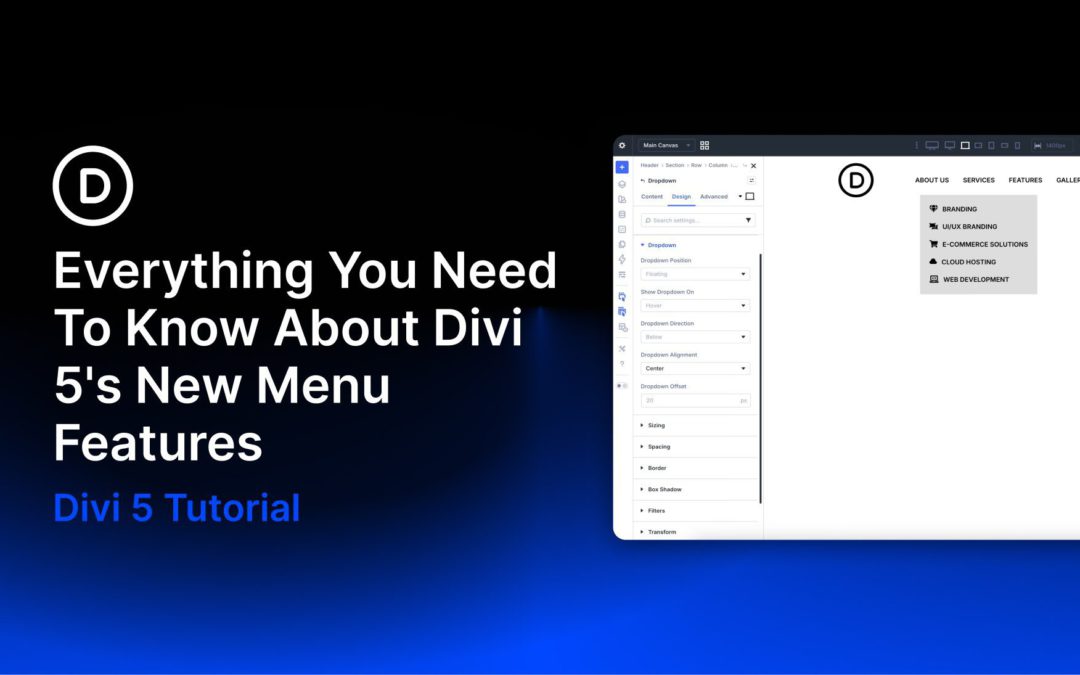
Divi has evolved into a modular, performance-focused platform with a more streamlined builder, a rebuilt framework, and ongoing feature releases. As Divi 5 development continues, new features are being rolled out regularly. One recent update introduced new menu features that let you build navigation directly inside the Visual Builder, without plugins or custom CSS.
The classic Menu module is still available for simple setups, while the new Link and Dropdown modules act as building blocks for fully custom menus. Paired with updated Loop Builder capabilities and selector-based Interactions, they let you design everything from simple dropdowns to full-screen overlays, slide-ins, and mega menus using native Divi 5 modules and settings.
In this post, we’ll look at these new features, walk through creating a simple desktop and mobile menu with them, and share a few practical tips to help you get started.
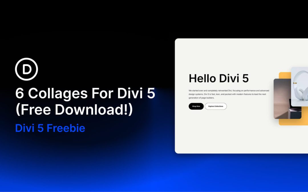
Divi 5 makes it easy to build modern, image-driven layouts that feel polished without adding unnecessary complexity. In this free pack, you’ll get 6 Collage Sections designed for hero areas, product spotlights, portfolio intros, creative landing pages, and other content that benefits from layered visuals and clean typography. Drop one onto any page, swap the content, and you’re ready to go.
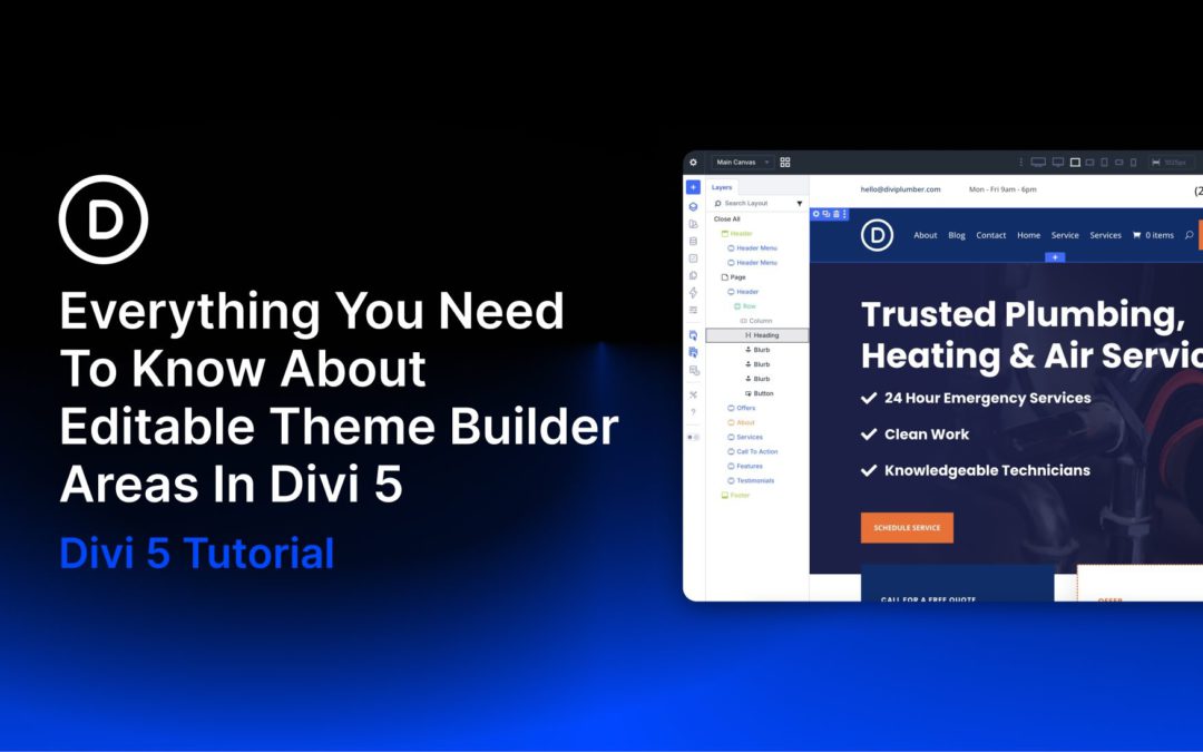
Divi 5 is now available, bringing a rebuilt foundation focused on performance, a modernized builder experience, and a growing list of new features. One of the latest additions is Editable Theme Builder Areas, also referred to as complete site editing. Instead of leaving the Visual Builder to open the Theme Builder separately, you can now edit the active header, footer, and body template areas directly on the front end while working on the page itself.
This creates a smoother workflow because the global template areas assigned to the page you’re viewing appear inside the same editing session. You can update site-wide elements and page-level content side by side, with less context switching and faster visual feedback.
In this post, we’ll walk through what Editable Theme Builder Areas are, how to use them, and a few practical ways to work with them more efficiently.
What Are Theme Builder Areas In Divi 5?
Divi has always been more than a page builder. It also gives you control over structural parts of your WordPress website, including headers, footers, post templates, product templates, category templates, and other dynamic layouts.
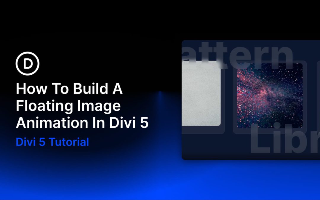
Floating images are elements that appear to hover and drift above the page, creating depth and organic motion without any user interaction. You’ve seen them on agency sites, SaaS landing pages, and portfolio headers—images that gently bob and sway as if suspended in space. The effect transforms static layouts into something that feels alive.
Divi has offered built-in animation controls for years, but Divi 5 makes this workflow cleaner thanks to its rebuilt Visual Builder, improved attribute management, and flexible design controls. Combined with a single CSS property, Divi’s built-in Animation options can produce smooth, continuous floating motion directly inside the builder. No plugins. No JavaScript. Just Divi’s native tools and one line of Custom CSS.
This tutorial walks through the full build: layout, card styling, animation, staggered timing, and a frosted-glass text treatment that ties the composition together. By the end, you’ll have a reusable section that looks polished and works well across devices.
Receive the latest WordPress, Divi, SEO and design news in your inbox for FREE from Web Design Solutions Unleashed.
We use cookies to ensure that we give you the best experience on our Web site. If you continue to use this site we will assume that you are happy with it.