by Foster D. Coburn III | Feb 28, 2017 | Web Design, WordPress
When I think back to my days in middle school, I realize how many friends I made that are still in my life years later. Today we’re going to talk about one of those friends. We went in different directions when it came time to go to college. After college, we also went in different directions. While I’m designing Web sites from offices in Arizona and Mexico, he is designing amazing outdoor spaces in California, Mexico and beyond.
Throughout his career, he worked his way up to a senior level position in a firm. I certainly suggested a few times that he consider starting his own firm. He did exactly that almost a year ago. Then the next step was putting together a Web site for the new firm and it has now launched.

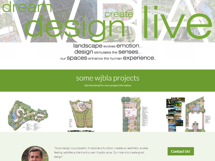
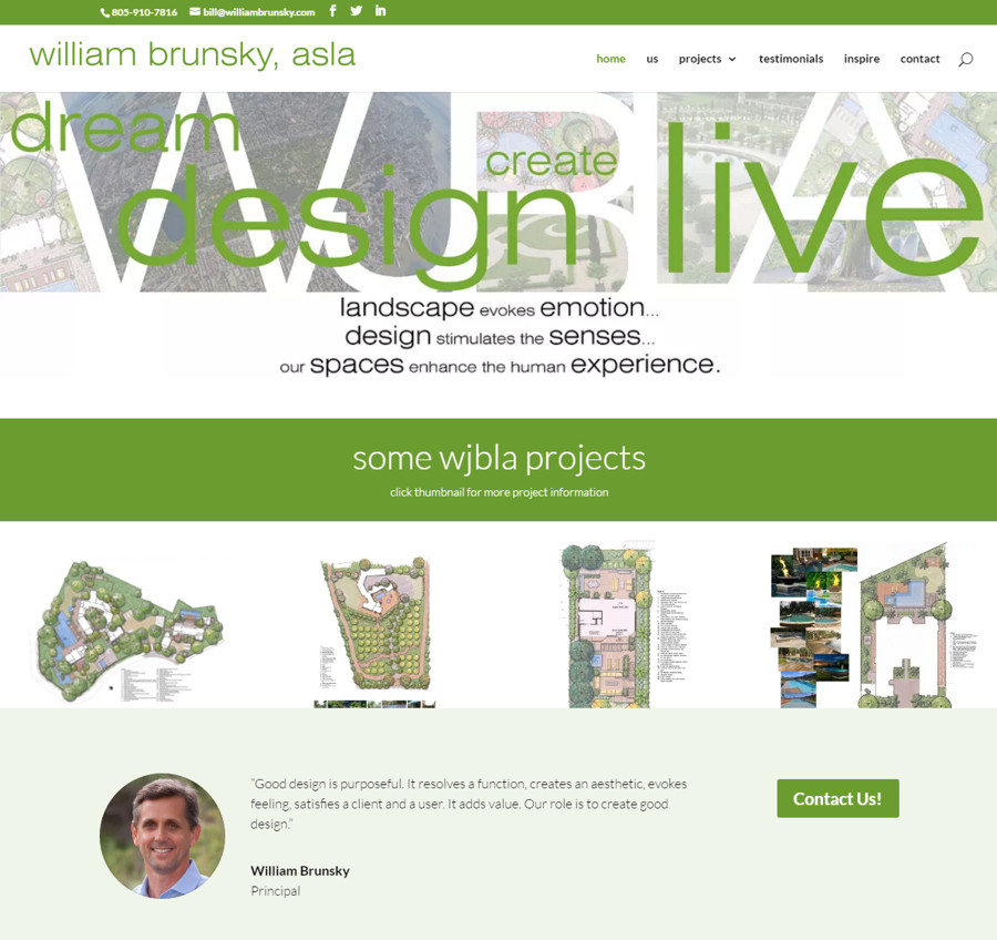
We had a lot of discussions about what to include on the site and the best way to present it. One conversation I have with many clients is the importance of a site on a phone. That’s always a bit more challenging when the client is somewhat who never surfs the Web on their own phone. Yet as we worked on the site, Bill truly understood the importance and always made sure to look on his own phone.
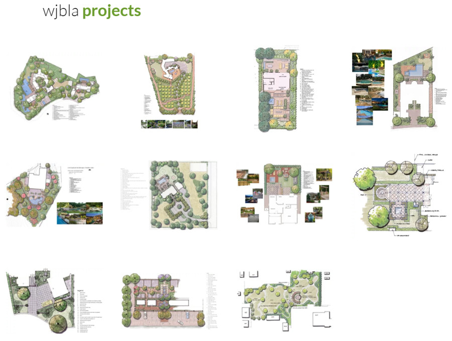
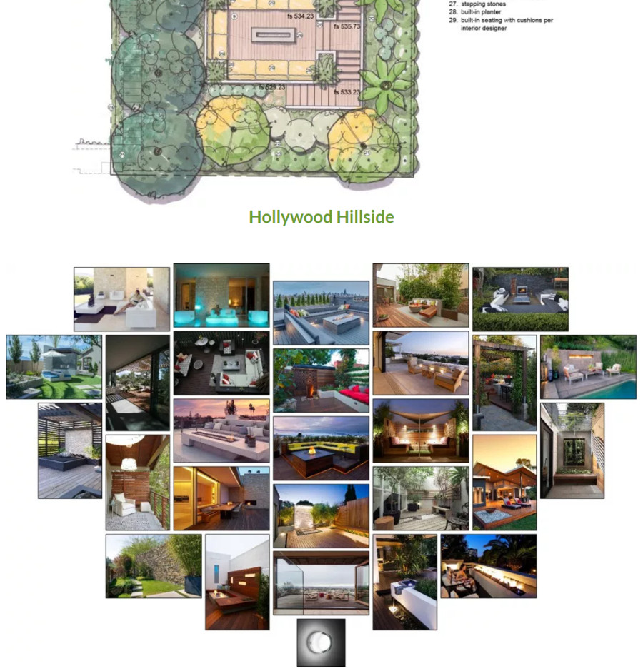
As a landscape designer, it was important to show off his designs. This also led to a challenge since many projects take a long time to go from the design phase to completion. Thus there were a number of designs to show which were still in the build phase. In his overall portfolio, the projects are all shown.

There is also a separate portfolio for projects he designed at previous firms, including some very large resorts in the Caribbean and Mexico. Each of the individual projects from the portfolios also have a dedicated page where project details and photos can be shown.

I encourage you all to visit WilliamBrunsky.com to see all of Bill’s amazing work. If you need help designing an incredible outdoor space, talk to Bill about it! For those who are in need of a great Web site, get in touch with Unleashed and we’ll get to work!

by Foster D. Coburn III | Feb 14, 2017 | Web Design, WordPress
Rarely have a met a Web client that wanted me to spend more time on their site than necessary or to bill them for more hours than needed. Typically they wanted the least expensive site possible. I am happy to work with clients to achieve this goal, but it has the best results if the clients are able to provide all of the information needed.
While each project is different, some tasks are true of most every site. The more the client contributes, the less time I will spend on the project. In many cases, only the client can provide the needed content. Below is a list of some of the most important elements.
Pages and Navigation
I guess I assume you have visited some other Web sites. Most likely hundreds of them. As you visit other sites, you see the individual pages on those sites. Make a list of pages you’ll want on your site. For example: Home, About Us, Contact Us, Our Services. Name them whatever you want, just make a list. You might have a list with only 3-4, you may have a list with hundreds. If I don’t know what pages you want, it is really hard for me to build them.
Once you have the list of pages, I need to know what will go on those pages. You know your business much better than I do. Even if you aren’t a writer, any text you can create is very helpful. I can clean up what you provide, but I can’t write about something if I don’t know anything about it.
Once upon a time a client asked me to write a bio for each of the ten employees on their staff. I had never met nine of them. Do you see why it would be difficult for me to write about them if all I knew was their name? In that situation, ask each staff member to write two sentences about themselves. We can edit the bio, but it isn’t something I can write.
By listing page names and the text content of the pages in an electronic file, you save me a lot of typing. Do you really want to pay my hourly fee to have me be a typist? Yes, you might grumble that I’m asking you to do it, but I’m trying to help you save money while also getting a better Web site.
Photos and Graphics
Just like I often need your help with the text on pages, I also need your help with photos and graphics. Yes, I can sometimes take photos for you. Once again, that means you will be paying for my time setting up the photo, shooting it, editing it and then putting it on the site. Maybe you already have good photos. Why reinvent the wheel?
No, the incredibly low resolution photo can’t be used. It is awful. Computers can do wonderful things, but they can’t work magic on awful photos. When you provide good original photos, I can improve them and they will look great on your site. Plus, I can do it quickly to keep your bill as low as possible.
The same is true of other graphics. Sure we could purchase stock artwork. Yes I have a lot of skills for creating and editing graphics. But all of that takes time and time is money. If you can provide me more artwork, I can save you money.
One of the most important graphics is your logo. I need it in a vector format. No, that crummy JPG on your current Web site isn’t a good answer. Could I rebuilt it? Sure, but it could take me a few hours. Please spend just a few more minutes looking for the best version you can find. This helps me put the best version of your company on the Web site and also saves money.
Sample Sites
When you’ve surfed the Web, you have probably seen some sites that you like. Maybe not even the whole site, but elements of the site caught your eye. Give me a list of some of your favorites and tell me why you like it.
Just as you have your favorites, you probably can also name a few sites you think are bad. I want that list as well so I can avoid the things you don’t like.
I know this may sound like a lot of work. If you want to raise your budget, I’m happy to do more and bill you for it. But if you want me to keep to a very tight budget, I need your help providing as much as the content as possible. Then I can focus on making your site awesome!

by Foster D. Coburn III | Dec 19, 2016 | Makeover, Web Design, WordPress
Recently we were asked to makeover a site for a company that does custom embroidery. While there were some aspects of the old site that the client wanted improved, some of the requested changes were related to security.
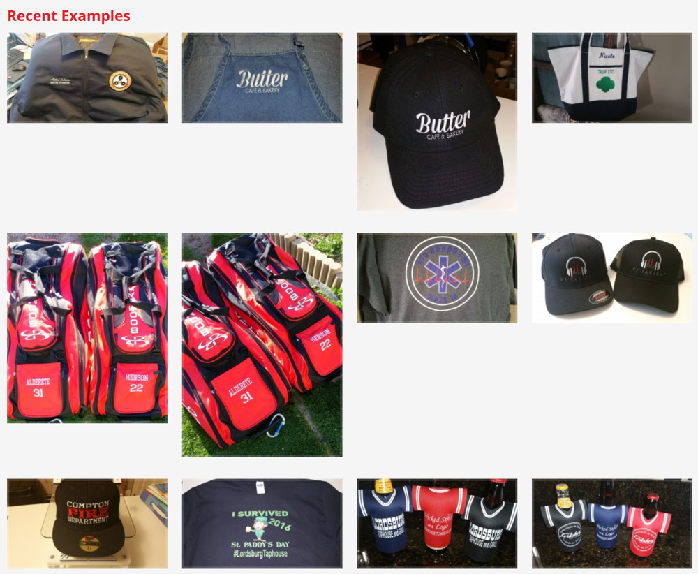
Let’s go through some of the visual changes. The company certainly wants to show off their past projects. On the home page, they had quite a few graphics depicting projects and it was somewhat difficult for them to update what was shown.

Not only was it hard to update, it took up a large amount of space. The graphic above does not show all of the projects. We decided to simplify it by putting the projects into a slider. This took up a lot less space and cycled through all projects. If you hover over any of the projects (as shown below), it tells you the name of the project and a click takes you to a page of project details.

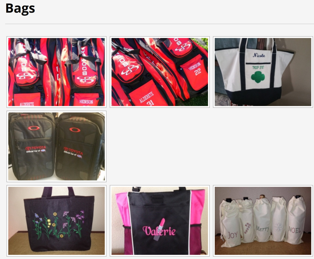
They also have dedicated pages for each type of project. These pages were also difficult to update. Below is the old page showing bags.

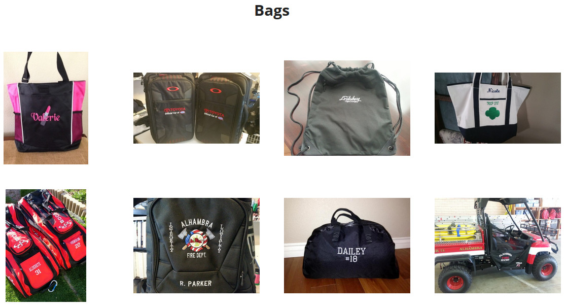
While the new page doesn’t look drastically different (see below), it updates automatically as new bag projects are added. Once again, hovering over any of the bags will show the name of the project and clicking on one of them takes you to the details of the project.

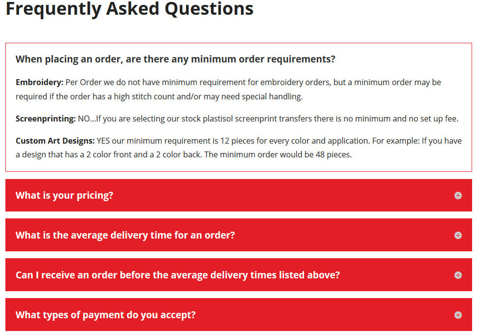
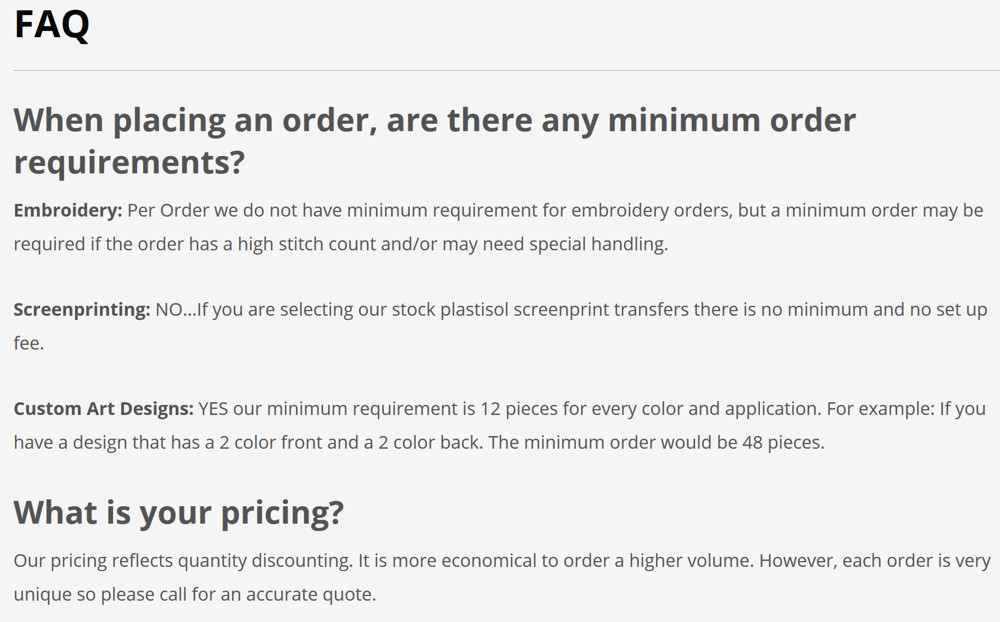
Many Web sites included frequently asked questions (FAQs). Unfortunately visitors rarely read them. This site had just such a page, but it was a wall of words that could be easily ignored (see below).

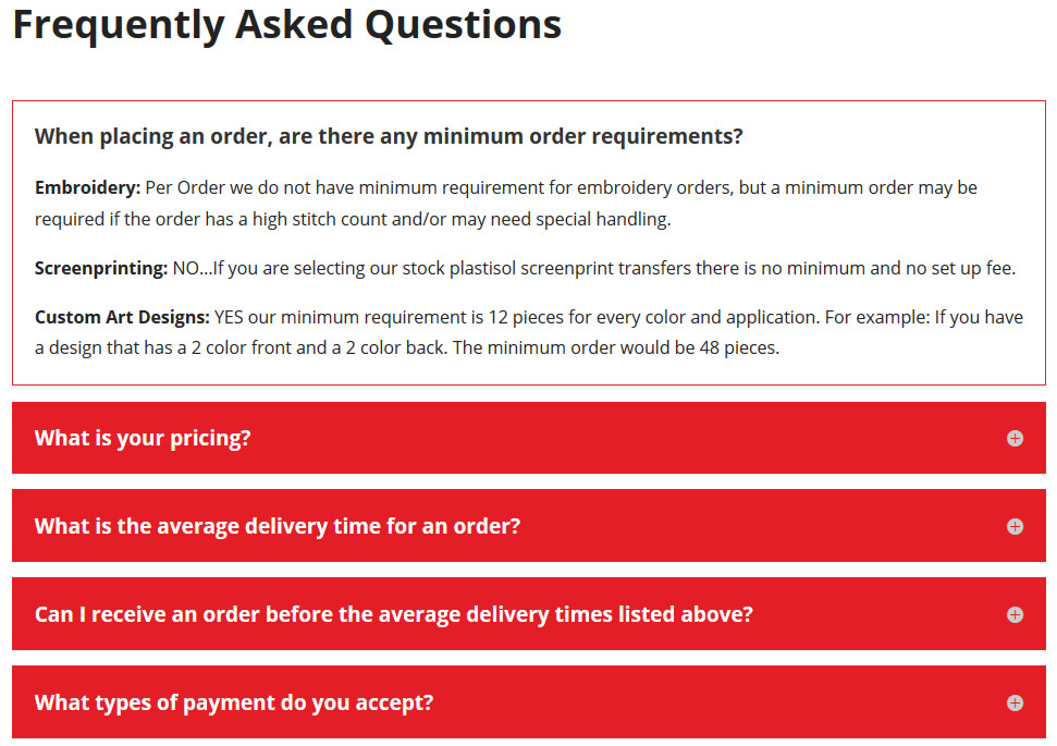
We cleaned it up so that each of the questions was prominently featured (see below). Clicking on a question expands just the answer for that question. This makes it easier for visitors to find just the information they need.

There were numerous other changes made behind the scenes to make the site faster and more secure. Best of all, it will be easier for either Web Design Solutions Unleashed or the client to make future updates. Does your site need a makeover of either looks or functionality? Visit our Contact Us page and let us know how we can help!

by Foster D. Coburn III | Dec 8, 2016 | Makeover, Web Design, WordPress
A friend called and asked if I could fix a couple of things on his Web site. The first issue was an error message in the sidebar where news should appear. There was also a problem receiving information submitted by the contact form. As I hadn’t built the site, there were some unknowns in first finding the errors and then correcting them.
I gave the site a quick look and noticed that it was not the least bit mobile friendly. This is a big deal as 64% of small businesses have a Web site, but only 33% of them are optimized for mobile viewing. Yet it is the way that the majority of visitors see most sites. There was a great article in The Wall Street Journal recently, The Key to Making a Mobile Site Customers Want, that should be read by anyone with a Web site.
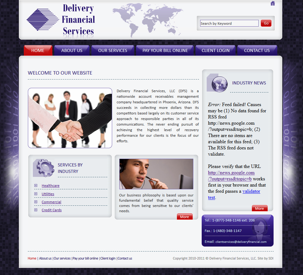
I proposed that I could give the site a quick makeover in about the same amount of time it would take me to diagnose and fix the errors on the site. So that was the direction we took. First, let’s look at the old site and one of the ugly errors.

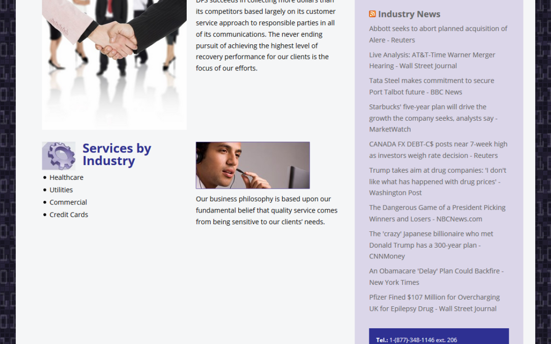
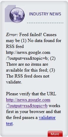
 Above you can see the entire home page from the old design and at right is just the sidebar with the big, ugly error message. The best part about the error message is that it provides the address of the feed that should appear. I tested the feed and it worked perfectly, so clearly there was a coding error.
The original site was not built with WordPress so I first set up a brand new WordPress site and copied all of the content from the old site. As there were only five pages, it didn’t take long to build a replica site. One of the tougher challenges was creating a background with the “binary numbers” on top of tiles.
We could use the old binary graphic as it was only two strips for each edge of the main content area. The new design had to be setup so that it would scale to all screen sizes. It was easy to keep the tiles and I created a new binary overlay so the entire background was seamless and would scale to any size screen.
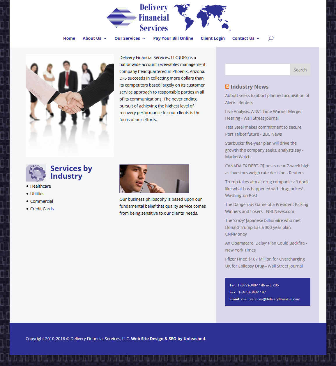
While it may have been quicker to fix just the two items mentioned, it didn’t take much longer to makeover the whole site. The result is a site that is without the errors of the previous site and it works on all devices. Should any future changes need to be made, they can be easily integrated. Below is a screen shot of the new home page.

Do you need a site updated, made over, fixed or changed in any way? We’d love to help! Please visit Web Design Solutions Unleashed for more information and then send us a note telling us something about your project.

by Foster D. Coburn III | Oct 25, 2016 | Makeover, Web Design, WordPress
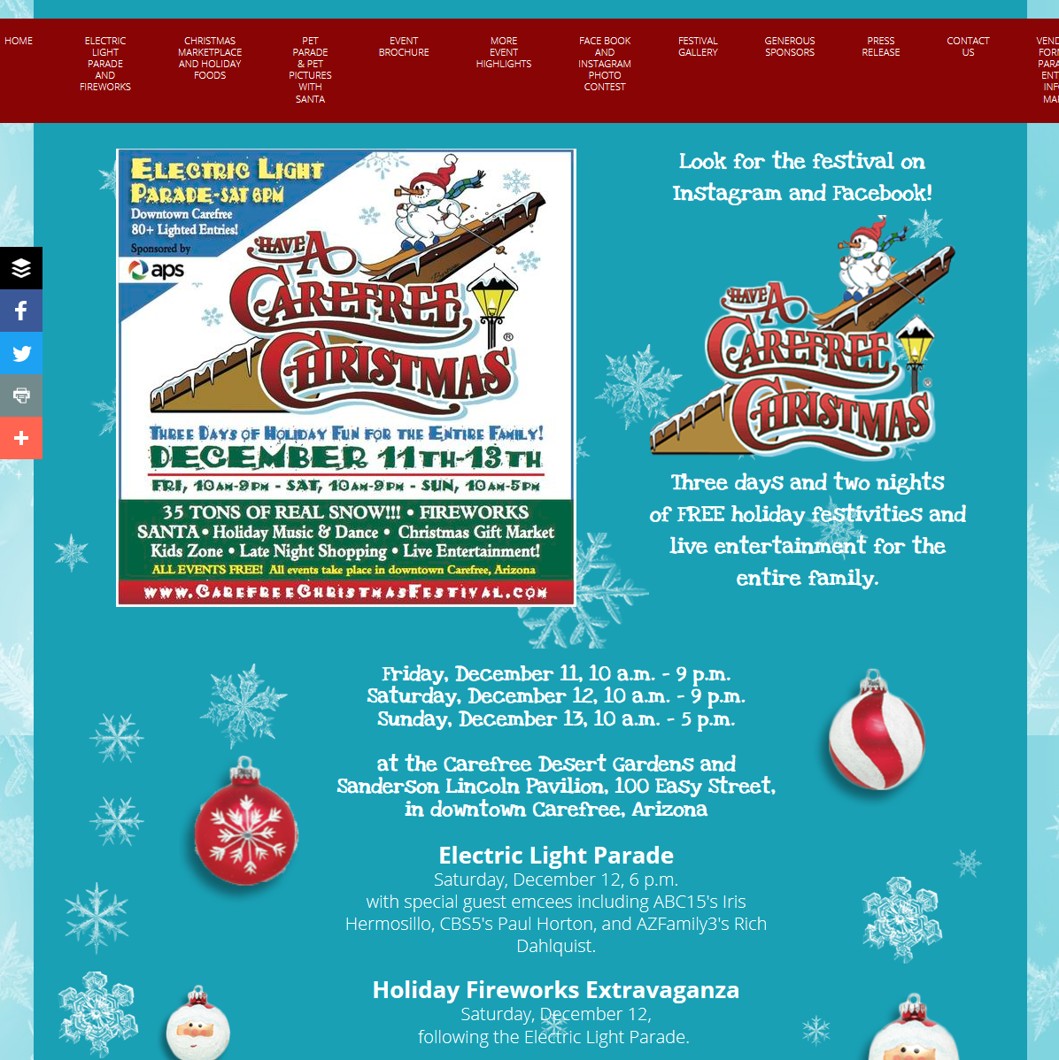
When we were contacted about making over the site for a local Christmas festival, it was easy to see things that could be improved. The site had used one of the popular do-it-yourself “Web site builders” which limited the look of the site (shown below).

The first thing we noticed was the large number of menu items across the top of the site. It is simple enough to put them into sub-menus so they aren’t so small and crowded. It also seemed odd to be dominated by colors that aren’t associated with Christmas. Our mission was to rebuild the site using WordPress while giving it a facelift at the same time.
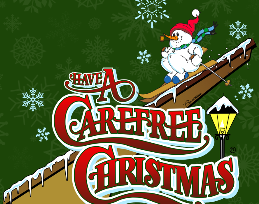
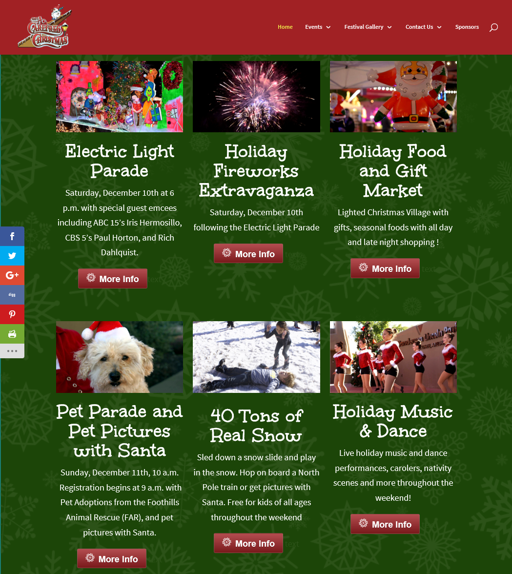
A huge challenge was having a very limited budget and thus very little time to spend on the makeover. So while it is easy for us to see ways the site could be even better, we had to focus on doing everything we could in the limited time allowed by the budget. Below is a section of the home page after the makeover.

This particular event is made up of a series of events with different organizations leading the sub-events. Of course each group feels their portion is the most important part of the overall event and we tried to give them all equal billing on the site. As with many projects, getting photos, text, logos and other content was a challenge.
The best sites, and those that easily come in under budget, are those where clients are very active in providing content for the site. Even pulling photos from the previous site wasn’t a great answer because they were of a low quality. Trying to feature them on the new site showed they were low resolution and less than optimal.
Another heavy focus of any site makeover is to make sure the new site works great on mobile devices. Why? Because around 65% of all visits are coming from mobile devices. If you only view a site on a computer, you aren’t seeing what the majority of visitors will see. In many ways, the new version of this site< looks better on a phone than it does on a computer!
Do you have a site that is overdue for a makeover? Please contact us with an overview of your budget and needs and we’ll get your site looking and performing great!

by Foster D. Coburn III | Sep 13, 2016 | Makeover, Web Design, WordPress
With more than half of all Web traffic coming via mobile devices, it is increasingly important to have a site that works well on mobile. Google also encourages mobile-friendly sites by giving them higher ranking than sites that aren’t mobile friendly.
The JC Printing Web site was originally created by another designer and Unleashed took over the site a couple of years ago. It was already an established WordPress site and the company was very happy with the theme chosen by the original designer. We had run into a few bumps with the old theme, but it made the site at least functional on mobile. That all changed with a recent update to WordPress and the theme developer was in no hurry to release an update.
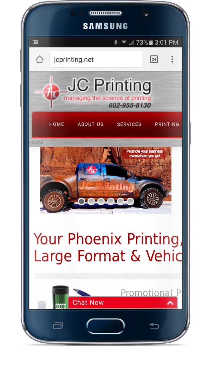
When the owner of JC Printing contacted us about the site failing Google’s mobile-friendly test, we knew it was time to give the site a makeover with a different theme. Before we get into the changes, let’s take a look at the site on a phone before the makeover. Notice the menus and other content go off the right edge of the screen.

We knew the makeover wasn’t as simple as just installing and configuring a new theme. Numerous pages on the site were dependent on specific features of the original theme. This meant the makeover came in two major parts. Each of the pages needed to be rebuilt without the old theme’s features. Once the pages were all rebuilt, then we could install the new theme.
 Earlier, we had installed Divi Builder on the site to use its pricing table feature. Therefore it made sense to use Divi Builder to rebuilt each of the pages. Then the site would only be dependent on its features rather than those specific to a theme. While rebuilding the pages, we also did our best to make the pages more attractive and also more functional and informative for visitors.
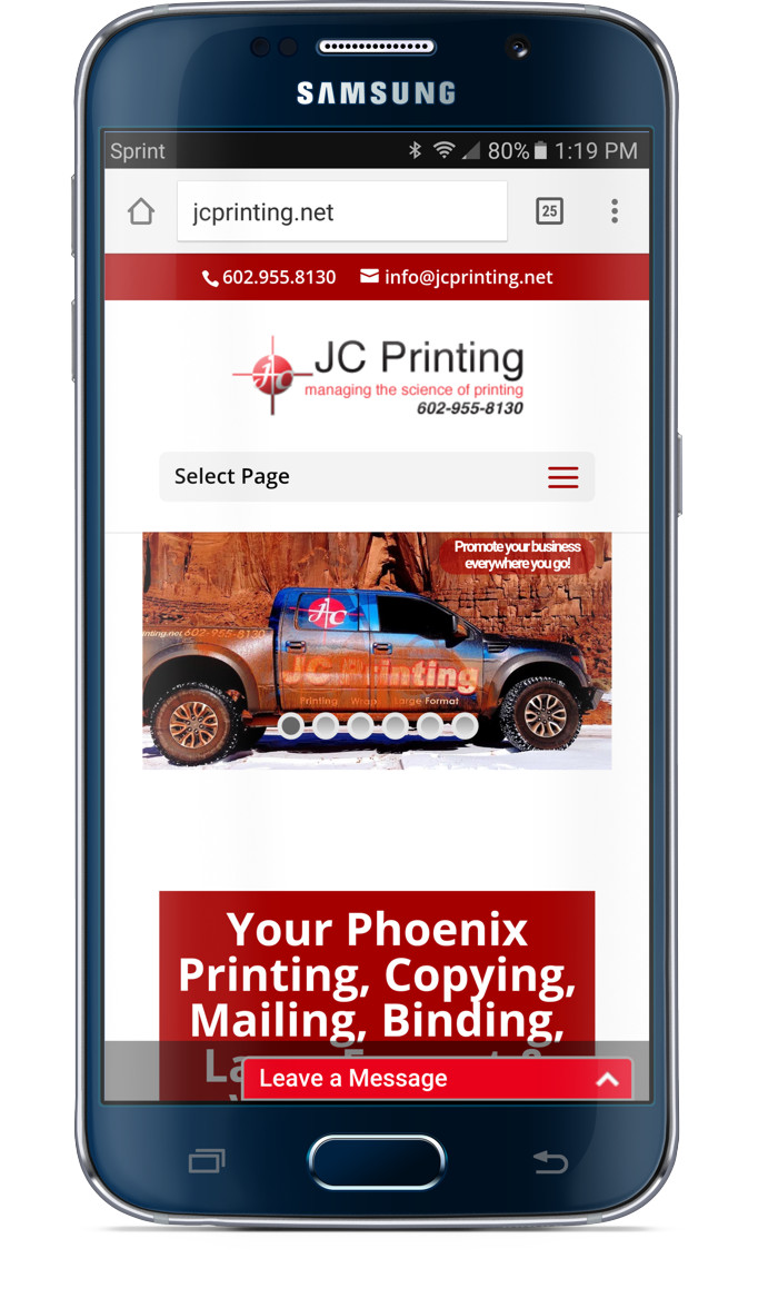
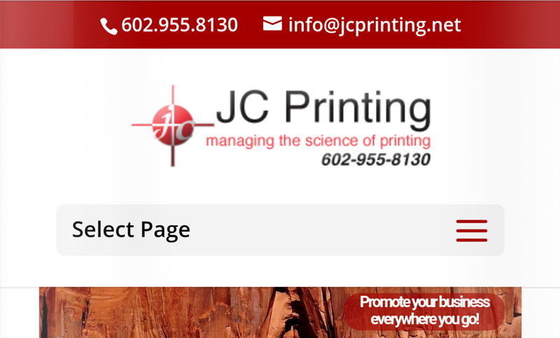
Once the pages had all been rebuilt, we installed the Divi theme and configured it to the preferred settings of the client. Even though we had to edit all pages of the site, the makeover came in under budget! Below is the site as seen on a phone after the makeover. To fully appreciate the functionality of the site on mobile, get out your phone and visit JC Printing!
