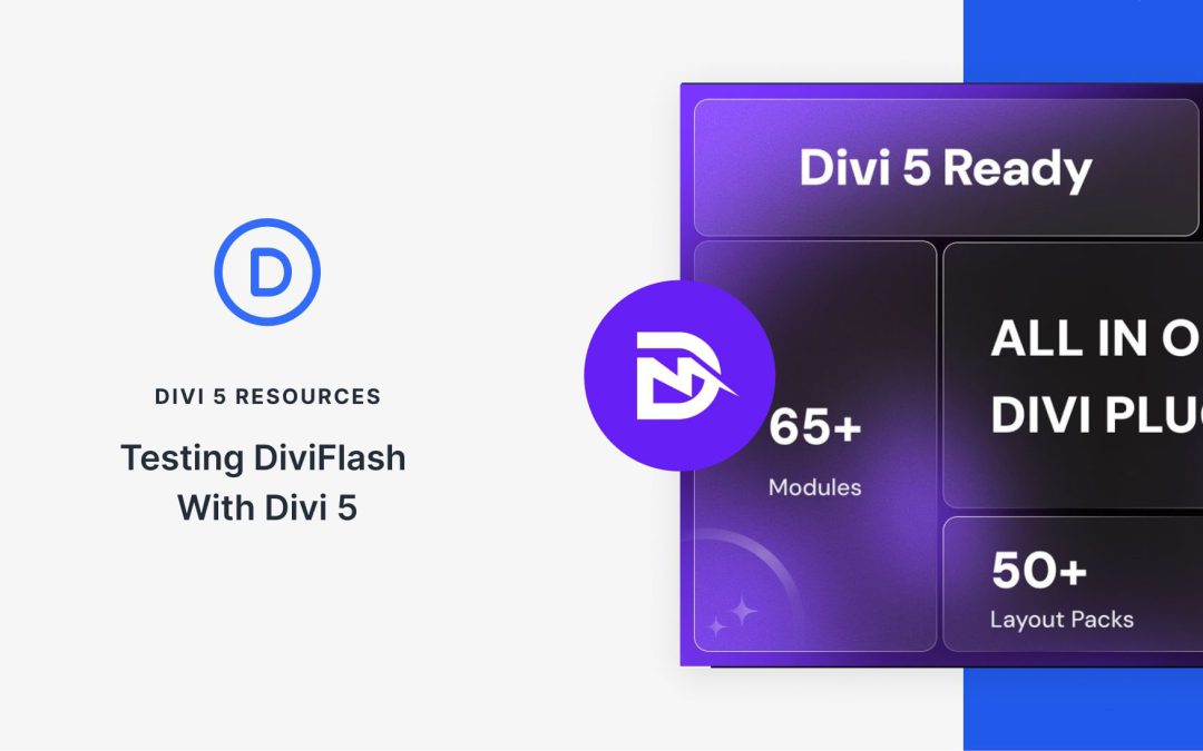
Another Divi Community staple is preparing for the next chapter. DiviFlash has been a cornerstone extension for Divi users who need more than the native modules can offer, and their team has been working diligently on Divi 5 compatibility.
Divi 5 is an architectural overhaul of the builder, and third-party developers face the substantial and necessary task of rebuilding their extensions from the ground up. DiviFlash has embraced this challenge head-on. Their public roadmap shows the Divi 5 module rebuild is complete, and their Public Beta is available now. We love to see it!
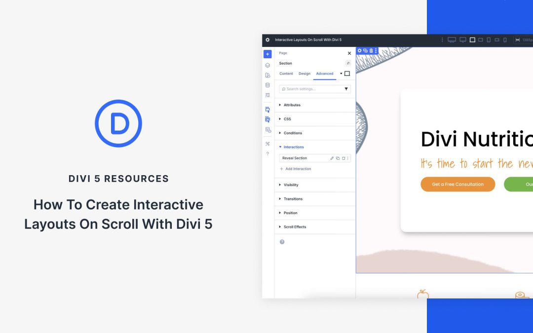
Capturing user attention requires more than static designs. Modern websites thrive on engaging, dynamic experiences that unfold as users scroll Divi 5‘s new Interactions feature allows designers to build scroll-triggered effects and animations that transform passive pages into captivating stories, guiding visitors through seamless interactions. In this post, we’ll explore how Divi 5 Interactions work, why they’re perfect for scroll-based layouts, and provide a step-by-step tutorial with practical examples to elevate your website’s engagement.
What Are Divi 5 Interactions?
Divi 5 Interactions is a powerful, code-free system that lets you create dynamic, user-driven experiences. By defining triggers, effects, and targets, you can build animations and behaviors that make your website feel alive. For scroll-based effects, Interactions go beyond traditional animations by allowing precise control over when and how elements change as users navigate the page.
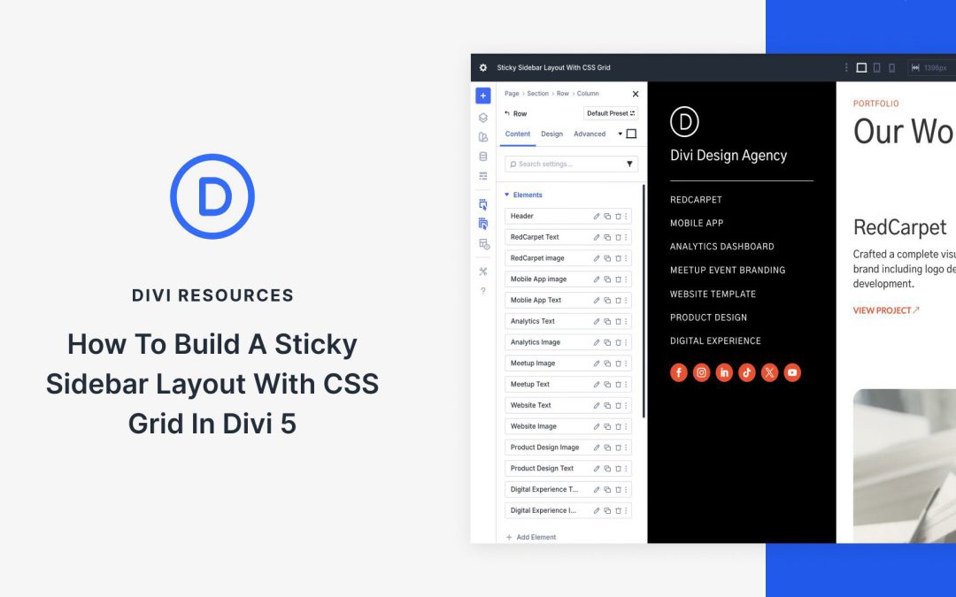
With Divi 5, CSS Grid is built into the Visual Builder, so you can create true two-dimensional layouts using rows and columns together without touching a stylesheet. That makes sticky sidebar layouts much easier to build, especially when it is time to make them responsive.
In this post, we will walk through a step-by-step tutorial to build a sticky sidebar that stays clean across desktop, tablet, and phone without writing a single line of CSS.
What Is CSS Grid?
CSS Grid is a two-dimensional layout system that allows you to create complex grids with rows and columns inside a single container. Unlike Flexbox or older methods like floats, CSS Grid gives you full control over both axes. Simply define the structure once, and the content snaps into place.
Key concepts include the grid container (the parent with display: grid), grid items (the direct children), explicit tracks (rows/columns), implicit tracks (auto-crated for overflow), and placement controls like grid-row to span full height or grid-column to stretch across columns. Introduced in 2017 and now supported in 95% of browsers, CSS Grid is a lightweight and semantic layout system. Best of all, Divi 5 brings it directly into the Visual Builder.
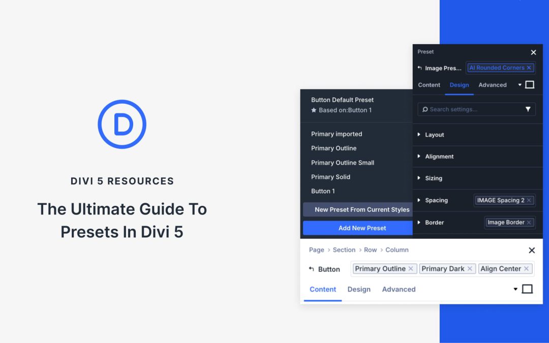
Divi 5 helps you remember and reuse your design decisions. Using presets, you can set your brand colors, button styles, heading sizes, and spacing once, and every new element you add can automatically follow those rules. This transforms your styling into a reusable system that maintains consistency without the repetitive work of styling each element individually.
Stacked and Nested Presets take that system further. You can now layer styles on top of each other, build variations without duplicating work, and build layout patterns that adapt as your design evolves. This post guides you through how presets work together and demonstrates how to create a design system that scales with your site. Let’s get to it!
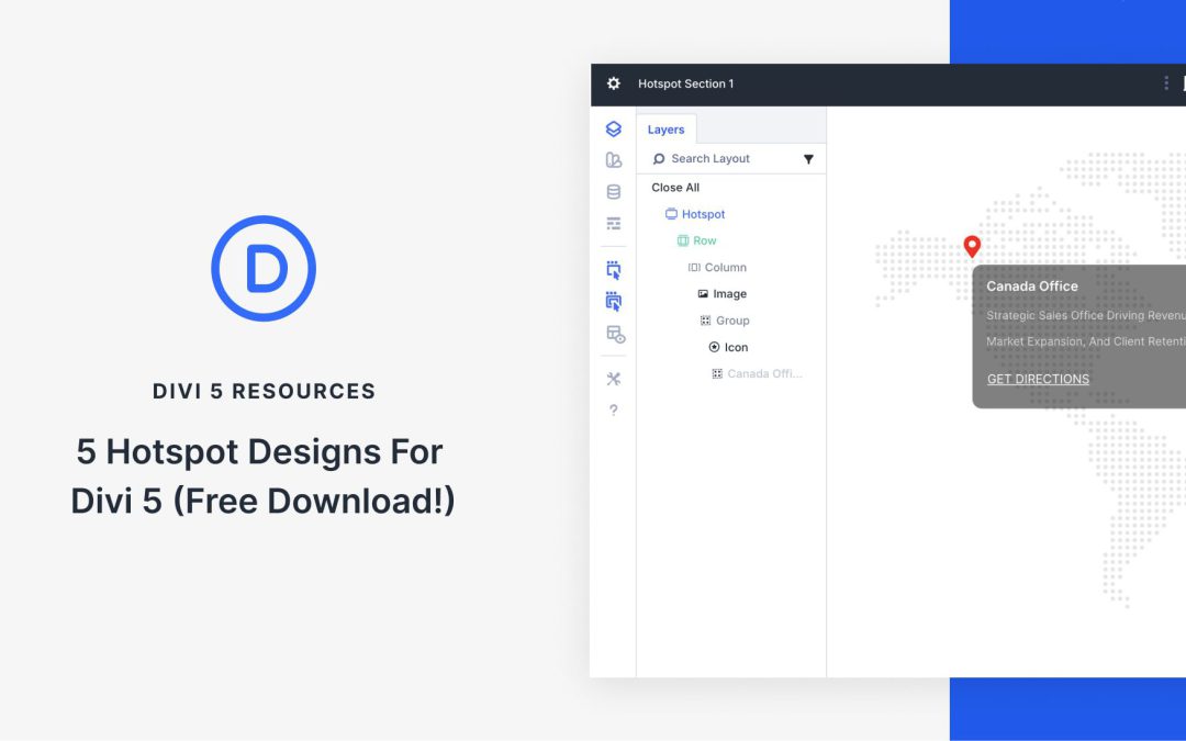
Divi 5 makes it simple to build interactive sections that feel intentional, balanced, and on brand. In this free pack, you will get 5 Hotspot Sections, each designed to highlight key locations, features, or details in a clean and engaging way. Drop one onto any page, swap the text and imagery, and you are ready to go.
Receive the latest WordPress, Divi, SEO and design news in your inbox for FREE from Web Design Solutions Unleashed.
We use cookies to ensure that we give you the best experience on our Web site. If you continue to use this site we will assume that you are happy with it.