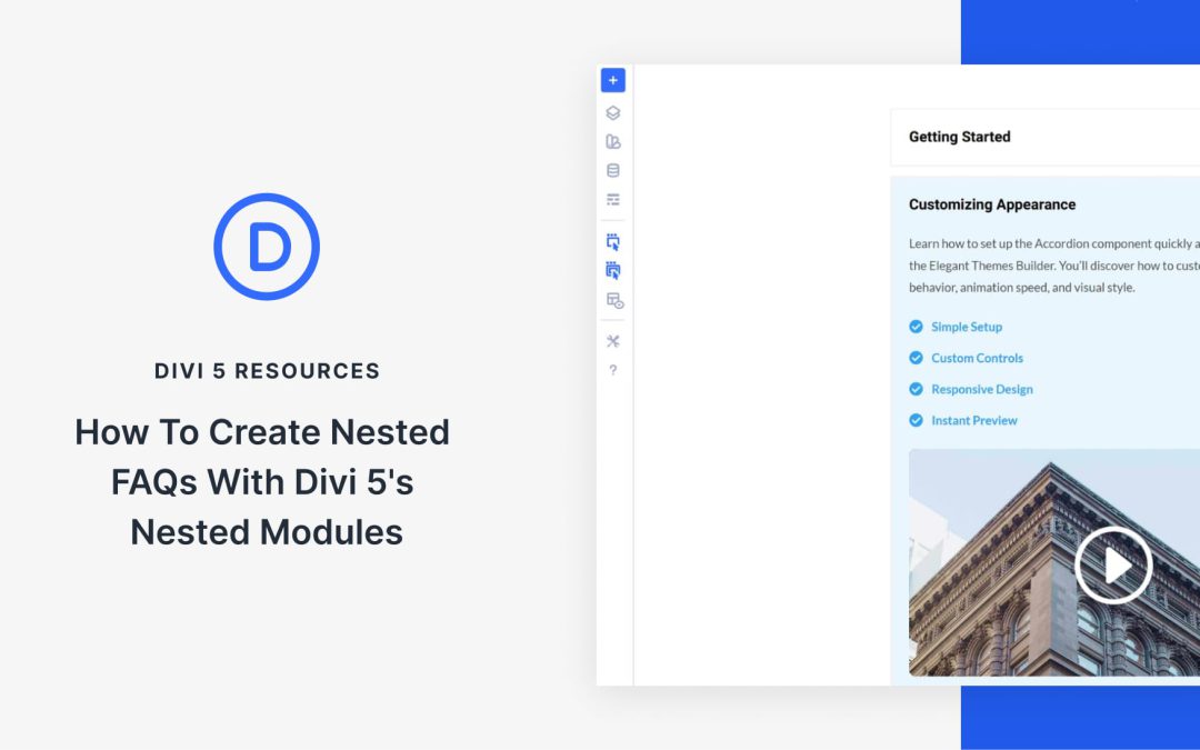
Visitors scan FAQ sections more than they read them. They skim headings, looking for the one question that matches their problem. When they can’t find it fast, it affects conversions.
The solution doesn’t lie in writing better answers, but in better organization. So, in this post, we’ll show you how to build Nested FAQs with Divi 5‘s Nested Modules. Let’s get started!
What Makes A Great FAQ Section
What separates helpful FAQs from the ones visitors usually skip often comes down to what’s inside the answers.
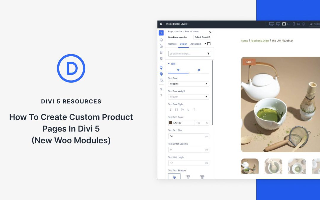
When it comes to ecommerce, standing out means ditching cookie-cutter templates for product pages that not only captivate but also convert. With Divi 5‘s Woo Product Modules, you can build high-impact product pages entirely from scratch, all while seamlessly integrating real-time WooCommerce data.
In this post, we’ll walk you through creating a product page from scratch using Divi 5’s 17 Woo Product Modules and the Theme Builder. Let’s get started.
Understanding The Woo Product Modules In Divi 5
Divi 5’s Woo Product Modules represent a step forward in ecommerce design, offering 17 native modules that pull dynamic data directly from WooCommerce. You’ll have full control over every element, from eye-catching visuals to seamless user interactions via Divi’s intuitive Visual Builder.
To make sense of this toolkit, we’ve grouped the 17 modules into four intuitive categories based on their roles in a typical product page flow. Each integrates effortlessly with Woo’s backend, ensuring your content stays fresh and functional. Let’s break them down:
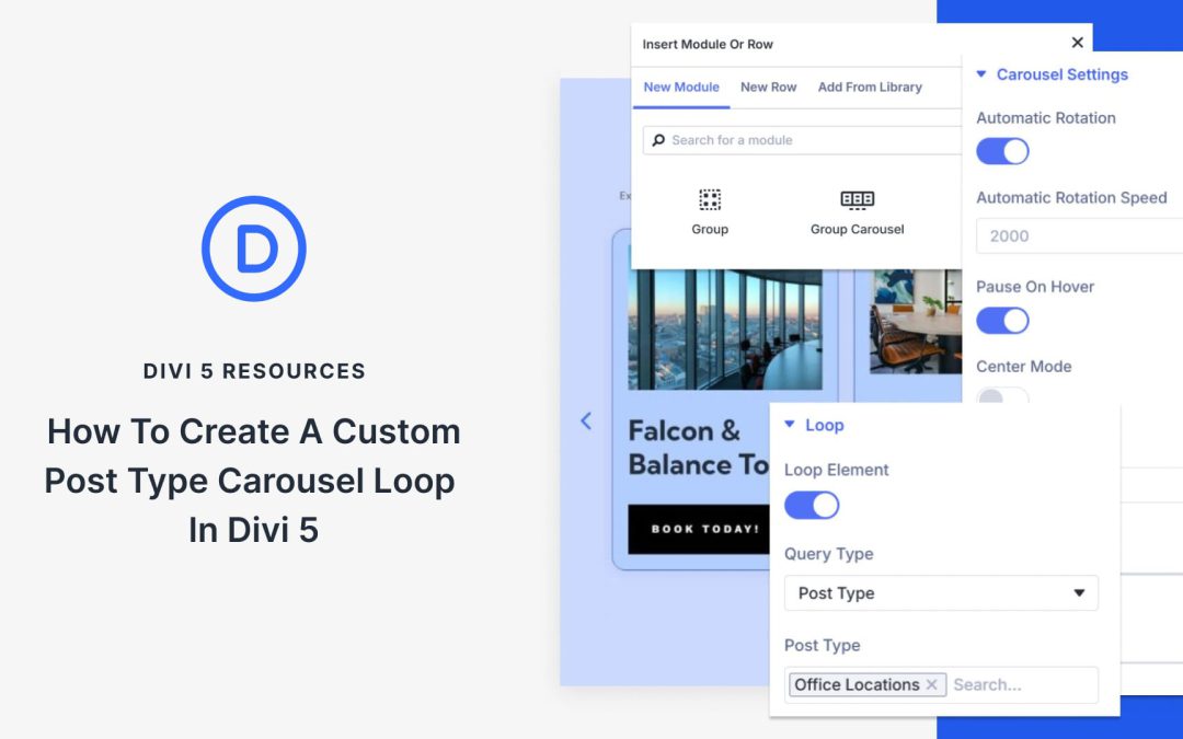
Post displays keep visitors engaged with your content. They showcase what matters and encourage people to explore further. Static post loops work fine, but sometimes require an extra element to capture attention. That’s where carousels come in; they add movement that actually makes people stop and engage.
In this post, we’ll show you how to combine Divi 5‘s Group Carousel and Loop Builder to build post carousels that capture attention and drive engagement. Let’s get started.
How Post Carousels Beat Static Loops
Static loops get the job done. They display your posts in rows or grids, allowing visitors to scroll through them.
Carousels bring something different to the table. Movement draws the eye. When content slides into view, people pause. They notice. That split second of attention matters more than you might think.
The swiping action creates what some refer to as a micro-commitment. Once someone interacts with the first slide, they’re more likely to keep exploring. You’ve captured their attention.
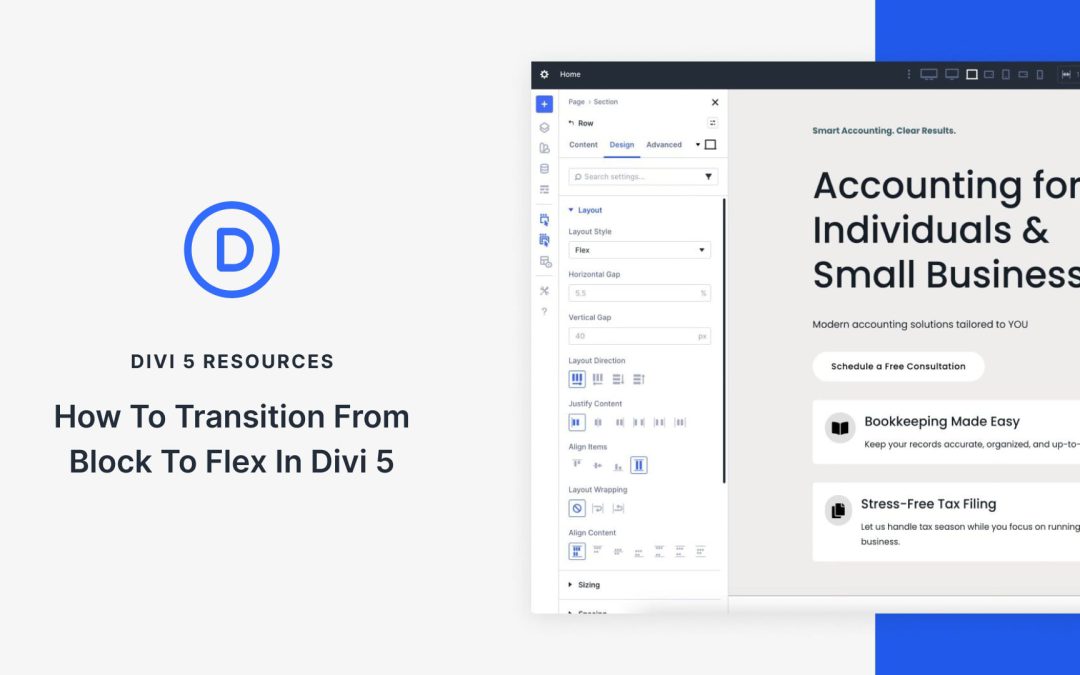
For years, Divi users relied on a block-based layout system that worked well at the time, but as WordPress page builders have evolved, limitations have emerged. Columns stacked predictably in rows, mobile reordering required duplicate sections or custom CSS, and achieving perfect vertical centering felt like a battle.
Divi 5 changed everything by making Flexbox the default layout engine. With the recent release of Divi 5 Public Beta, this new system is no longer experimental. It’s stable and ready for real-world projects.
In this post, we’ll guide you through converting a Divi starter site to Flexbox in Divi 5. You’ll learn exactly where to click and what settings to change without writing a single line of CSS.
Let’s get started.
Understanding Block-Based vs Flexbox Layouts In Divi
In Divi 4, every layout is built on a traditional block model powered by floats and inline-block elements. You drop a Row and place Modules inside the Columns. Everything stacks vertically by default, and horizontal arrangements are enforced by floating the Columns.
This system is predictable and familiar, but it comes with a few pain points:
Changing the order of elements on mobile usually means duplicating entire sections and hiding/showing them per device.
Perfect centering often needs absolute positioning or CSS tricks.
Specialty sections were originally created to allow for sections with varying row structures.
The more complex the design, the heavier the generated CSS becomes.
If you’ve ever spent an hour tweaking negative margins just to make a hero section look right on tablets, you’ve felt the limitations of the block model.
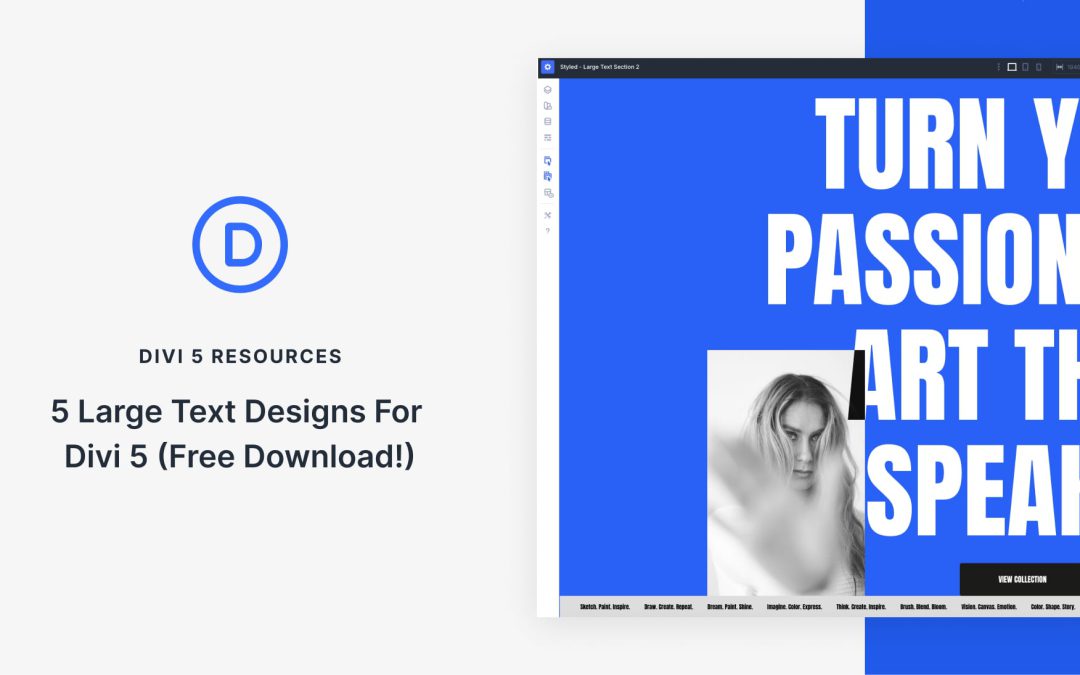
Divi 5 makes it simple to build bold hero sections and headline areas that feel intentional, balanced, and on brand. In this free pack, you’ll get 5 styled Large Text Sections — each crafted with strong typography, clear hierarchy, and flexible layouts so you can plug in your own content in seconds. Drop one onto any page, swap the text and imagery, and you’re ready to go. No extra setup required.
Preview
Here’s a quick look at all 5 Large Text Sections included in the pack. The download is further down the post.
Receive the latest WordPress, Divi, SEO and design news in your inbox for FREE from Web Design Solutions Unleashed.
We use cookies to ensure that we give you the best experience on our Web site. If you continue to use this site we will assume that you are happy with it.