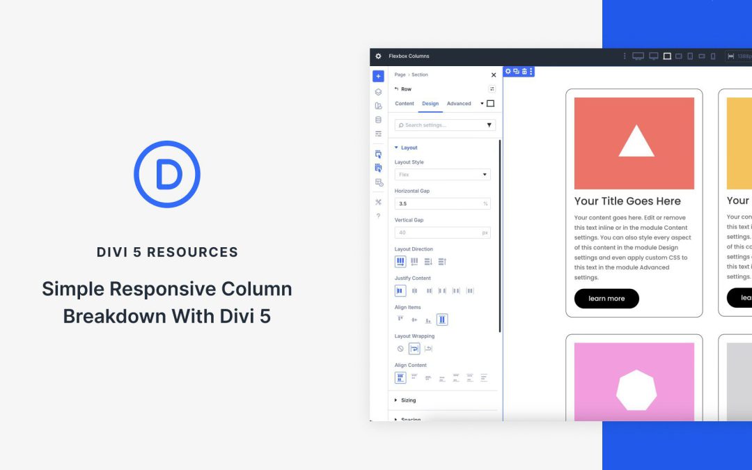
At its core, Flexbox is a powerful CSS layout model that gives you precise control over how items flow and align within a container. Divi 5 integrates Flexbox directly into the Visual Builder, turning every element into a flexible container. Flexbox isn’t just a minor update; it’s a shift that enables you to create responsive sites with just a few clicks.
In this post, you’ll learn how to harness Divi 5’s Flexbox system to build simple, fully responsive layouts that adapt beautifully to every screen size. We’ll walk through setup, key features, and provide a hands-on tutorial using Divi’s new Flexbox system.
Understanding Flexbox Basics in Divi 5
If you’ve built sites with Divi 4, you already know how capable it is with pre-defined row templates, specialty sections, and responsive controls. The Visual Builder made complex designs accessible, and for many layouts, Divi 4’s system just works. But when it comes to truly fluid, adaptive column breakdowns — especially with custom widths, natural wrapping, or per-device reordering — Divi 4 often asked you to reach for CSS or duplicate sections.
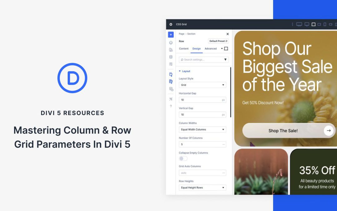
With the release of Divi 5‘s CSS Grid feature, Divi users are equipped with intuitive tools to build layouts that adapt seamlessly across devices, eliminating the steep learning curve that comes with learning CSS code. At the heart of this innovation lie the column and row grid parameters, Divi’s streamlined controls for defining grid templates, sizing, gaps, alignment, and offsets.
In this post, we’ll guide you through understanding, implementing, and mastering these core parameters, unlocking advanced grid-based designs that boost your creativity. Let’s dive in and unlock the full potential of CSS Grid in Divi 5.
Understanding CSS Grid In Divi 5
CSS Grid is a two-dimensional layout system that allows designers to create complex, responsive layouts by defining rows and columns in a grid container. Unlike traditional methods like Flexbox or floats, CSS Grid allows for precise control over the horizontal and vertical placement of elements simultaneously. You can define grid tracks, span items across multiple cells, set flexible or fixed sizes using units like fr (fractional) or auto, and control gaps. This makes it a go-to for structured, yet creative designs.
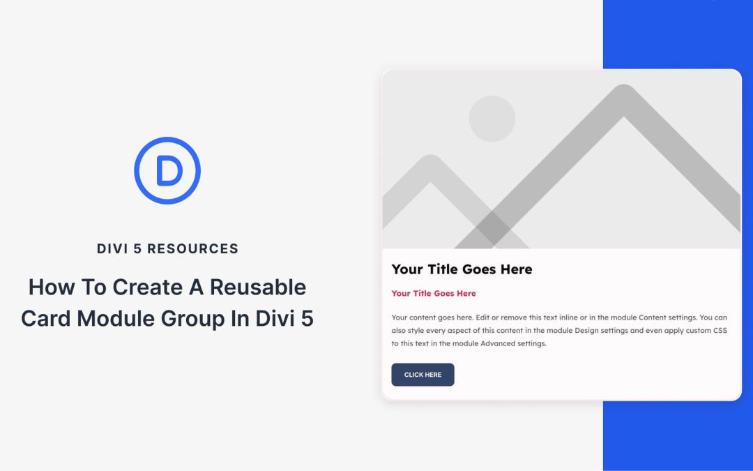
Card layouts show up all over a site, but you often rebuild them from scratch or copy and paste the same stack of modules. Module Groups in Divi 5 allow you to bundle an image, heading, text, button, or any other module into one card and reuse it anywhere.
In this tutorial, we’ll build a clean card, save it to your Divi Library, and import it on any page. We’ll also pair it with the Loop Builder to auto-generate grids for posts or products.
A core concept in WordPress is the theme, and it is not possible to run a website without one. That’s why it is often the first decision that a WordPress user needs to make. Getting this decision wrong often means wasting time learning a system that you’ll probably never be satisfied with. Plus, it often requires a full site rebuild to switch.
To complicate matters, there are many types of themes available. There are three main categories: (1) Full Site Editor (FSE)/Block Themes designed to use only WordPress’s native features. There are (2) Classic themes that work with page builders, but that means you have to choose a theme and a page builder (another decision). And there are (3) themes that include a built-in builder themselves, covering the complete website building experience (this is what most people want from a theme).
You certainly have plenty of choices, and I wanted to share my thoughts on the best WordPress themes for your next build. These suggestions encompass all three types of WordPress themes, featuring the best options in each category. Each listed theme has a case that could be made for it based on its performance, workflow, integrations, and/or pricing.
As you read, jot down which criteria matter most to you and how you think each theme aligns with your workflow. I have provided some short videos to demonstrate key aspects of each theme. This is a huge decision, but you can consider my observations and draw your own conclusions from them.
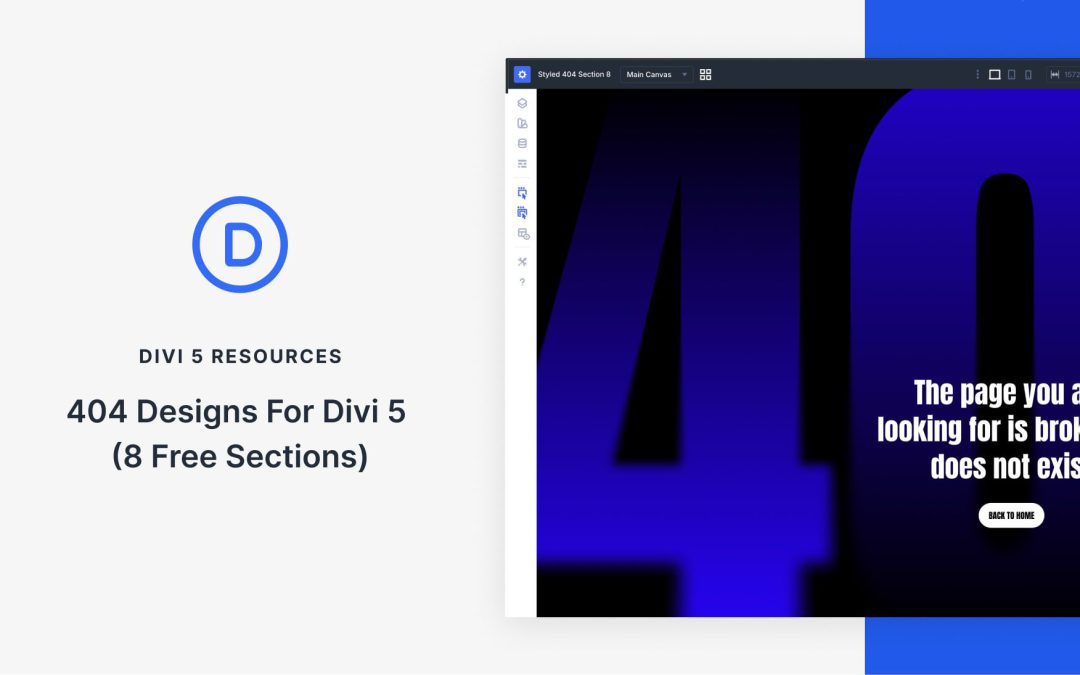
Divi 5 makes it easy to build custom 404 pages that feel intentional, helpful, and on brand. In this free pack, you will get 8 different 404 Section designs in both styled and unstyled JSON files, so you can either use a ready-made design or start from a clean structure and apply your own presets and Design Variables. Drop one into your Divi Library, add it to a page or template, and you are ready to go.
Receive the latest WordPress, Divi, SEO and design news in your inbox for FREE from Web Design Solutions Unleashed.
We use cookies to ensure that we give you the best experience on our Web site. If you continue to use this site we will assume that you are happy with it.