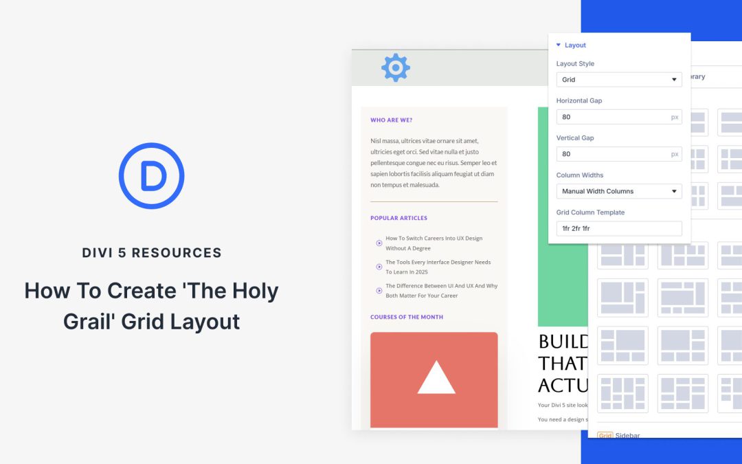
The Holy Grail layout earned its name because it used to be frustrating to build. Designers wanted a clean header and footer with two sidebars flanking a main content column, but making those columns behave, especially responsively, often required hacks and workarounds.
That’s exactly the kind of problem Divi 5‘s Grid System is meant to solve. CSS Grid has always been one of the best tools for this layout, and Divi 5 brings Grid controls directly into the Visual Builder so you can set column ratios, spacing, and responsive behavior without leaving your workflow. In this post, we’ll build the Holy Grail layout step by step and fine-tune it for every device. Let’s get started!
What Is The Holy Grail Layout?
The Holy Grail layout features a header at the top, a footer at the bottom, and three columns in the middle. Your main content is positioned in the center column, which is typically the widest, while the left and right columns contain elements such as navigation or advertisements.
Building an online store with WordPress means choosing a theme that can handle the demands of WooCommerce. This is not the same decision as picking a theme for a blog or brochure site. ecommerce themes need to manage product catalogs, handle checkout flows, display dynamic pricing, and convert visitors into customers.
The wrong choice here is expensive. I have seen business owners realize six months in that their theme cannot handle the product variations they need, or that checkout customization requires a developer every time they want to test a new layout. Switching themes on any website is painful, and it’s even more so on an ecommerce site, often requiring a complete rebuild of product pages, cart templates, and checkout flows.
The themes below, in my opinion, represent the best options based on my experience building and maintaining stores for clients in both agency and freelance settings. We’ll help you make the right choice from the start, so you can enjoy your decision for years to come.
Best WooCommerce Themes
I have built several stores, ranging from simple single-product sites to catalogs with over 100 SKUs. The themes on this list are the ones I have trusted for professional ecommerce work. Each has a clear use case based on how it handles WooCommerce integration, checkout optimization, long-term maintainability, and, of course, pricing considerations.
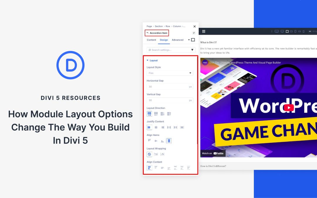
Divi 5 introduces a system-wide update that changes how layouts are built. Every module now includes Layout controls in the Design tab.
This means that modules can now act as their own layout containers using Flexbox and CSS Grid. Elements inside align, reorder, and space themselves without rebuilding the structure around them. It is a quiet change, but a meaningful one. Layout control now lives closer to the content, making designs cleaner, more flexible, and easier to adjust as they evolve.
A System-Wide Layout Upgrade For Every Module
Divi 5’s layout system is powered by Flexbox, with CSS Grid available as needed. This shift simplified how rows and columns behave, making alignment, spacing, and responsive behavior more predictable. Structural design became easier and more consistent across the board.
However, while the layout system evolved, the internal structures of the modules themselves remained rigid. Each module, like a Blurb, always followed the same internal structure. The image, heading, body text, and button appeared in a fixed content order. Designers could style each element, but they couldn’t control how those elements flowed together.
Adjusting alignment or spacing involved working around the module by adding extra rows, tweaking column settings, or adjusting padding values until everything looked right. That limitation no longer exists. Layout options are now available in the Design tab of every module.
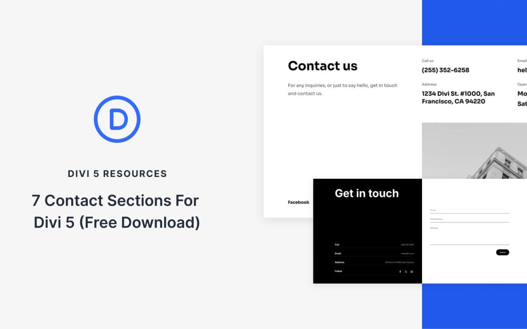
Divi 5 makes it easy to build contact sections that look polished, professional, and ready for real inquiries. In this free pack, you will find 7 Styled Contact Sections, each designed to help visitors reach out quickly using clear layouts, strong typography, and modern form styling. Drop one onto any page, swap the details, and you are ready to go. No extra setup required.
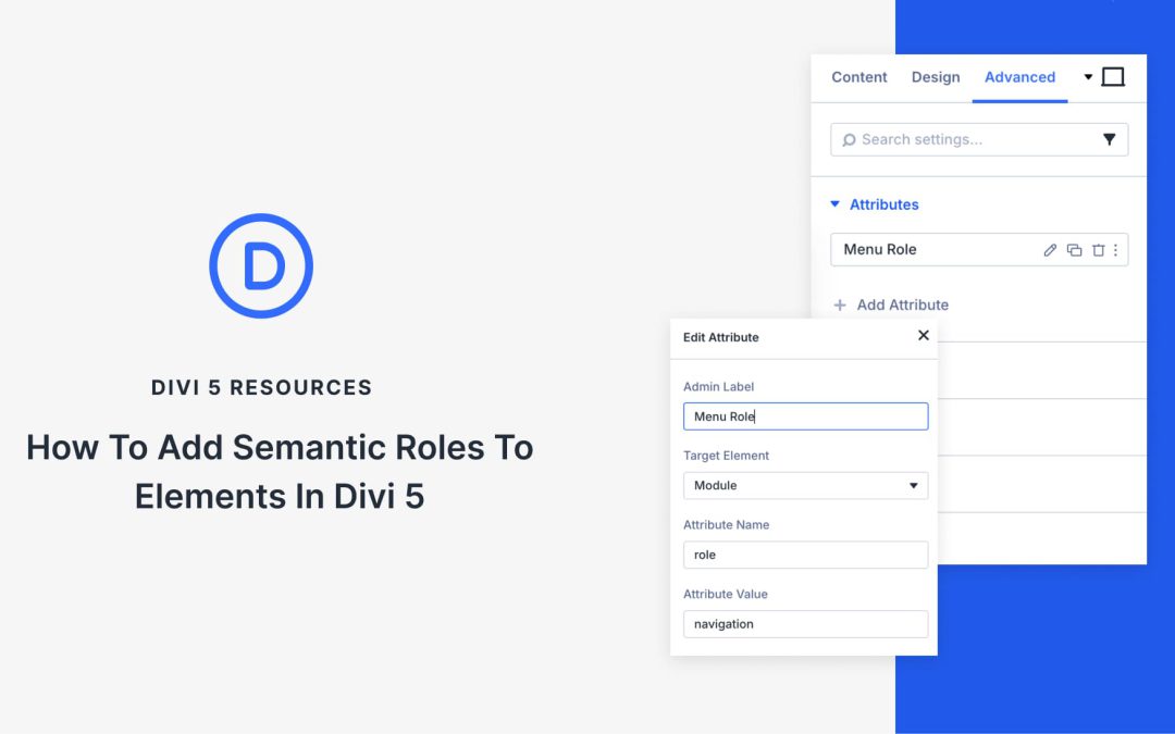
For years, Divi gave you CSS IDs and Classes for elements. That worked fine for styling and scripting, but attributes like ARIA roles or focus attributes, such as tabindex, required third-party plugins or custom code.
Not anymore. Divi 5 introduces Custom Attributes that let you add semantic roles directly in the builder. You can now design pages that work better with assistive technology without leaving Divi or writing extra code. This tutorial guides you through the most useful semantic roles and demonstrates how to apply them in Divi 5.
What Are Semantic Roles?
Semantic roles inform browsers and assistive technology about the actual function of an element on your page. When you add role=”navigation” to a div container, you’re creating a landmark that screen readers can identify and jump to directly. Users can skip past content they don’t need and land exactly where they want to go.
Receive the latest WordPress, Divi, SEO and design news in your inbox for FREE from Web Design Solutions Unleashed.
We use cookies to ensure that we give you the best experience on our Web site. If you continue to use this site we will assume that you are happy with it.