
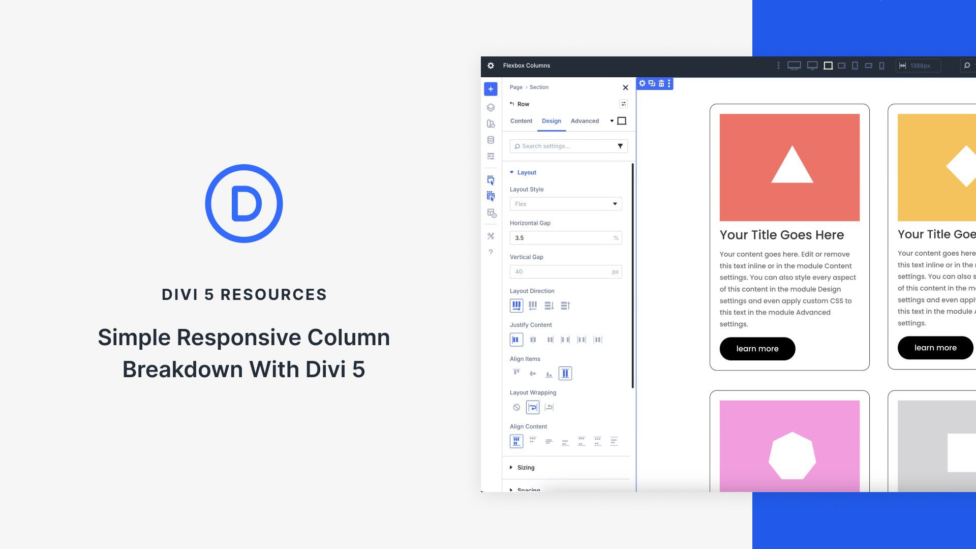
At its core, Flexbox is a powerful CSS layout model that gives you precise control over how items flow and align within a container. Divi 5 integrates Flexbox directly into the Visual Builder, turning every element into a flexible container. Flexbox isn’t just a minor update; it’s a shift that enables you to create responsive sites with just a few clicks.
In this post, you’ll learn how to harness Divi 5’s Flexbox system to build simple, fully responsive layouts that adapt beautifully to every screen size. We’ll walk through setup, key features, and provide a hands-on tutorial using Divi’s new Flexbox system.
Understanding Flexbox Basics in Divi 5
If you’ve built sites with Divi 4, you already know how capable it is with pre-defined row templates, specialty sections, and responsive controls. The Visual Builder made complex designs accessible, and for many layouts, Divi 4’s system just works. But when it comes to truly fluid, adaptive column breakdowns — especially with custom widths, natural wrapping, or per-device reordering — Divi 4 often asked you to reach for CSS or duplicate sections.