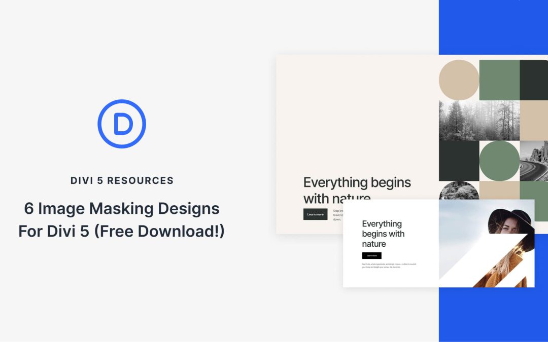
Divi 5 makes it easy to create eye-catching image compositions without custom code. In this free pack, you will find 6 Styled Image Maskings, designed to help you turn ordinary photos into polished hero visuals, collages, galleries, and featured sections. Drop one onto any page, swap the images, and you are ready to go. No extra setup required.
Fixed spacing values have become second nature in web design. Your website looks great on your laptop, but when someone views it on a larger monitor, everything falls apart. You adjust spacing for various breakpoints, but you are still guessing.
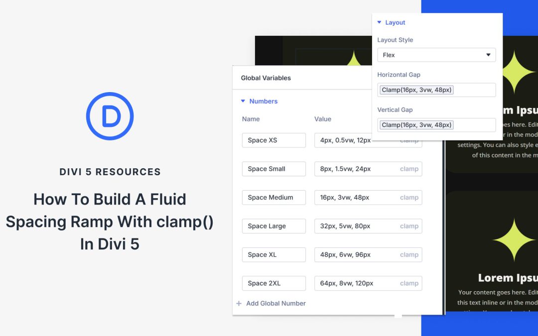
There’s a better way: fluid spacing ramps. These scales proportionally across every screen size, keeping your design balanced without manual tweaking. In this guide, we’ll show you how to build such a fluid spacing ramp in Divi 5. Here’s what you need to know.
What Is A Fluid Spacing Ramp And What Does It Do?
A fluid spacing ramp is a systematic set of spacing values that scale proportionally across screen sizes. Most designers use fixed values: 16px padding on mobile, 24px on tablet, 32px on desktop.
These create visible jumps when the viewport hits each breakpoint. It also doesn’t account for device sizes between these breakpoints, such as a smaller tablet or phones in landscape, which results in awkward gaps.
Fluid spacing ramps eliminate those jumps. They use the CSS clamp() function to define three values: a minimum size, a preferred (fluid) value, and a maximum size.
Clamp() ensures that spacing remains fluid and proportional, regardless of whether someone views your site at 375px or 2560px. This prevents awkward gaps on ultrawide monitors and cramped layouts on odd tablet sizes.
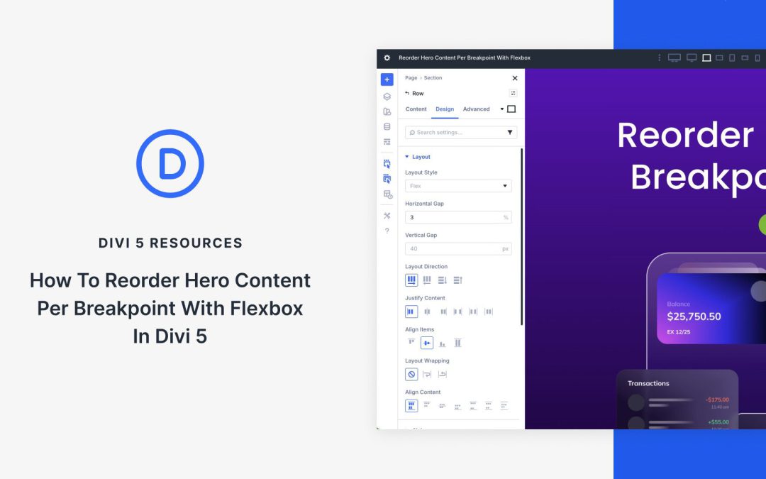
The majority of website visitors browse on mobile devices, so ensuring the hero section is responsive is crucial to your success. With Divi 5’s Flexbox layout system, reordering hero content for varying screen sizes is quick to do. The integration of Flexbox and Customizable Responsive Breakpoints makes it easy to adjust content, letting you fine-tune layouts with a few clicks.
In this post, we’ll dive into building and reordering a hero section with Flexbox, so you’ll better understand the system and how to use it.
What Is Flexbox?
Flexbox, short for Flexible Box Layout, is a CSS layout model designed for arranging elements in rows or columns. It allows items to dynamically expand, shrink, or wrap to fit the available space. This makes it ideal for creating flexible and responsive designs with precise control over alignment, spacing, and ordering.
In Divi 5, Flexbox has been fully integrated as the core layout system, marking an evolution from previous versions. It replaces older systems, such as Specialty Sections and Fullwidth Sections (which have been deprecated), eliminating many of the constraints that required workarounds. In Divi 5, you no longer need to duplicate content or use custom CSS for responsive reordering. At its core, Divi 5 enables you to use Nested Rows and Module Groups, and allows for infinite layout possibilities.
Working with Flexbox in Divi 5 is straightforward. When adding new rows, Flex is selected as the default layout style, unless you choose a Grid-specific structure. When using Layout Packs or Divi Starter Sites, you’ll currently have to switch from Block to Flex. It’s as easy as opening the Design tab in the Row’s settings, expanding the Layout menu, and setting Layout Style to Flex.
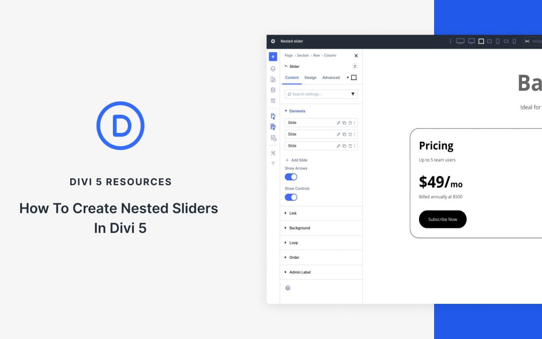
Advanced customizable sliders used to require third-party plugins or custom CSS, but with Divi 5, the game has changed. Using Nested Modules and the Slider Module together allows designers to create these experiences, all without writing code or installing plugins that can slow down your site. The result is cleaner code, fast performance, and complete design freedom.
In this post, we’ll guide you through a step-by-step process for creating a stunning nested slider. Everything you’re about to learn is available right now in the Divi 5 Public Beta. Grab it, open the Visual Builder, and let’s build it together.
Understanding The Building Blocks
Creating nested sliders in Divi 5 boils down to mastering two native tools: Nested Modules and the native Slider Module. Once you understand how they work together, you’ll never look at a plain carousel the same way again.
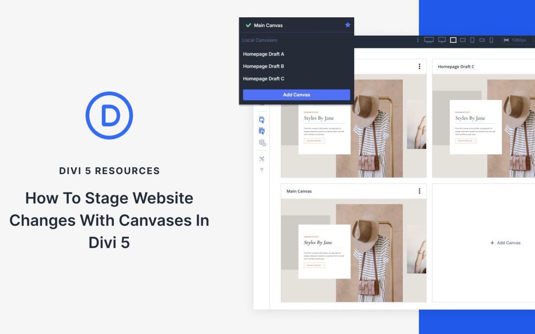
We recently introduced Canvases in Divi 5. These are workspaces detached from your page. You can use Canvases to stage updates, keep off-canvas elements tidy, and much more.
In this post, we’ll go over how to use a Divi Canvas to stage website design changes right where you work. Let’s get to it!
What Is Staging And Why Does It Matter?
When redesigning a homepage, you may want to test several hero sections or rearrange content blocks. Making changes directly on your live website means every visitor sees your work as you build it. They’ll encounter half-finished sections, test content, and layouts you’re still tweaking.
A staging environment is a separate copy of your website that allows you to test and implement changes before they go live. You can experiment with new designs, test different layouts, and try ideas without affecting what visitors see. You can compare how changes look across different devices and switch between them.
You can also share previews with clients or team members. Once everything works the way you want, you can move those changes to your live site.
This approach keeps your public site stable while you work on it. Visitors always see the finished version, and you get the freedom to test without rushing. You can take the time needed to get things right before anything goes live.
However, most staging setups require separate servers, local development environments, or third-party tools. You work in one place, then sync files and databases to another. The process eats time and adds complexity to every update. For big updates, having a separate staging site might be necessary, but for smaller edits, there are alternatives as well.
Receive the latest WordPress, Divi, SEO and design news in your inbox for FREE from Web Design Solutions Unleashed.
We use cookies to ensure that we give you the best experience on our Web site. If you continue to use this site we will assume that you are happy with it.