by Foster D. Coburn III | Jul 22, 2024
When it comes to WordPress themes, Divi and Enfold both shine as top picks for newbies. These powerhouse themes have ruled the beginner WordPress scene for years, boasting unique features and design flexibility.
But how do Divi vs Enfold really measure up? That’s exactly what we’ll unpack in this deep-dive comparison. Let’s explore their pros, cons, and overall value to help you nail the right choice for your next project.
by Foster D. Coburn III | Jul 21, 2024
Over the past few years, visual website design has become synonymous with WordPress. Two of the popular names that still stand out in the WordPress website-building community are Divi and Brizy. Both offer drag-and-drop interfaces and many features, but which one is the best for your project?
Let’s explore our in-depth comparison of Divi vs Brizy to uncover each powerful page builder’s strengths, weaknesses, and ideal use cases!
by Foster D. Coburn III | Jul 20, 2024
Struggling to find the perfect theme for your WordPress website? Look no further. This post compares two of the most popular WordPress themes: Divi and Betheme.
Both themes cater to slightly different audiences and excel at delivering top-quality services. In this comparison, we will look at features such as ease of use, customization options, flexibility, pricing plans, and support to help you choose the right one.
But first, let’s get a quick overview of Divi and Betheme.
by Foster D. Coburn III | Jul 19, 2024
WordPress provides a variety of themes that simplify website design. Two veterans in the field, Divi and OceanWP, are among the most popular. Both offer professional designs, extensive customization, and broad compatibility, among other things. But which one should you choose? This comparison will examine their features, ease of use, and pricing options. We’ll explore what sets these themes apart and help you determine which might better suit your needs. Ready for this Divi vs OceanWP comparison? Let’s get to it!
by Foster D. Coburn III | Jul 19, 2024
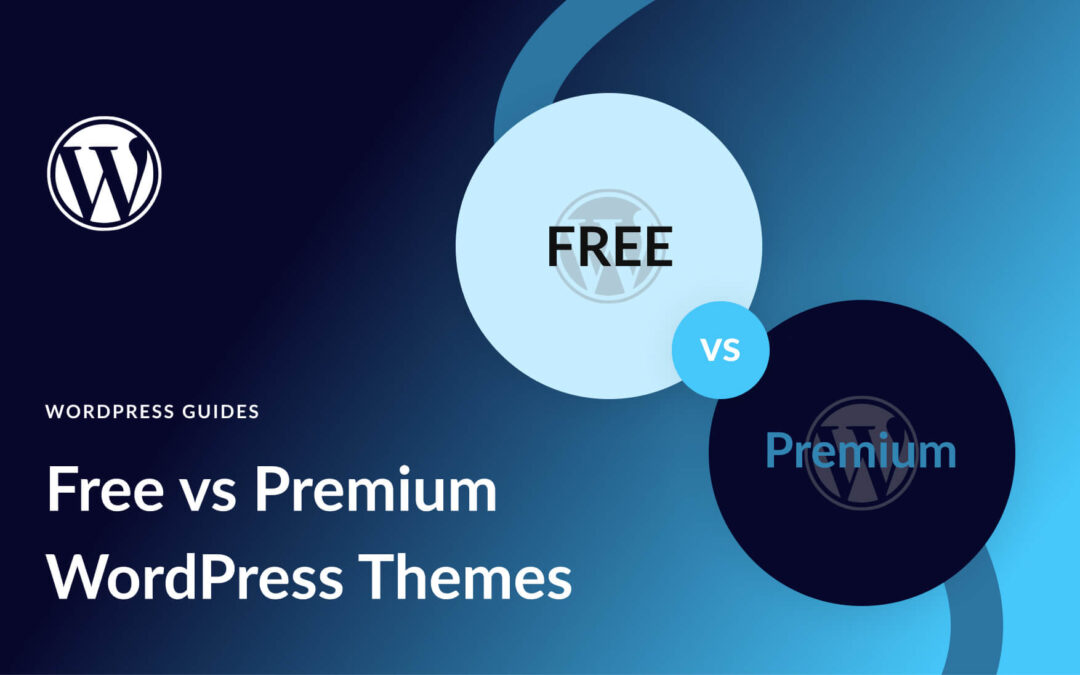
Struggling to choose between free vs paid WordPress themes for your website? You’re not alone.
Free WordPress themes are a great way to save money. But their limited features and support could lead to more problems that will cost you down the road.
Premium WordPress themes generally offer more flexible design tools, robust features, and a large following of dedicated supporters. But you’ll have to pay a premium price, which may or may not be worth it.
I really comes down to picking the right theme for you and your budget. In this post, we’ll break down the pros and cons to help you pick the best theme for your site.