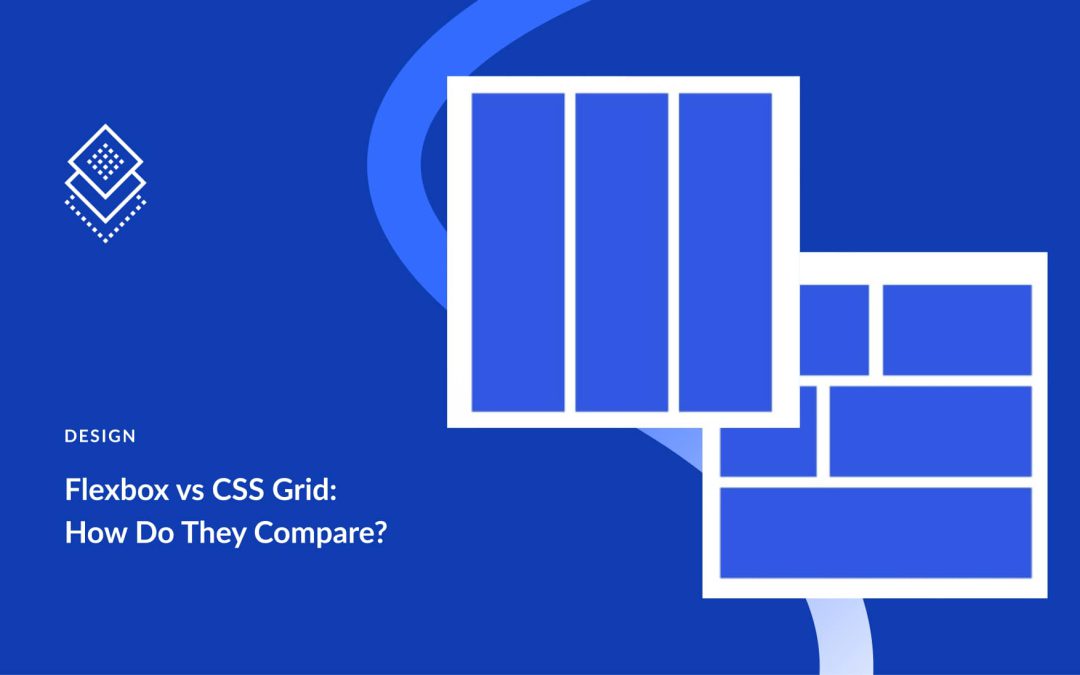
Flexbox and Grid are the two layout systems that define modern CSS. At first glance, they seem similar. Both handle rows and columns, manage alignment and spacing, and replace the old float-and-table workarounds. The real difference is in how they approach layout challenges and the kind of problems each one solves best.
This post explains the difference between Flexbox and Grid and shows when to use each. We’ll also show you how Divi 5 integrates Flexbox to help you create stunning websites quickly.
What Is Flexbox
Flexbox, short for Flexible Box Layout, is a CSS layout model designed to make arranging elements easier and more predictable.
At its core, Flexbox works in one direction at a time. You can line items up across a row or stack them in a column. That single decision defines how everything inside the container behaves. Rows make items flow horizontally, while columns let them stack vertically.
What Is CSS Grid
CSS Grid is a layout system that works differently from Flexbox. While Flexbox arranges items in one direction at a time, Grid handles two directions together: rows and columns.
You can picture it like drawing a spreadsheet on your page. The horizontal lines form rows, the vertical lines form columns, and the spaces in between create cells where your content sits.
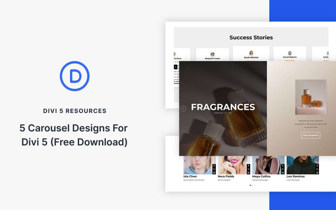
The Group Carousel Module makes it easier than ever to create carousels that look clean, adapt beautifully to different screen sizes, and are simple to customize in Divi 5. In this free pack, you’ll find 5 unique carousel section designs, each built to inherit your global styles for consistent branding across your site. These carousels are ready for you to drop into any page!
Preview
Let’s take a look at all 5 Carousel Sections in this pack. This pack is free for you to download further down the post.
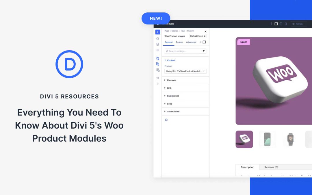
Compatibility with WooCommerce has now been expanded to Divi 5, giving you full control over product pages without relying on WooCommerce’s built-in templates. The newly-integrated WooCommerce Product Modules let you design engaging, user-friendly layouts that match your brand and help boost sales, while tapping into all of Divi 5’s features, including Flexbox, to build product pages with modern layout control.
In this post, we’ll cover the modules’ key features and show you how to use them for your next Divi 5 ecommerce website. Let’s dive in.
Divi 5 is moving fast, and the Divi Extension ecosystem around it is following suit. We are now seeing more third-party developers release Divi 5-compatible versions of their plugins, and that’s a positive sign. It means developers are ready to build for the next generation of Divi’s framework. Site owners can also prepare for better performance, faster building, and more advanced functionality.
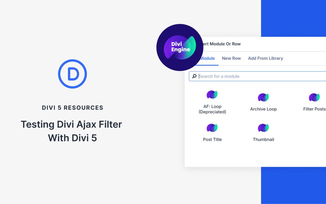
One of the latest updates comes from Divi Engine, known for building powerful add-ons for WooCommerce and custom post-filtering. Their plugin, Divi Ajax Filter, now has an initial Divi 5 version in beta. This plugin allows you to create filterable post and product listings that update instantly without reloading the page.
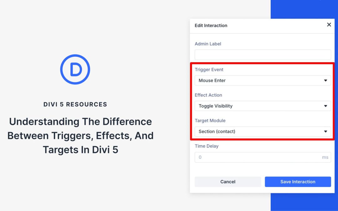
Divi 5’s new Interactions use a simple model — Trigger, Effect, Target. Separate what starts it, what happens, and what changes, and you can create clear, coordinated movement across your layout. In this post, we’ll explain each part, show how they fit together, and walk through a quick example you can reuse. Let’s get to it!
What Are Triggers, Effects, And Targets?
Interactions in Divi 5 are built from three moving parts that work together. A trigger sets things in motion, an effect decides how the response looks, and a target defines which element changes.
Receive the latest WordPress, Divi, SEO and design news in your inbox for FREE from Web Design Solutions Unleashed.
We use cookies to ensure that we give you the best experience on our Web site. If you continue to use this site we will assume that you are happy with it.