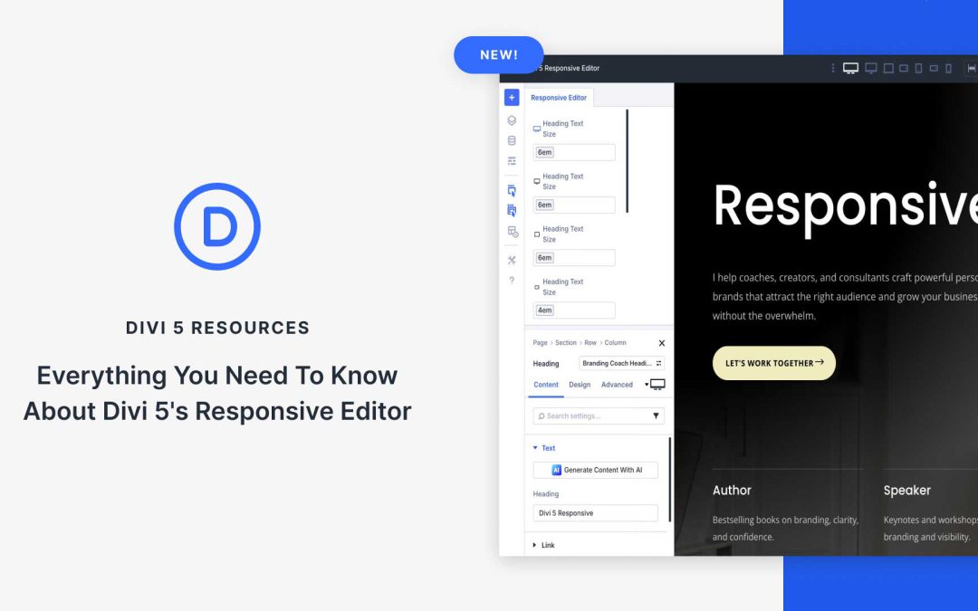
With Divi 5, responsive editing gets simpler. The new Responsive Editor puts device, hover, and sticky states in one panel so you can see and adjust everything in context and at a much faster pace.
In this post, we’ll explore how the Responsive Editor works and how it benefits your workflow. Let’s dive in!
What Is The Responsive Editor?
The new Responsive Editor in Divi 5 significantly improves how you view responsive design. It manages and centralizes changes automatically as you switch between devices. This feature helps improve your design process by eliminating unnecessary clicks and helping you keep a clear overview of your responsive values.
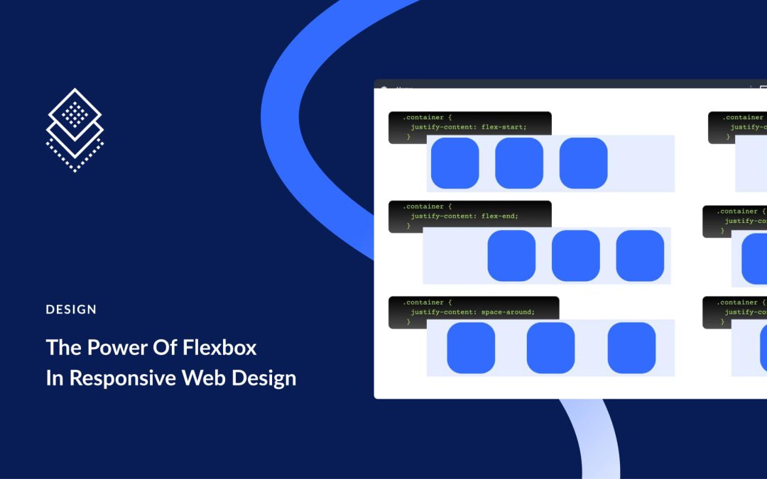
Traditional layout methods often break at smaller widths. Content misaligns, spacing collapses, and manual fixes pile up. Flexbox solves this by defining relationships instead of fixed positions. In Divi 5, these controls live in the Visual Builder, and the new Flexbox release makes alignment, wrapping, ordering, and spacing straightforward across breakpoints.
In this post, we’ll walk you through using Flexbox for responsive design, and we’ll also show you how Divi 5 makes it easy to build responsive layouts.
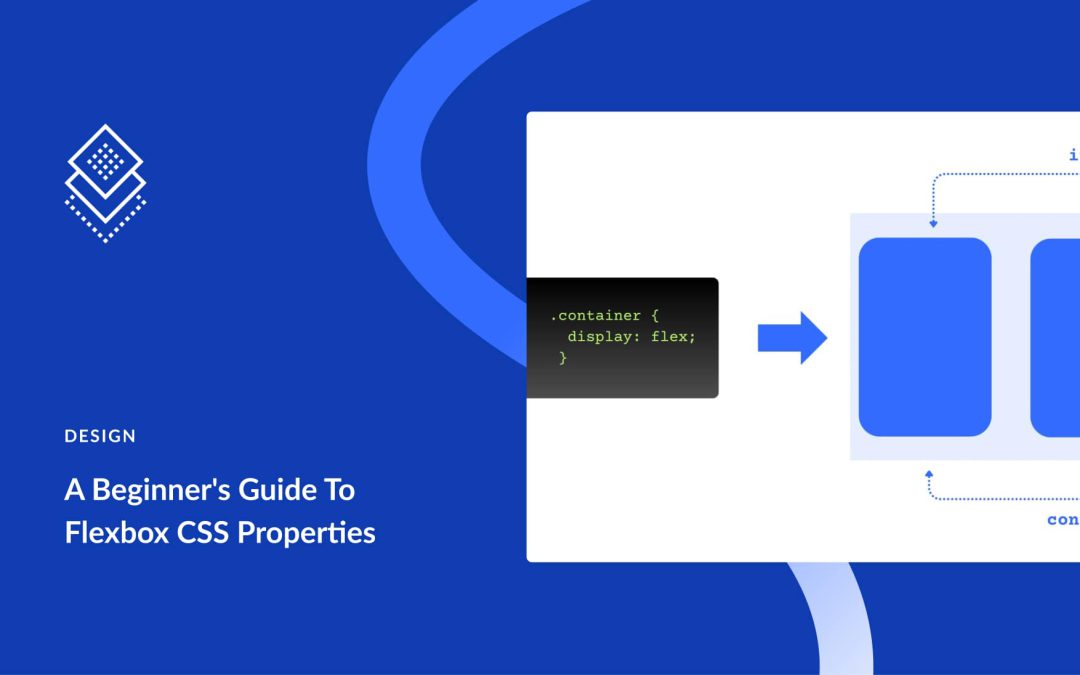
Good layout starts with a clear model for alignment and spacing. Flexbox provides that model by organizing content along a single axis with predictable control over direction, alignment, wrapping, and gap.
This post covers the basics of these CSS properties and how they work together. After the fundamentals, we show how the same approach is implemented visually in Divi 5 using the Flexbox Layout System. Let’s get to it!
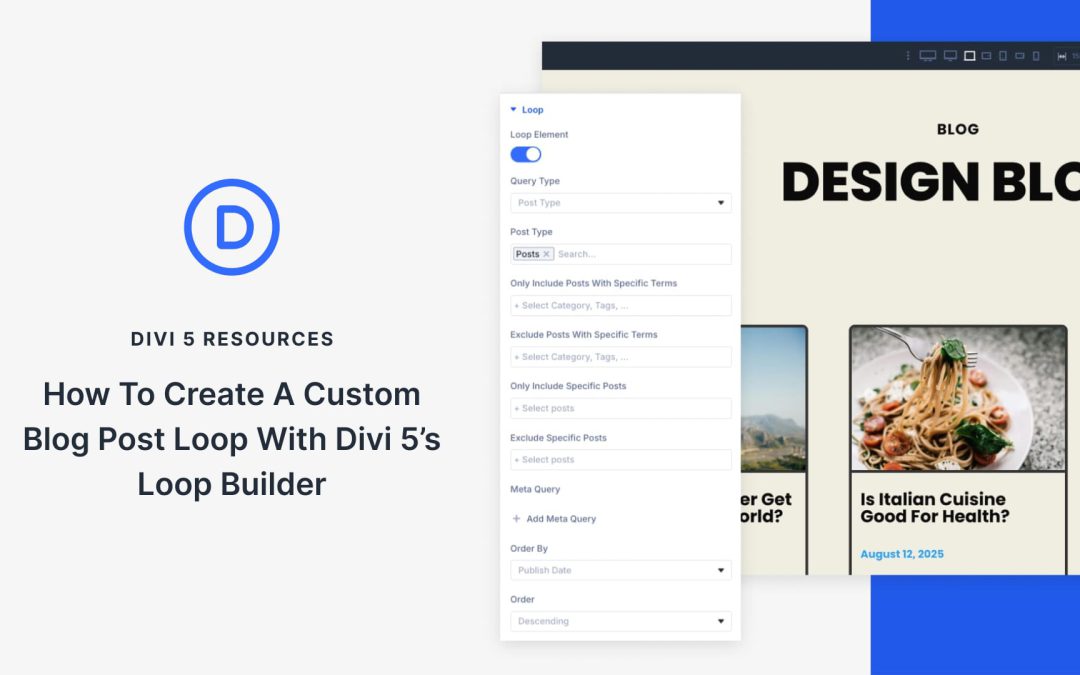
Your brand shouldn’t be constrained by a static layout, so we aim to provide you with full flexibility as Divi 5 continues to develop. Divi 5’s new Loop Builder is a great step in that direction; it lets you design an item once and loop it into dynamic grids or lists.
In this tutorial, we’ll show you how to set up a custom blog post loop. We’ll design the listing, connect dynamic fields, set the query, and refine the layout for a clean grid or list. Let’s get to it!
What Is Divi 5’s Loop Builder
With Divi 5’s Loop Builder, you design a single “card” layout in the Visual Builder using as many Divi modules as you want, then Divi loops it for each item you choose to display.
Enable the Loop Element on a column, set a query (posts, custom post types like Projects, terms, or users), and map dynamic fields such as titles, featured images, categories, custom fields, and buttons. You can reorder elements, control spacing, and let everything inherit your global styles.
The result is a responsive, reusable listing that matches your system without the need for extra plugins or custom code.
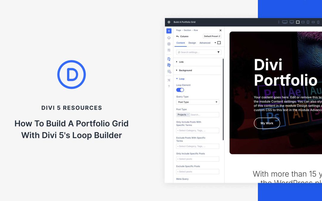
A portfolio grid is a simple, effective way to showcase your work. With Divi 5’s Loop Builder, you can design a reusable card layout and let it auto-populate from your content directly in the Visual Builder.
Unlike single-purpose modules, Loop Builder lets you use any Divi element, set a query for posts or custom post types, and output a responsive grid that inherits your global styles. In this tutorial, we’ll build a portfolio grid step by step using the Projects custom post type.
Receive the latest WordPress, Divi, SEO and design news in your inbox for FREE from Web Design Solutions Unleashed.
We use cookies to ensure that we give you the best experience on our Web site. If you continue to use this site we will assume that you are happy with it.