Building a CSS Grid layout isn’t difficult to understand, but it can be challenging to execute cleanly. Sketching columns is easy. Keeping spans, gaps, and breakpoints in sync across pages is where most people stall.
The good news: there are several ways to build real grids. You can write CSS by hand, use WordPress blocks, or lean on page builder plugins. You can also use Divi 5 if you prefer to place items on a grid with controls instead of writing code.
They all work, but in different ways. Some give total control, but slow you down during iteration. Others let you move fast during setup, but box you in once layouts get complex. The right choice depends on how comfortable you are with code and how much customization your project needs.
In the sections ahead, we’ll walk through each method and show you what works and what doesn’t.
Managing dozens of color variations across a design system creates unnecessary chaos. You might spend hours adjusting tints and shades instead of building the actual website.
However, there’s a way to build colors that are flexible, consistent, and easy to maintain: with Hue, Saturation, Lightness (HSL)-based colors. Divi 5 gives you the tools to do this without overcomplicating your workflow.
In this post, we’ll walk through setting up semantic color roles so you can design intuitive layouts without the grunt work. Let’s get to it!
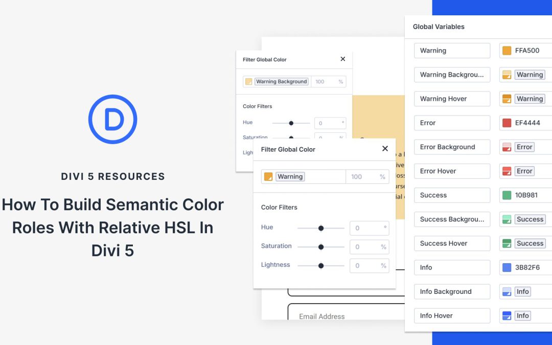
What Are Semantic Color Roles
Semantic color roles organize your palette by purpose. Instead of naming colors “blue” or “red,” you name them by what they do: primary, secondary, warning, error, success, and info.
This naming system solves a common problem. You’re building a site and need an error color. You could create a new red or hunt for the red you used before. With semantic naming, you just grab “error” and move on.
Every error across your site uses the same color because they all reference the same variable. Form validation, alert messages, and other common uses. Perfect consistency without thinking about it.
The naming creates a shared language as well. Hand your project to another designer or client, and they understand immediately. Primary handles main actions. Warning handles alerts. Success handles confirmations. The room for confusion is completely gone.
Divi 5 offers Flexbox, Nested Rows, and CSS Grid, which, when combined, build a stunning structure that stays responsive all the time. You can create a parent grid for your main structure, then build smaller grids inside its columns to organize content with real control.
In this post, we’ll show you how to create nested grids using these new features. We’ll recreate the design step by step and show you how to style each grid level separately, ensuring everything stays clean, flexible, and easy to update. Let’s get to it!
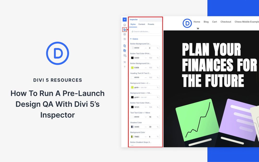
Before you publish a landing page, you scroll through one more time to check if everything looks right. But spacing that doesn’t match, incorrect colors, or different fonts can slip right past you.
Divi 5’sInspector tool solves this by displaying all your design changes in one place, making it easy to spot what needs fixing. This guide walks you through using the Inspector to review your landing page section by section and make sure it’s polished before launch.
How Divi 5’s Inspector Makes Design QA Effortless
The Inspector in Divi 5 is a visual panel that allows you to view everything happening inside your design without opening multiple settings windows. When you select any section, row, or module, it instantly shows all the applied design and content settings in a single sidebar.
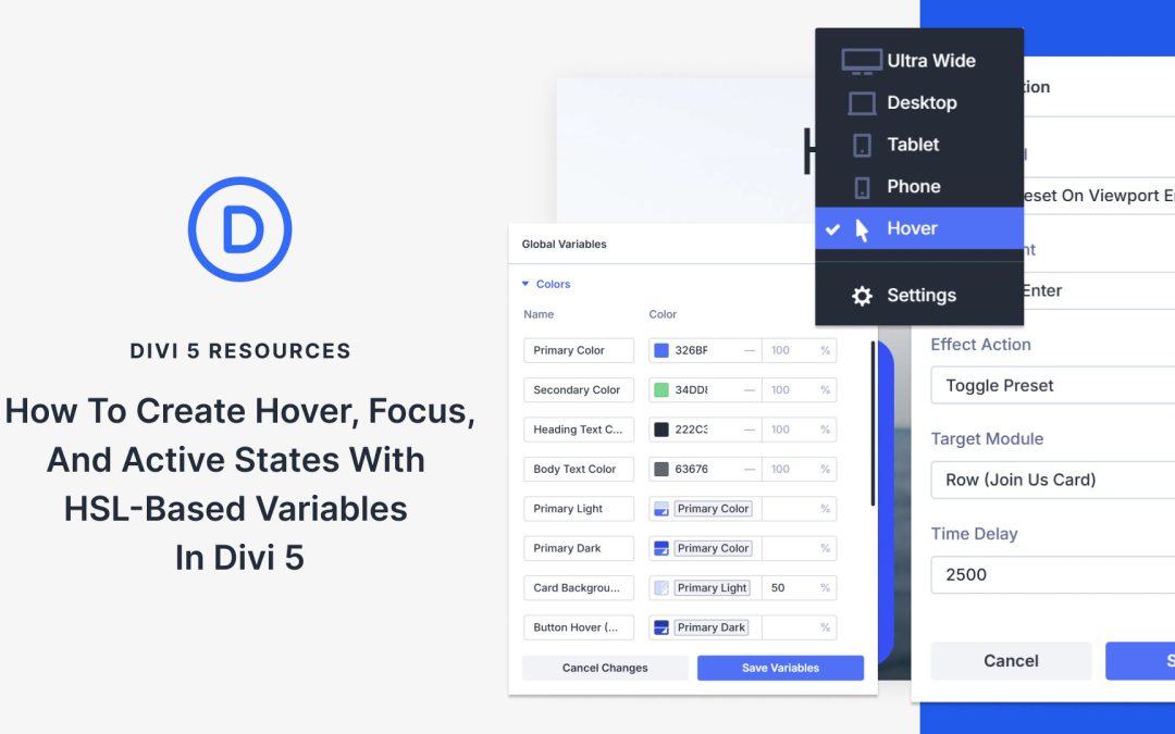
Building interactive elements that look good across every user action takes more effort than it should. You set up a button’s default appearance, then manually create variations for when someone hovers over it.
Each state needs its own color, and each color requires its shades. Keeping them all visually cohesive means juggling numbers that don’t relate to each other. Divi 5 combines HSL-based color variables with state management to simplify and make this process more consistent. Here’s how to set it up.
What Are HSL Colors
HSL stands for Hue, Saturation, and Lightness. Unlike hex codes or RGB values that mix red, green, and blue channels together, HSL separates color into three independent controls.
Hue measures the actual color position on a wheel using degrees. Red lands at 0°, yellow at 60°, green at 120°, cyan at 180°, blue at 240°, and magenta at 300°. The wheel completes at 360°, returning to red.
Saturation controls color intensity as a percentage. Full saturation at 100% delivers the purest, most vivid version of that hue. Zero saturation removes all color information, leaving only gray. Mid-range values produce muted or pastel tones.
Lightness handles brightness on a scale from 0% to 100%. At 0%, any color becomes black. At 100%, it turns white. The middle point of 50% shows the color at its truest form, neither darkened nor lightened.
Receive the latest WordPress, Divi, SEO and design news in your inbox for FREE from Web Design Solutions Unleashed.
We use cookies to ensure that we give you the best experience on our Web site. If you continue to use this site we will assume that you are happy with it.