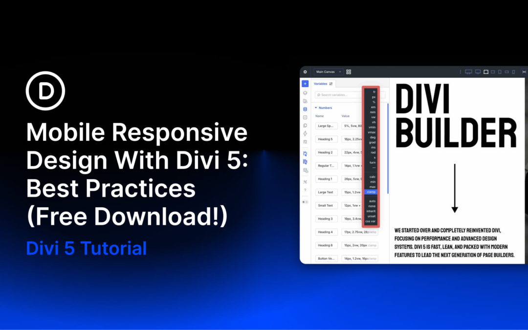
Divi 5 is now officially out of the Public Beta phase. It launches with an entirely new framework rebuilt from the ground up, moving away from shortcode-based content storage to a modern, block-editor-like format and layout system. This modular approach delivers faster performance, cleaner code, better scalability, and a more intuitive experience for Divi users.
In this post, we’ll dive into best practices for mastering mobile responsive design and show you how to implement them using Divi 5 features. Let’s get started.
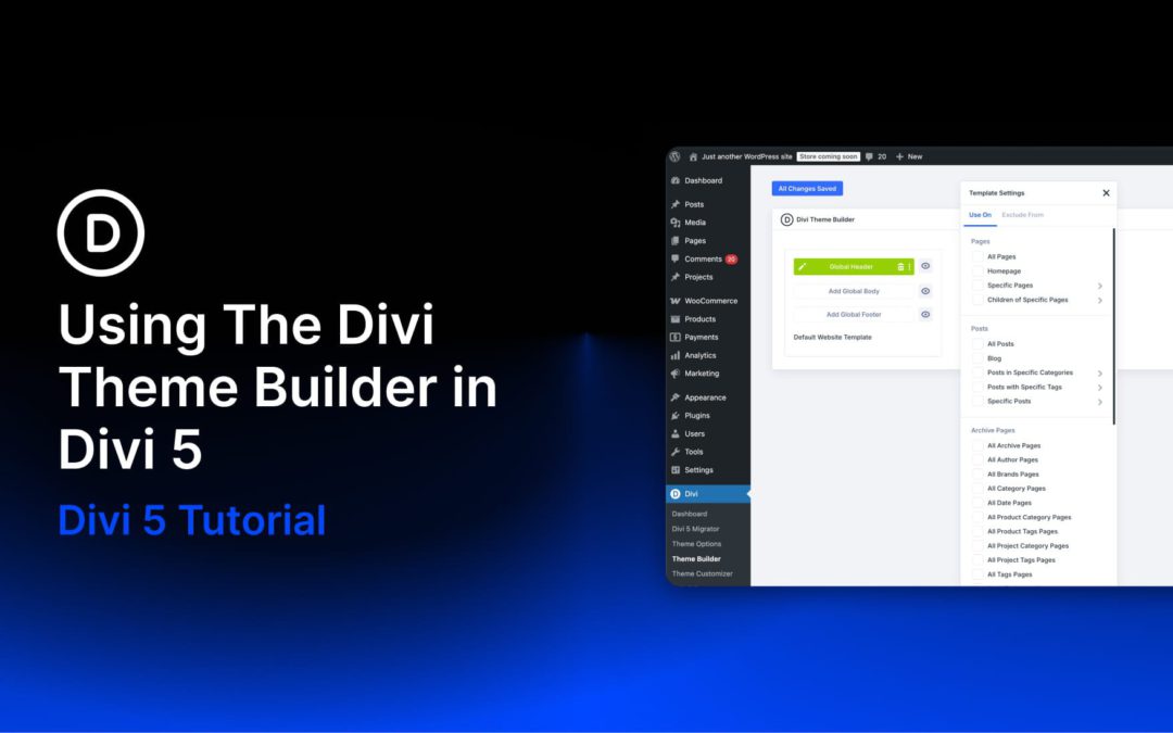
Your site needs a header, a footer, and templates for blog posts, products, and other content types. Divi 5‘s Theme Builder gives you a single workspace to design all these global parts, with new features that let you fully control your entire website’s look and functionality.
This post walks you through using Theme Builder for the most common use cases, showing you how to get the most out of those new features.
If you want to follow along faster, grab our free Divi 5 Design System freebie first. It includes ready-made Theme Builder templates (headers, footers, and post layouts) wired to Design Variables, so you can customize the examples in this guide with your own brand styles in minutes.
What Is Divi’s Theme Builder
Most page builders let you design individual pages. Divi’s Theme Builder goes further. It gives you one workspace to design everything that repeats across your site, such as:
Global Header: Your site’s main navigation area, shown across all pages. Build it once with your logo, menu, and call to action, then let it run site-wide.
Global Footer: The bottom section of every page, covering links, copyright text, social icons, and newsletter signups.
Blog Post Template: A layout that wraps every article you publish. Set up the hero area, content column, sidebar, and related posts section once, and every new post uses it automatically.
WooCommerce Templates: Product pages, category pages, cart, and checkout all get their own templates. Build the exact layout your store needs using Divi’s full suite of WooCommerce modules, rather than settling for the default WooCommerce output.
Custom Post Type Templates: If your site uses custom post types, whether for team members, events, testimonials, or portfolios, each one can have its own template with its own layout and content structure.
404 Page: A branded error page that matches the rest of your site instead of showing a generic WordPress fallback.
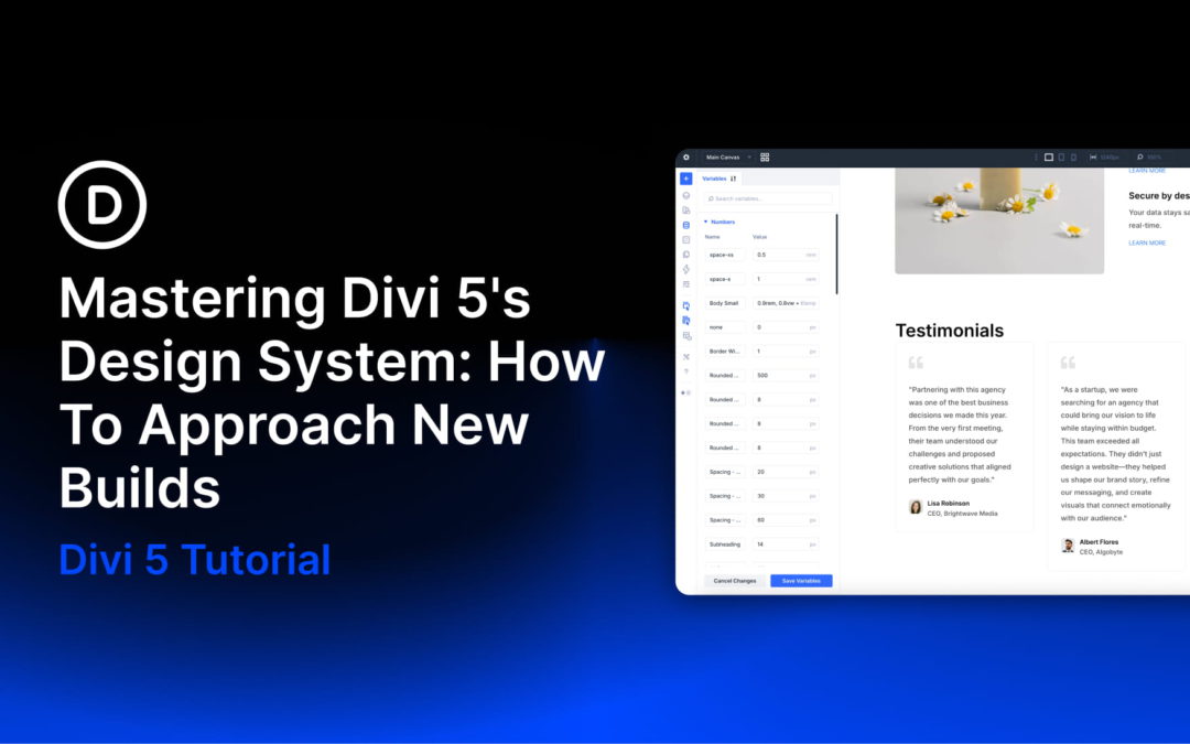
Divi 5 is the biggest evolution in the history of Divi. It is a complete rebuild focused on performance, modern accessibility, and a powerful no-code design system. The result is a platform that lets anyone create consistent, scalable websites faster and more efficiently.
Divi 5’s new modular framework provides a faster, more feature-rich Visual Builder. With tools like Design Variables, Element and Option Group Presets, Loop Builder, Flexbox, CSS Grid, and Divi 5 Canvases, you can create professional, complex websites more easily than ever before. Simply define global systems once, apply them everywhere, and update site-wide with a single change.
In this post, we will break down Divi 5’s core design system, explain how to set up a rock-solid framework, and share a step-by-step approach for new projects. This post builds on our free Divi 5 Design System freebie, which gives you a complete, production-ready starting point you can import into a new Divi 5 site.
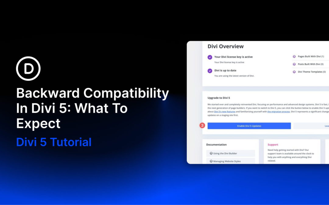
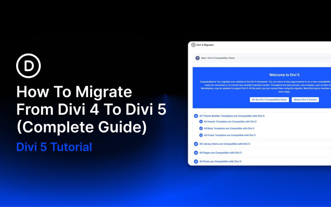
Divi 5 is officially here, and while the performance boost is huge, we know you are likely wondering what this means for your current website. Migrating existing sites can feel daunting or unreliable, but the Backward Compatibility System is designed to solve this. It checks and converts your existing content into the Divi 5 format, without disrupting your existing layout or functionality.
In this post, we’ll explain what the Backward Compatibility system is, how it works, and how to use it. By the end, you’ll have the confidence to upgrade your site and experience everything Divi 5 has to offer.
Divi 5 is officially here. If you have an existing Divi website, migrating to Divi 5 is the single most impactful upgrade you can make. The new framework delivers faster page loads, a redesigned Visual Builder, and features that fundamentally change what’s possible. This guide walks you through every step of the Divi 4 to Divi 5 migration, so you can step into the future of Divi with confidence.
What Changes When You Migrate To Divi 5
Before getting into the how, it helps to understand what the migration actually does under the hood. Divi 4 stores all layout data as shortcodes, such as
and
, embedded directly in your post content. This format served Divi well for years, but over time, it led to performance constraints and slowed the pace of new feature development.
Divi 5 replaces shortcode-based layout storage with a new, more stable storage format behind the scenes. When you run the migration, the Divi 5 Migrator converts every supported module on your site from the old shortcode format to this new structure. Your content, design settings, and configurations are preserved. The front end of your site looks and functions the same after migration. The difference is entirely in how Divi processes and renders that data, which is where the performance gains come from.
Modules that aren’t yet supported by Divi 5 (primarily third-party extensions from the Divi Marketplace) get wrapped into a backward-compatibility layer that continues running them using the Divi 4 framework. That means legacy Divi 4 modules can continue running through Divi 5’s backward-compatibility layer instead of being converted natively. Those modules keep working exactly as they did before until their developers release Divi 5-native updates.
Receive the latest WordPress, Divi, SEO and design news in your inbox for FREE from Web Design Solutions Unleashed.
We use cookies to ensure that we give you the best experience on our Web site. If you continue to use this site we will assume that you are happy with it.