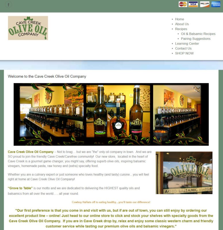
Last summer a relative was visiting and we decided to go into the local olive oil store. It was an eye opening trip for me and I’m always looking for local businesses in need of a Web site. When I got back to the office, I gave their existing site a look and knew that I could be a big help to them. Below is a screenshot of the top part of their old home page.
One of the first things I typically do with a site is see how it works on a phone. This one didn’t work well at all as there was no navigation. It was about the fifth time I looked over the site that I realized it had a store and you had to click on the credit card icons to get to it. Plus, it just needed a design makeover.
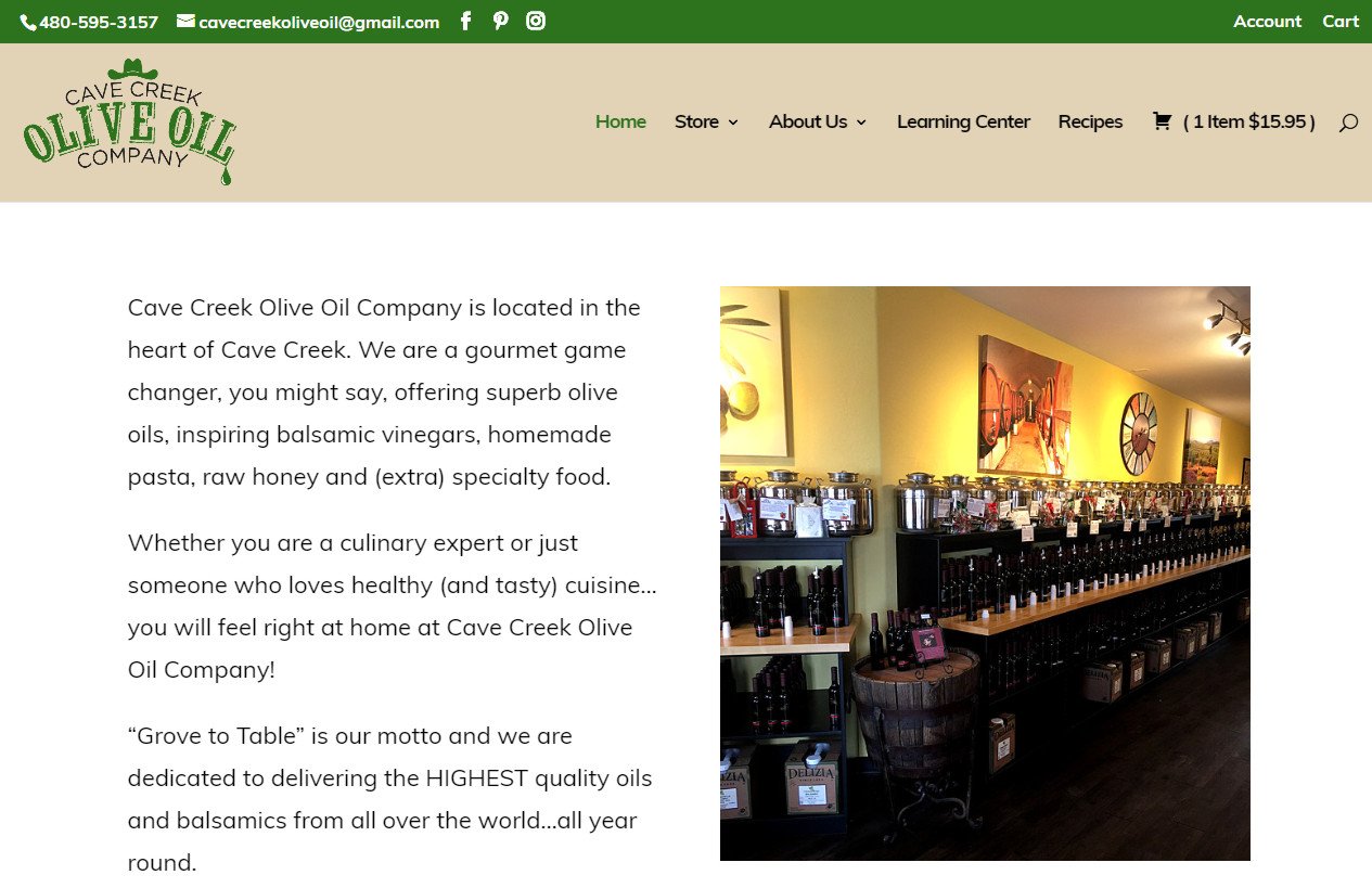
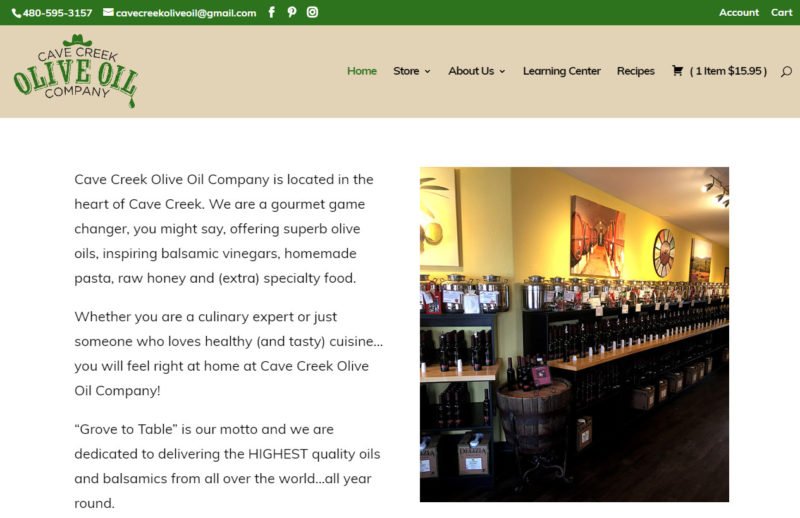
Once we were done, the top of the home page had a new look and it works great on mobile. The very first elements are the phone number and email address. On a phone, a visitor can click the phone number and it will dial the store. Menus have a cleaner look and they translate well to a phone. While not shown on this screenshot, there are also featured products and a box for signing up for their mailing list.
Social media was barely visible on the old site with a somewhat hidden Facebook icon. The new site features prominent icons for Facebook, Instagram and Pinterest as well as recent posts embedded throughout the site.
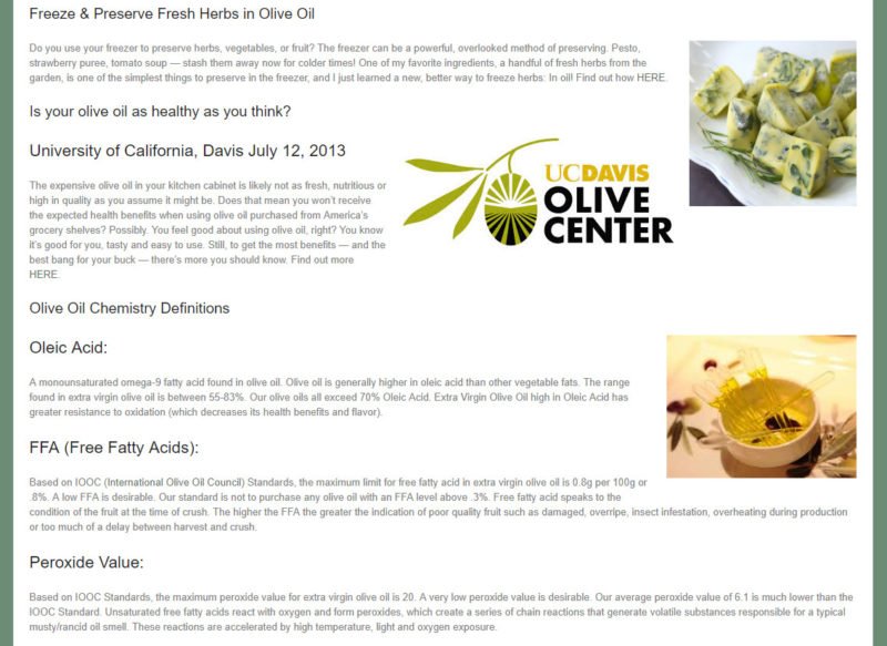
Some visitors to the site and store will be very knowledgeable about olive oil. While I know it tastes good and has health benefits, I don’t know much more. That’s a perfect reason for the site to have a section labeled Learning Center. On the old site, it wasn’t very inviting and it was easy for me to overlook. Below is an example.
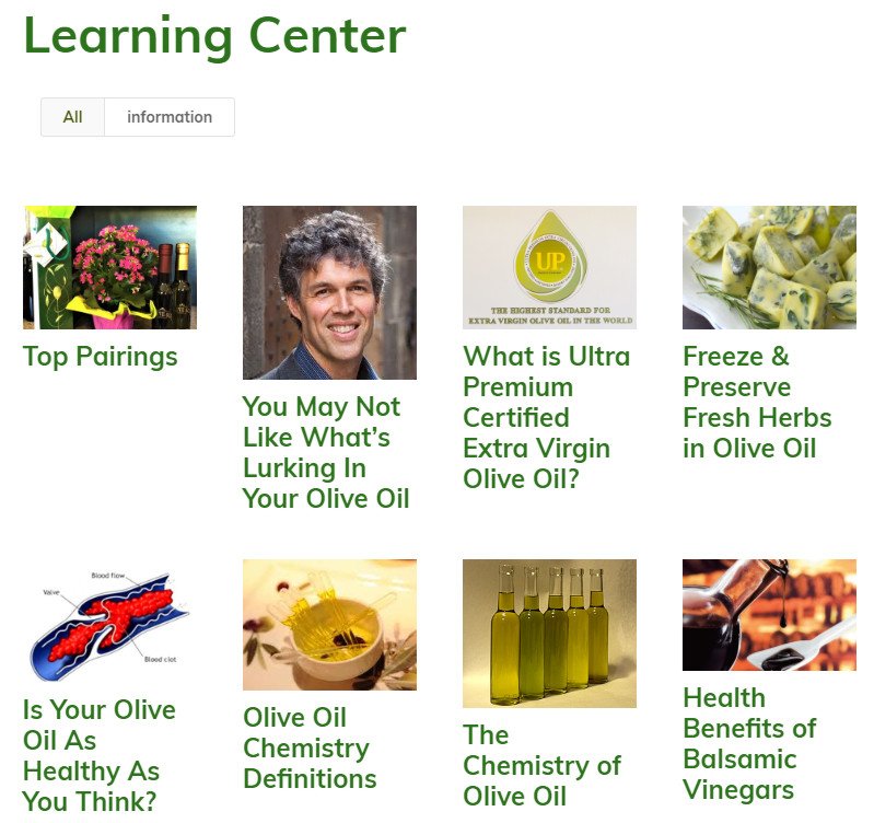
Everything was stuffed on a single page. We broke out each topic into an individual lesson and gave the page a more appealing look. Not shown in the screenshot below is the sidebar promoting other parts of the site or the navigation shown in the earlier shot.
Now visitors can easily see the title of each lesson and click on it to learn more. Now learning about olive oil is more appealing and can help direct visitors to products they can purchase.
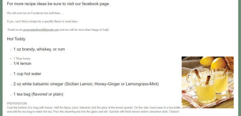
One of the most popular types of site on the Web are recipes. The old site had some recipes though they weren’t presented in a way to draw in visitors. Below is a screenshot of the old site.
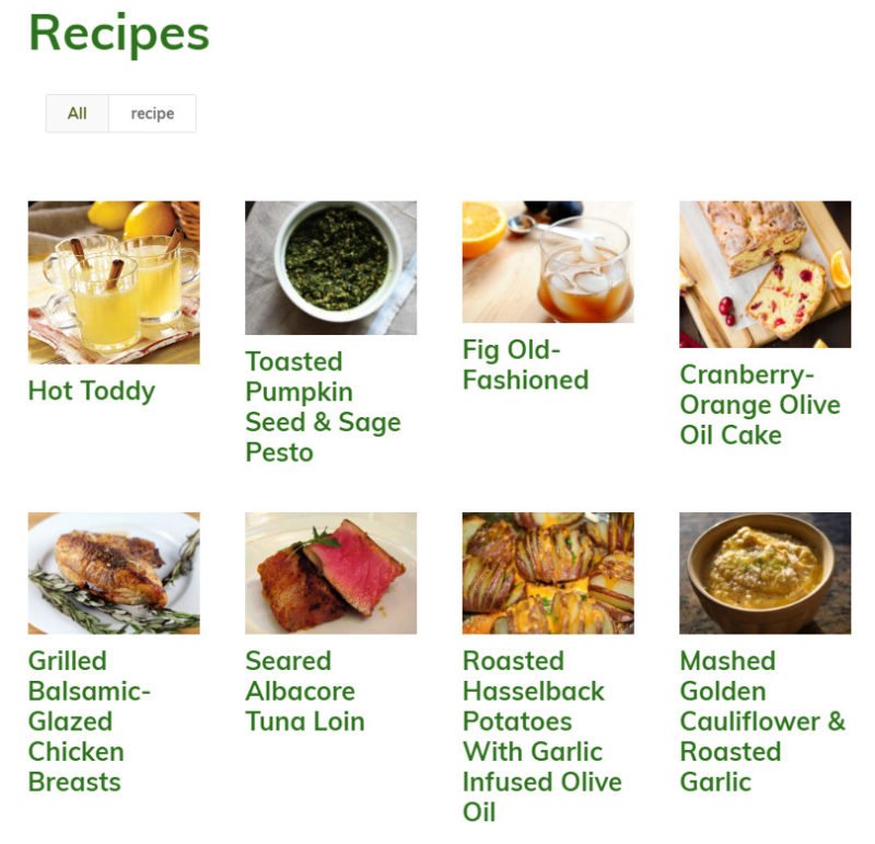
Just as with the learning center, all recipes were on a single page. We felt it important that each recipe be laid out similarly to the popular recipe sites. The main recipe page simply has links to each of the individual recipes as shown below.
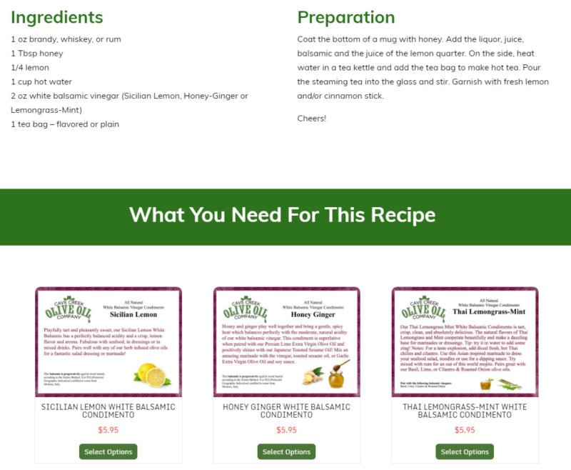
When you click on one of the recipes, it takes you to a detail page. Having all of the distinct pages also gives search engines more content to rank so the site will be found more often. Below you can see how the recipe is laid out and we even included links for purchasing the products needed by the recipe.
What isn’t shown in the screenshot is a slider that links to all other recipes so that visitors can easily navigate through all of them if they like.
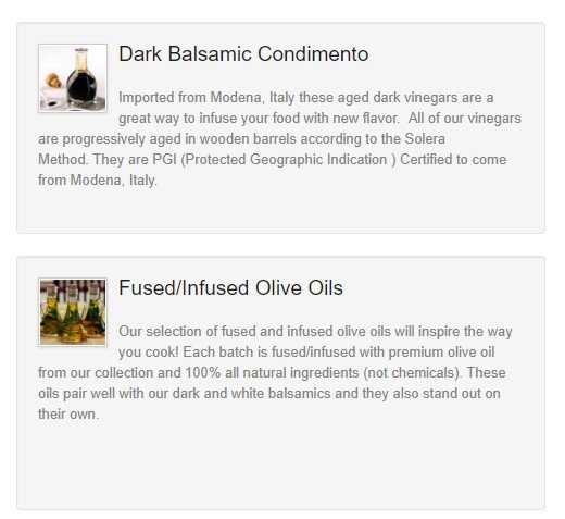
Of course the ultimate goal of the site is to provide a way for visitors to purchase products. While the old site had a store, it wasn’t obvious to visitors. Once you got to the store, you were presented with links to some general categories as shown below.
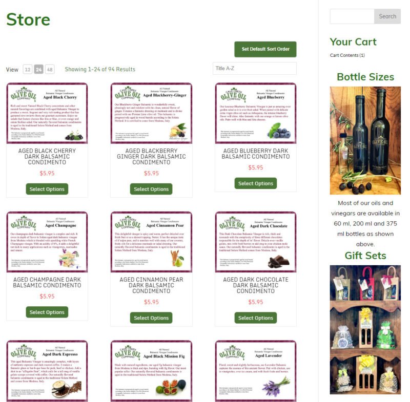
Clicking on a category led to another page with products and more clicks were required to add a product to the shopping cart. This was a very inefficient process and their online sales weren’t living up to their potential. We truly integrated the store into the site as you already saw on the recipe page. Below is the main store page also showing the sidebar.
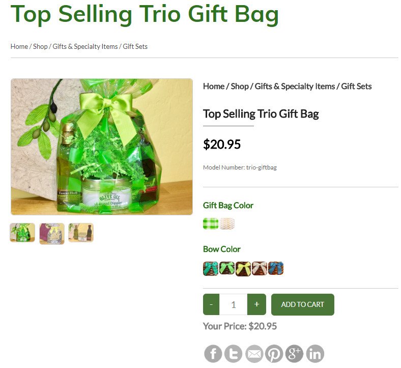
In addition to the main store page, we also have dedicated pages for each category of products. Some of the products are added directly to the shopping cart, while others have options to select. Below is a product page that allow you to select the gift bag and bow color.
Early in the project I was asked by the owner if I felt this would increase their sales by 10%. I smiled and said I would be very disappointed if we only saw a 10% increase. I’m fully expecting their online sales to double with the new site.
Want to see all the changes? Visit the Cave Creek Olive Oil site and pick up something tasty while you’re there! Want our help in designing a site for you or giving your site a makeover? Send us a note and tell us how we can help.






0 Comments