Each project we undertake has a different flavor. The latest project has two parts to the makeover and today the first part will be discussed. We were originally contacted by the client on a Monday and the project was discussed. Things were finalized on Tuesday and we were ready to start on the makeover. Then came the bombshell, the current hosting was expiring in a week and the point person on the project was leaving on vacation on Friday. So we basically had three days to harvest information from the old site and get a new VJ Properties site launched.
Because of the very tight timeframe, the first part of the makeover was simply moving the site. Once the point person returns from vacation, we’ll improve the looks of the site and update the information. The original home page had very little information and was composed entirely of a single Flash element. Flash is out of favor and losing support so some visitors would see absolutely nothing. Those who had Flash support would see the home page below.

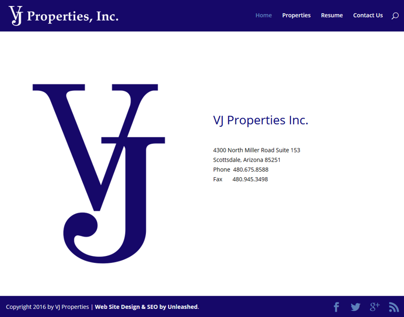
It was visually OK for those who could see it. But with all navigation built into the Flash element, some visitors wouldn’t even be able to navigate to other pages. One of the other complications was that the company did not have the logo in a vector format. Part of the project then came converting the logo from bitmap to vector so we could use it in various parts of the site. The new home part is still very basic (shown below), but it will evolve in the second phase of the makeover.
As the company deals with commercial properties, featuring those properties is of utmost importance. The old site had the properties page shown below.
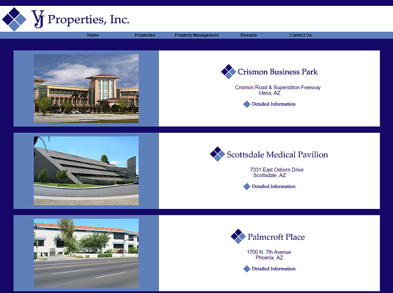
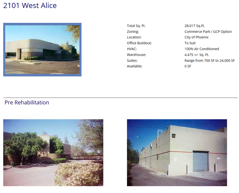
After the makeover, there isn’t a huge difference on the main properties page. We didn’t spend a lot of time on this aspect of the site yet as the list of properties is likely to change completely in the second phase of the makeover. Where we did focus was on the details page for each of the properties (shown below).
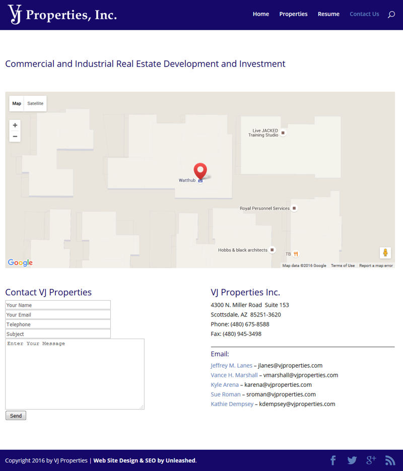
The old Contact Us page was very blah with nothing but text and no interactive elements. We added a nice map and a contact form in addition to the list of employees (see below).
While it may not be immediately visible from the examples shown here, the biggest upgrade is that the site is now responsive and works great on mobile devices. Before we started, the site didn’t work well on mobile devices at all. We’re looking forward to starting on the second phase of the makeover and making the site even better!





0 Comments