When Karen Friend of Soaring Spirit Studio came to us, her Web site hadn’t been updated in many years. Part of the reason it wasn’t being updated was the difficulty of making changes due to the fixed design of the original site. Each page of the site was carefully crafted in Adobe ImageReady, a now discontinued product.
Our goal was to create a beautiful site that would be responsive and easy to update. While most changes would be made by Unleashed, we also wanted Karen to be able to add upcoming events and new pieces of artwork. Let’s look at the before/after of several pages. Click on any of the screenshots to see a larger image.
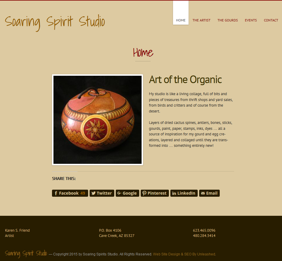
Soaring Spirit Studio Home Page
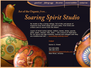
The home page on the original site (at left or top) is beautiful. But it was a fixed sized in all browsers and was not mobile friendly at all. Look carefully and you can see that some of the image pieces didn’t properly align on the right side making the right edge look strange.
After the makeover (at right or bottom), the home page is fully responsive so it looks great on all devices and it isn’t penalized by Google for not being mobile friendly.

Soaring Spirit Studio Artist Page
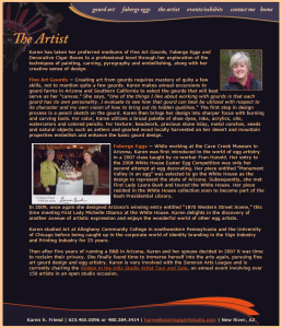
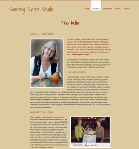
Once again the artist page on the old site looked great, but it was a fixed size. The new site features the pictures better as well as making the text more readable. Of course it is also responsive so it looks great on all devices.
Soaring Spirit Studio Contact Page
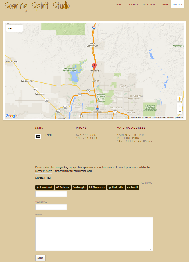
The original site didn’t have a dedicated contact page which is an important element on any Web site. A page was added with a big Google map, contact details and a contact form as shown below.
Soaring Spirit Studio Events Page
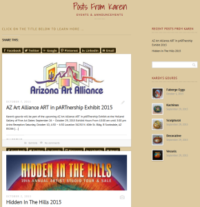
For an artist, having an up-to-date list of events where their art is shown is extremely important. The original site was showing dates more than five years in the past. On the new site, we decided that blog posts were the best option for telling visitors about upcoming events. Best of all, the artist can easily create the blog posts herself!
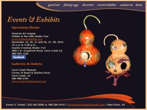
Soaring Spirit Studio Gourds Pages
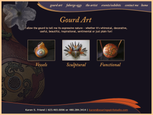
Just like the events, photos of the gourds on the original site hadn’t been updated in a very long time. The layout was fixed and changes were not easy to make. Previews of the gourds were also very limited in size. Below are two of the gourd pages before the Web site makeover.

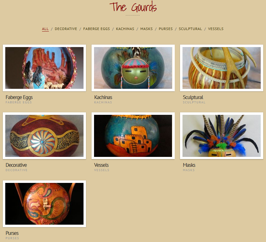
After the makeover, each category of gourds is featured on a single page and then large photos of each gourd are shown in a gallery. Adding photos to a gallery is quite easy so the artist can add pieces immediately after they are completed.
Publicizing Soaring Spirit Studio Pages
The look of a site is important, but it is equally important that the site is promoted so it can reach as many visitors as possible. Sharing buttons were added on each page so that visitors can tell others about the artwork on their favorite social network or via e-mail. In addition, SEO (search engine optimization) was performed on the pages so that they will rank better in the search engines. Previously there was no SEO at all.
Would you like Unleashed to makeover your Web site? Contact us with details of your project and we’ll get started!






This is a very interesting article, Foster. With all the effort and learning you had to go through for your own commercial websites, I can see why you would want to sell your experience and expertise. It may be frustrating at times because some customers can be real SOBs, but I think you are making a mark, at least in the Arizona area.
So do you set up the site so that she can update parts other than the gallery or does she still have to have a technician make picture and text changes?
Karen has the permissions to change anything. It is important for clients to understand that trying to make their own changes can also create a lot of problems. We work with each client on a plan that works best for them.
Yes, I can understanding giving her the permissions to her web site. That’s sorta an ethical question, since she would otherwise be hostage to you. However, a lot of the people I have met that are in a web business neither have the time, interest or understanding to make changes. I guess many of the web hosting sites have tools that make it easier to make simple changes, like adding to her gallery, just to keep a user from crashing the site with what should be like a simple change.
It really all depends on the client. If they are fairly competent on a computer, they are welcome to make changes to more aspects of the site. Some clients really struggle with all things computer and we don’t suggest they attempt to make any changes. We had one client that attempted to change a small piece of text and deleted a lot of formatting code that drastically changed the look of the site. So if they do this, it can cost them more to fix things that it would to have had us change it for them in the first place.