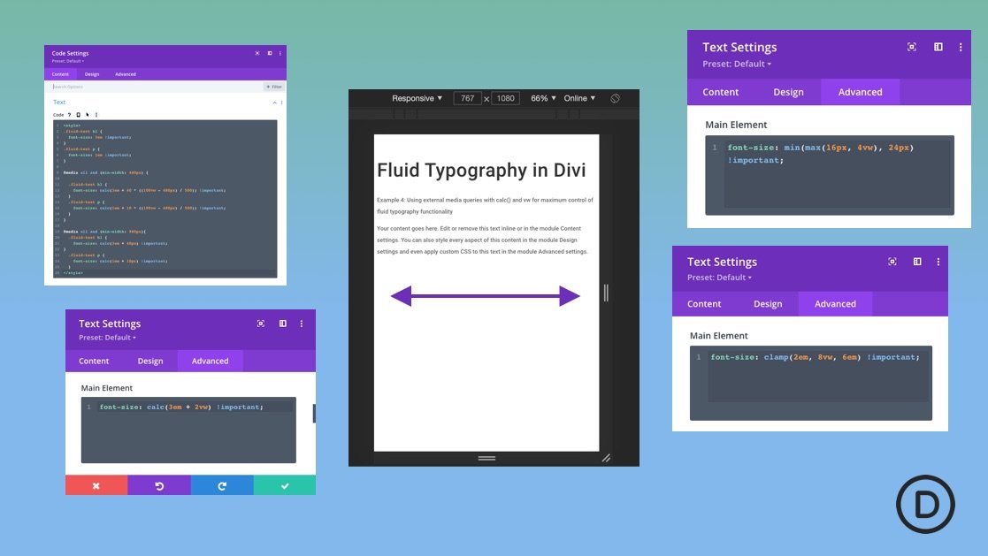
Fluid typography is web text (or font size) that scales fluidly with the width of the browser. Typically, typography in responsive web design (or responsive typography) involves changing the font size at certain breakpoints via media queries. But this can be a tedious process whenever you are trying to get the right font size for various devices and screen sizes. With fluid typography, the idea is to have the font scale fluidly from a minimum font size and a maximun font size. This gives a more consistent design across various screen sizes without all the fuss. But to make a font size fluid, we need to employ CSS methods that involve using relative length units (like vw), CSS math functions (like calc(), min() and max()), and custom media queries.
In this post, we will help you understand fluid typography and how to create fluid typography in Divi using 6 methods.


