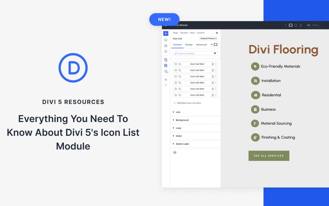
One of the latest Divi 5 updates introduced Carousels and Lottie Animations, as well as something every site can use: the new Icon List Module. Instead of plain bullet points, you can create styled lists with meaningful icons that add clarity and visual appeal.
Think of features on a product page, steps in a process, services in a pricing table, or even benefits on a landing page. The Icon List Module makes all these easier to design and more engaging for visitors.
In this post, we’ll cover everything you need to know about the Icon List Module, from features to practical use cases, so you can upgrade your lists and improve your Divi sites.
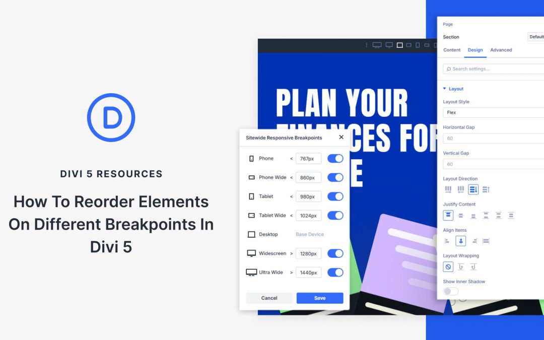
Responsive design requires more than scaling layouts, it also requires controlling how content stacks across devices. A design that feels structured on desktop can be a confusing order on mobile, with sidebars or secondary elements pushing key content out of view. Divi 5 addresses this with its new Flexbox system, which introduces prebuilt responsive column structures and precise ordering controls.
In this post, we’ll look at why reordering elements matters, how Divi 5’s flexbox tools make it simple, and walk through the steps to restructure layouts at different breakpoints.
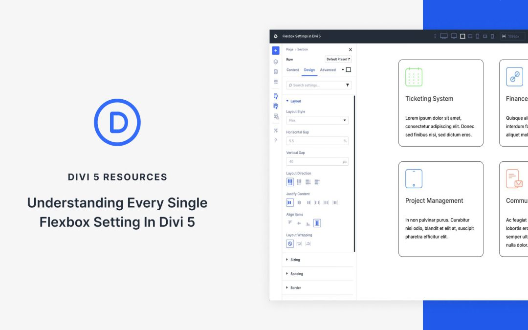
Flexbox and Divi 5 are a powerful duo that enables Divi users to create stunning, responsive layouts. In this post, we’ll provide the ultimate guide to understanding and using every Flexbox setting to easily create flexible, responsive layouts.
Flexbox is at the heart of Divi 5’s revamped Visual Builder, allowing users to build stunning designs with unmatched control. Divi 5’s Flexbox Layout System makes complex layouts a breeze, from aligning content to building dynamic grids.
Let’s dive in.
What Is Flexbox?
Flexbox is a CSS layout model designed to make it easy to arrange, align, and distribute elements within a container, even when their sizes are dynamic. Unlike traditional CSS layouts that rely on floats or positioning, Flexbox offers an intuitive way to build flexible and responsive designs, making it a cornerstone of modern web development.
Key Concepts Of Flexbox
Flexbox operates around several fundamental concepts:
Flex Container: The parent element that has display: flex or inline-flex applied, establishing the flex content. This container dictates how its children behave within the layout.
Flex Items: The direct children of the flex container, which are arranged and aligned according to the container’s flex properties.
Main Axis and Cross Axis: Flexbox operates along a main axis (either horizontal as a row or vertical as a column) and a perpendicular cross axis. The direction of the main axis can adapt to different modes, such as left-to-right-to-left, providing flexibility for global designs.
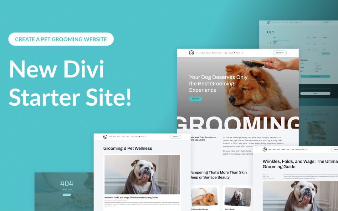
Divi empowers you to build the best websites possible, and now, Divi Quick Sites takes website creation to a whole new level. This revolutionary tool lets anyone, regardless of skill level, generate a complete website in under two minutes! Divi Quick Sites provides everything you need to launch your dream website instantly. You can choose a pre-made Starter Site that’s been professionally designed or Divi AI to generate an entirely new design.
Each Starter Site comes pre-loaded with all essential web pages, stunning Theme Builder templates, customizable global styles and presets, and a ready-made navigation menu. But that’s not all! Divi Quick Sites are completely customizable with Divi’s drag-and-drop page builder.
Let’s dive deeper into the Divi Pet Grooming Starter Site and discover what’s included!
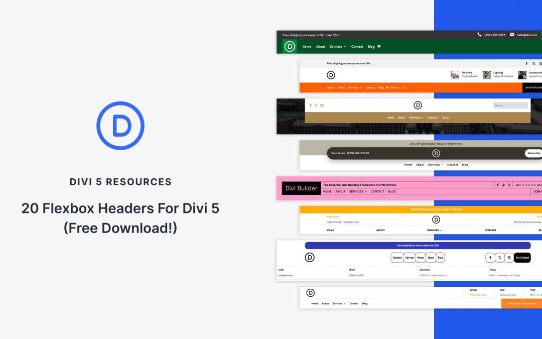
Flexbox makes it easier than ever to create headers that look clean, adapt beautifully to different screen sizes, and are simple to customize in Divi 5. In this free pack, you’ll find 20 unique Flexbox header designs, each built with Divi 5’s Flex layout system for precise alignment and responsive control. Whether you want to use your site’s existing global styles or start with a ready-made design, you’ll find both options here.
Receive the latest WordPress, Divi, SEO and design news in your inbox for FREE from Web Design Solutions Unleashed.
We use cookies to ensure that we give you the best experience on our Web site. If you continue to use this site we will assume that you are happy with it.