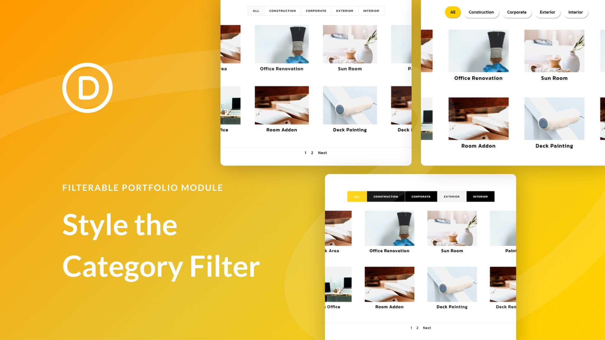
Divi’s Filterable Portfolio Module contains many elements, and each can be styled individually. The filter is one of the most useful elements, but it’s sometimes overlooked. In this post, we’ll see how to style the category filter in Divi’s Filterable Portfolio Module. We’ll see what can be done with the standard settings, and we’ll dig into CSS to see how to style it even further.
Disclosure: Some of the links on this page are “affiliate links.” This means if you click on the link and purchase an item, we will receive an affiliate commission.


