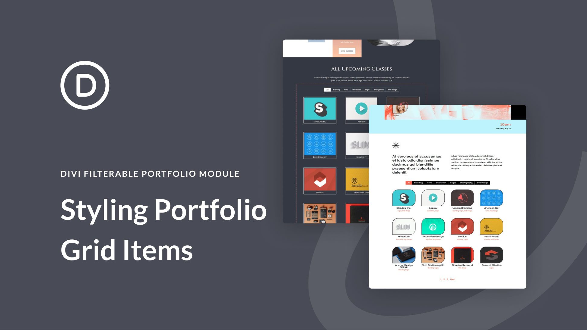
Having an area on your website to showcase your work is important. If you’re a stylist, you could create multiple projects within your WordPress website to show your concepts. If you’re a brand designer, you can use a portfolio to showcase your past work. Furthermore, we can even go a step further and add in various categories for our projects. This is where Divi’s Filterable Portfolio Module comes into play.
With this module, we are able to display our hard work in a way that is easy and organized. In today’s tutorial, we’ll be styling the Filterable Portfolio Module’s individual grid items. We’ll be using layouts from the Divi Conference and Divi Online Yoga Instructor free layout packs that come with every purchase of Divi. As with all things Divi, we have the ability to style this module to make it match our needs and wants. However, before we get into styling, let’s learn a bit more about the module.


