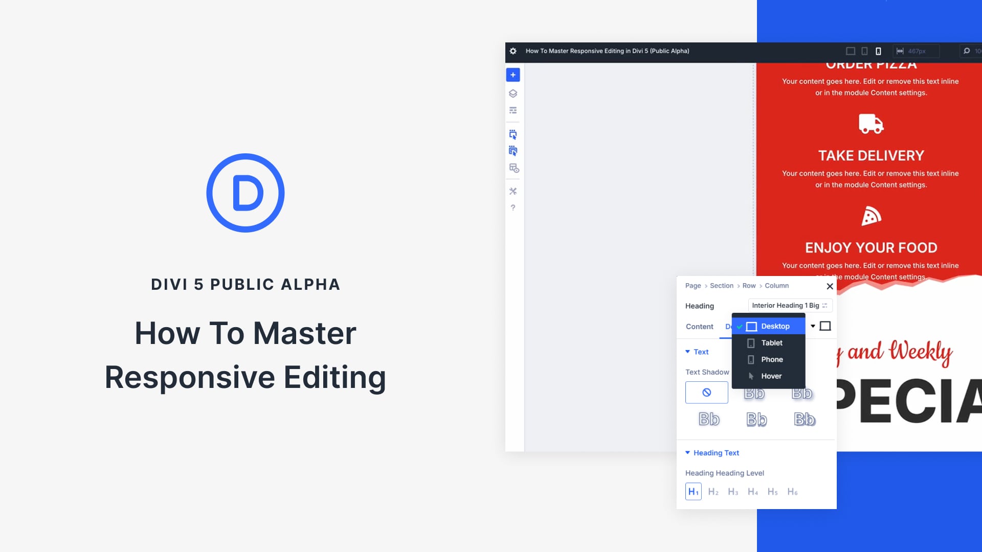
In web design, responsive design is not optional—it’s essential. With most users accessing websites on smaller screens, making content responsive is critical to providing an optimal user experience. Divi has long supported responsive editing, but with the release of the Divi 5 Public Alpha, this process has become even more powerful and efficient.
Divi 5 introduces several key improvements that make responsive editing easier than ever before:
- Seamless device switching lets you quickly toggle between desktop, tablet, and mobile views with minimal effort.
- Visual breakpoints provide real-time feedback as you make changes, allowing you to perfect your design for every screen size.
- Canvas scaling enables you to see how your design looks across multiple devices by adjusting the canvas so you can optimize layouts without guesswork.
In this post, we’ll explore these exciting features and show you how simple it is to make your websites fully responsive in Divi 5.


