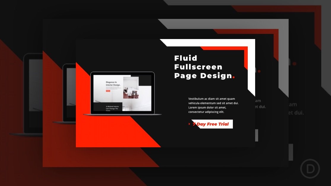
A website’s hero section is one of the best candidates for fluid design. Unlike traditional responsive design that adjusts at different breakpoints, fluid design scales seamlessly with the browser viewport and keeps the design consistent on any device. After all, the hero section is the first thing users see on a website.
You may have seen fluid design demonstrated in previous tutorials on fluid typography, fluid modules, and/or fluid buttons. In this tutorial, we are going to show you how to create an entire fluid hero section in Divi. The key to creating this fluid design is adding a fluid root font size to each of the modules used and then incorporating the em length unit (which is relative to the root body font size) throughout the module’s settings.


