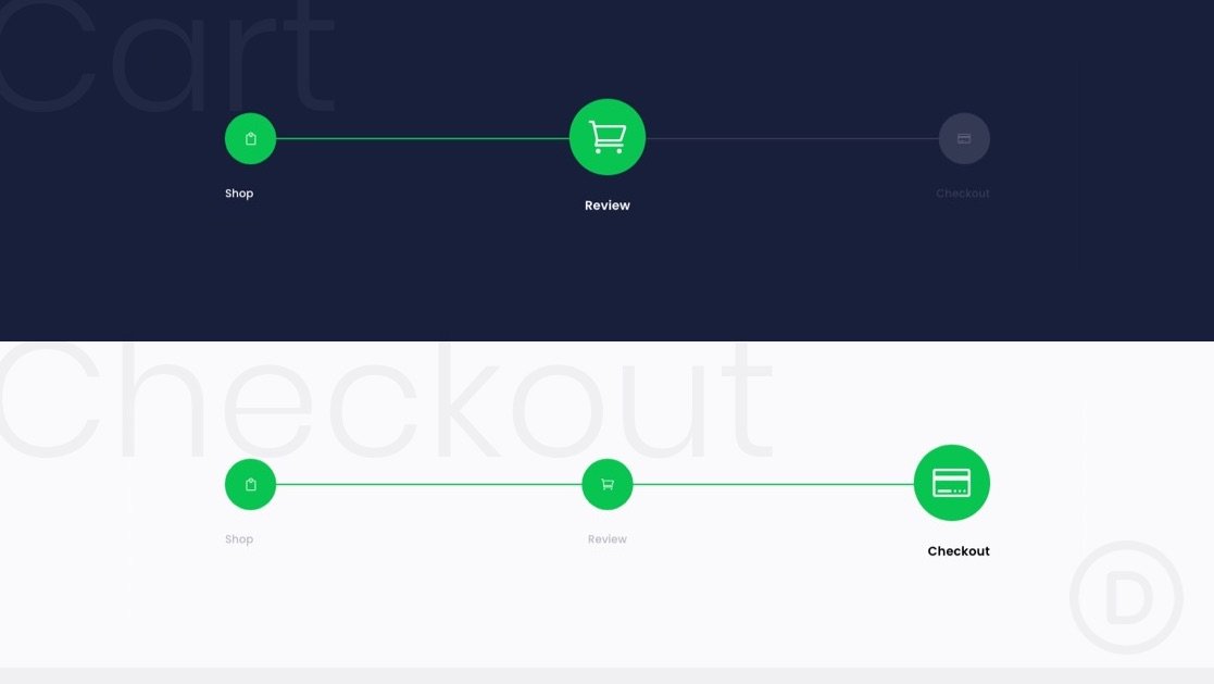
Leading customers through a successful checkout process is a challenging goal for every online store. So it helps to optimize your website’s checkout process to make it easier for customers. Since navigation plays a crucial role in the checkout process, we may want to start there. Creating a custom checkout process navigation menu is a great way to boost UX and sales conversion. It helps users go where they want quickly. And, it also can be used to spotlight where they are (and where they’re going) in the process.
In this tutorial, we are going to show you how to design a checkout process navigation menu in Divi. You will be able to use this custom menu to boost the UX on the pages most crucial to the checkout process (shop, cart, checkout, etc.). This kind of menu has been used in our free WooCommmerce Cart and Checkout Page Template Sets as well.


