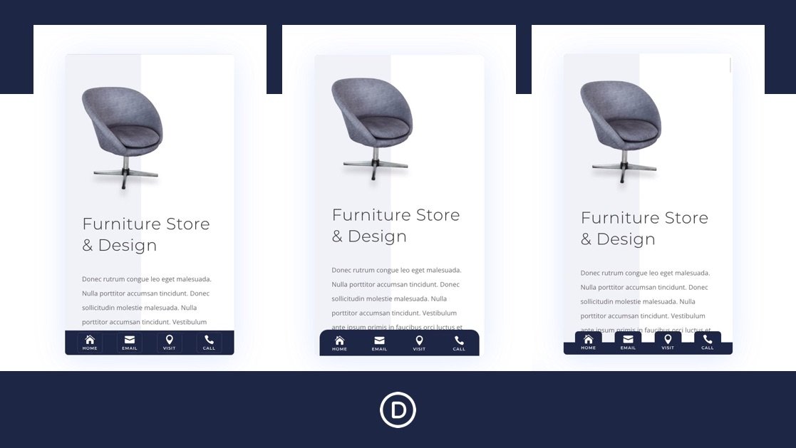
Sticky footer bars can be a useful addition to any website, especially for mobile devices. A sticky footer bar remains fixed (or stuck) at the bottom of the screen as the user scrolls through the page. Its position makes it more accessible to mobile users (especially on phones) because it is so close to the thumb. That’s probably why designers often include navigation buttons inside sticky footer bars. It can boost the navigation UX on mobile.
In this tutorial, we are going to show you how to create mobile sticky footer bars in Divi. The foundation of any sticky footer bar is the fixed position which is easily controlled with Divi’s built-in sticky position options. We’ll show you how to use the sticky position and the suite of Divi design tools to design 3 different sticky footer bar designs, each with 4 navigation buttons. This will work well for any company looking to improve its site’s UX on mobile.


