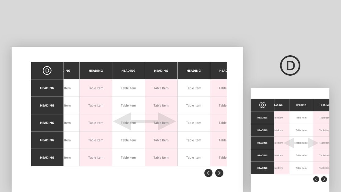
Creating a responsive table can be a challenge, especially if you have a table with a lot of columns. A great way to solve this problem is to add horizontal scroll capability to the table. A table with horizontal scroll solves two main problems. First, it allows the designer to keep the spacing necessary for the table content (really narrow columns will cause the content to smush together too much). And second, it allows the user to view the easy-to-read table content on mobile devices.
In this tutorial, we are going to show you how to user Divi to build a completely custom table with horizontal scroll. We’ll show you how to add the horizontal scroll functionality to the columns that overflow the table container. Plus, we’ll even add some horizontal scroll buttons to the table to boost the UX. All this without a plugin!


