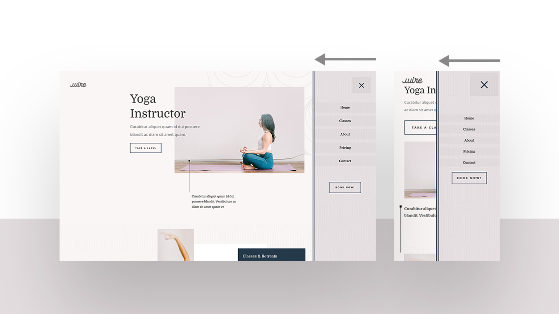
When setting up a website for a client of yourself, you’ll find yourself contemplating what type of header to build. The most used one around the web is the horizontal menu bar at the top, but there are other options as well, such as a slide-in menu. Slide-in menus help you limit the space that’s taken up by the global header. Rather than show all your menu items right off the bat, you can let a slide-in menu appear when your visitors click on the hamburger icon in the top right corner. Using a slide-in menu helps you add additional interaction to your website.
In today’s use case Divi tutorial, we’ll show you how to create one using Divi’s Theme Builder, the built-in Divi elements and some additional code. The design of this slide-in menu matches the Yoga Instructor Layout Pack perfectly but you’re free to modify it to match any website you build. You’ll be able to download the JSON file for free as well!


