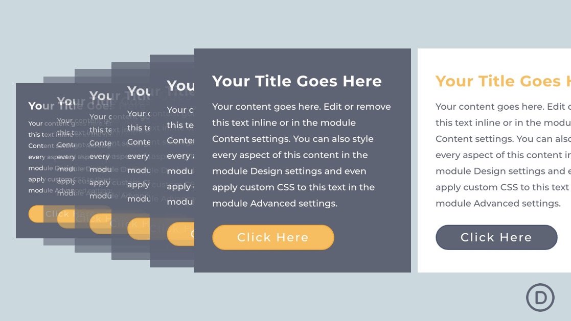
To further simplify the process of implementing consistent responsive design for a Divi module, we can apply the practices of fluid web design. Unlike the more traditional methods of responsive design, Fluid web design doesn’t break or abruptly jump to a different size/style at different breakpoints. It incorporates responsive length units relative to the viewport width so the design adjusts (or scales) fluidly, keeping the design consistent on all devices.
In this tutorial, we are going to show you how to create a fluid Divi module. Using similar fluid design practices to create fluid typography and/or fluid buttons, we are going to create a fluid Divi module that will scale seamlessly with the browser viewport. As we will find out, the secret combination is adding a root body font size with a relative (or fluid) length unit) to the module and then incorporating the em length unit (which is relative to the root body font size) throughout the module’s settings when needed.


