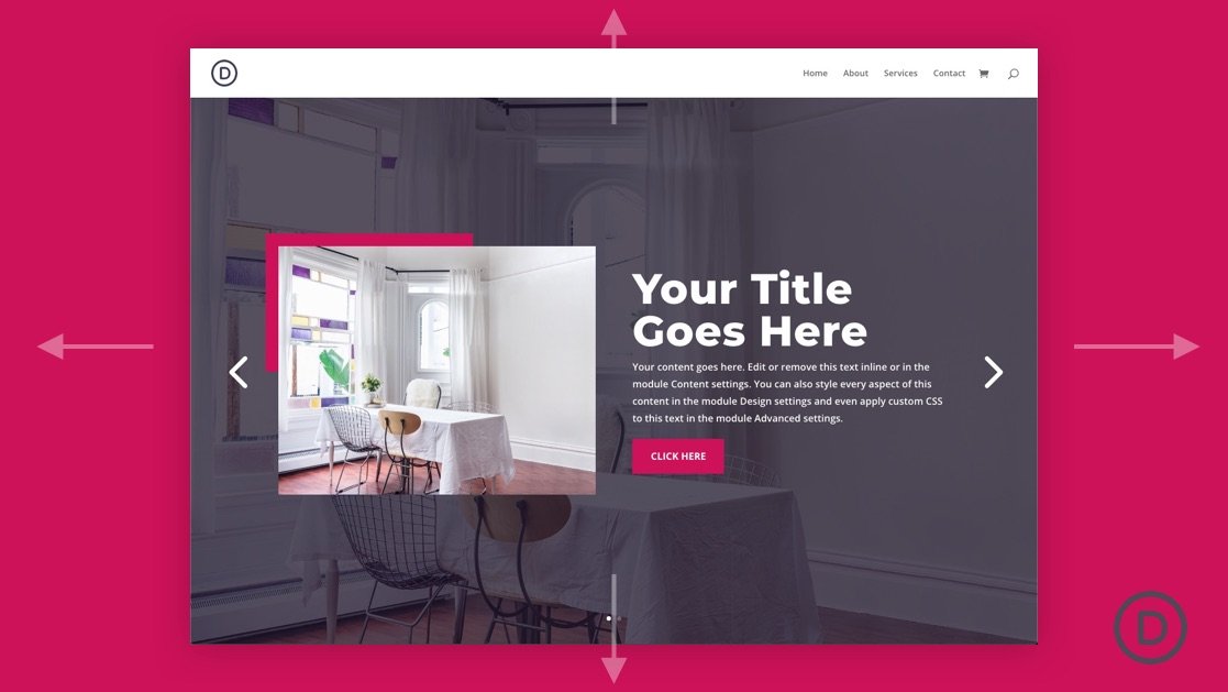
A fullscreen slider can work really well as the header of your website’s homepage. The fullscreen aspect consistently keeps important content above the fold. And the slider functionality allows users to see additional content (or CTAs) without having to scroll down the page.
Creating a fullscreen slider with Divi is surprisingly easy to do. The key is to give your slider a height that is relative to the browser height and then get rid of any extra padding and width restrictions on the parent row or section. In just a few minutes, you can create a fullscreen slider that expands to fill the entire screen on page load and look great on all devices.


