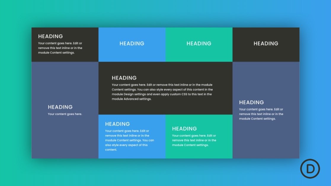
For those already familiar with building websites in Divi, creating custom grid layouts is a core aspect of the Divi Builder. Simply create a row and choose from multiple built-in column layouts for that row. Once the column layout is in place, we simply add the content/modules we want inside each column. But, what if we wanted an additional grid layout for those modules?
In this tutorial, we are going to explore how to expand upon Divi’s grid layouts by creating CSS grid layouts for Divi modules within a single column. The CSS Grid property (along with CSS Flex) is a popular way to create predictable and responsive grid layouts for content with just a few lines of CSS. With it, we can organize all the modules in a column into a fully responsive grid. Think of it as an additional grid layout for modules that you can add to any Divi column. But one of the best things about this technique is that each adjacent module will have the same height and width without all the hassle of trying to do this using custom padding or height values on each module.


