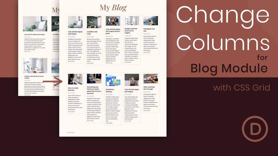
Divi’s blog module can display blog posts in either a fullwidth or grid layout. If you choose the grid layout, the maximum amount of columns you can have is three. In this tutorial, we are going to explore combining the power of CSS Grid with the Divi Blog module to create any number of columns you want. With just a few snippets of CSS, your blog will transform into a beautiful multi-column grid layout. Plus, the columns will be fluidly responsive with all browser sizes, so no need to worry about updating those media queries or responsive settings. After the CSS Grid magic, you’ll still have the built-in blog module settings to design the blog visually without any more custom CSS. So, if you are looking for more columns for your Divi blog, this will do the trick and more.
Disclosure: Some of the links on this page are “affiliate links.” This means if you click on the link and purchase an item, we will receive an affiliate commission.


