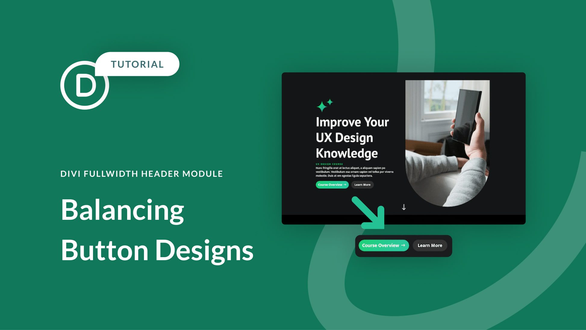
The Divi Fullwidth Header module makes it easy to add beautiful hero sections to your website. The module comes with two buttons, a title text, subtitle text, body text, a logo, and an image, making the customization options endless.
In today’s post, we’re going to demonstrate how to re-create hero sections using the Divi Fullwidth Header. We’ll start our design by using 3 premade layout packs and design our sections with a focus on balancing the primary and secondary buttons. We want the primary button to stand out, as it’s our main call to action while keeping the secondary button visible and accessible without overtaking the primary button.


