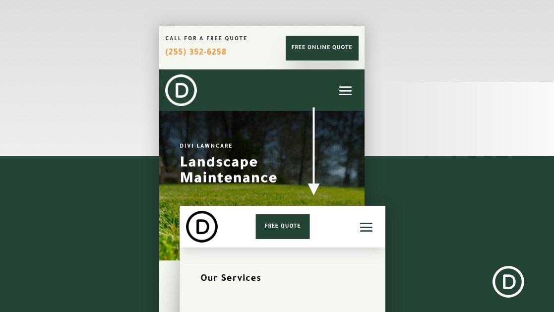
Typically, adding a sticky (or fixed) header to your website is a safe play for larger screens (desktops) because there is more room. Adding a sticky header on mobile devices with smaller viewports (especially phones) requires a little more finesse. You don’t want that sticky header taking up too much of the viewport. I mean, there’s no point in boosting the navigation experience with a sticky header if you can’t see the pages you visit. For this reason, sometimes it is easier to add a sticky header specifically designed for mobile.
In this tutorial, we are going to show you how to add a custom sticky header for mobile using Divi. Using Divi’s built-in options (including the sticky position options), we’ll show you how to display a completely custom sticky header that includes those crucial elements (like a logo, a button, and a menu icon) without taking up too much space.


