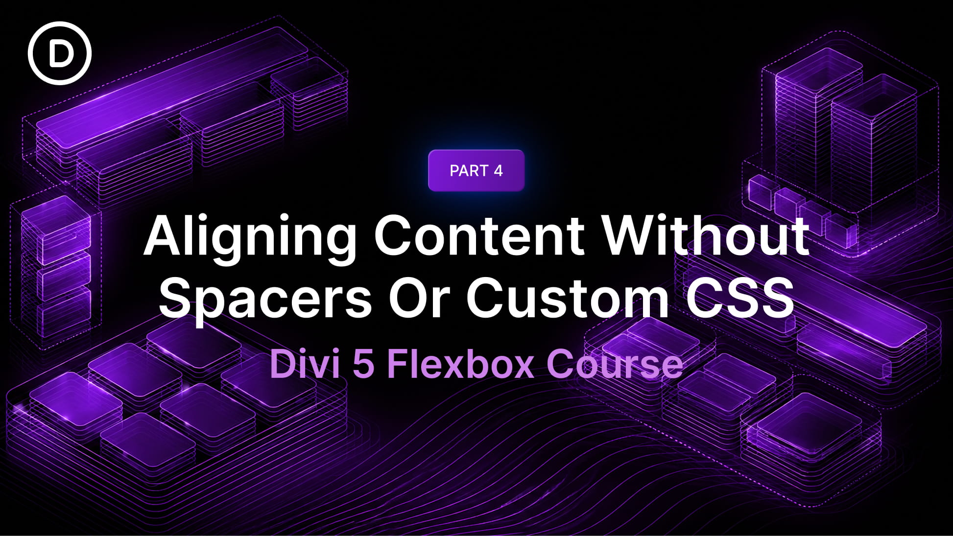
In Part 3 of our Mastering Flexbox series, we explored Layout Wrapping, the differences between Wrap and No Wrap, how Align Content affects wrapped multi-line layouts, and how Wrap Reverse and Display Order can improve responsive flow.
In this fourth installment, we’ll focus on one of the most common layout challenges in web design: aligning content without relying on hidden spacers, manual spacing hacks, or custom CSS.
Before Divi 5, designers often used empty Divider modules, manual padding, margins, or custom CSS to push content into place, create visual balance, or force elements to align inside equal-height containers. Those methods worked, but they added extra structure, required more breakpoint-specific cleanup, and made layouts harder to maintain.
Divi 5 gives you a cleaner visual workflow. With Flexbox controls such as Justify Content, Align Items, Align Content, and Gap, plus supporting tools like Grow To Fill, Module Groups, and Nested Modules, you can align content directly in the Visual Builder with far less custom code.
Why Traditional Alignment Methods Fall Short
Before Divi 5, precise vertical or horizontal alignment often required workarounds. Some of the most common techniques included:
- Using hidden Divider modules to push content down or create artificial space.
- Adding custom CSS to vertically center or bottom-align content inside equal-height columns.
- Relying on manual padding and margin values that needed constant adjustment across breakpoints.
Those approaches could solve the immediate visual problem, but they also made layouts more fragile. If a headline changed, a button label wrapped, or a section switched to a smaller breakpoint, the layout often needed another round of spacing adjustments.
With Divi 5’s native Flexbox Layout System, alignment can be handled at the container level. Tools like Justify Content, Align Items, Gap, and Grow To Fill help you create balanced layouts that respond more naturally to real content.