
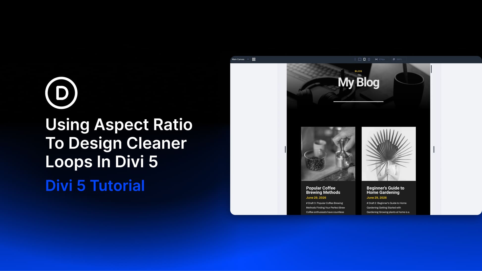
A blog grid can look perfectly aligned while you’re designing it with placeholder content, then fall apart as soon as real posts start loading in. One author uploads a wide screenshot, another uses a portrait photo, and somebody else adds a square image from the brand library. The card design stays the same, but the image proportions do not.
Divi 5’s Aspect Ratio and Framing settings solve that directly inside the builder. You define the frame once on the card, decide how images should fill it, and every featured image pulled into the loop follows the same visual rules without changing the original files in your Media Library. We’ll build the blog loop with the Loop Builder first, then apply the image settings that keep the finished grid consistent.
Why Loop Images Break A Grid
Nobody uploading a featured image is necessarily thinking about the proportions of your archive grid. A writer grabs the screenshot that illustrates their point, a contributor sends a portrait straight from their phone, and a designer exports a square from the brand kit.
Product catalogs run into the same problem when photos arrive from different suppliers, each using a different setup. The loop pulls all of those files into the same card design, so without a shared image frame, the layout inherits whatever shape each upload happened to have.