Marketing pages from Stripe, Linear, and Notion often use asymmetry to create movement, establish hierarchy, and give important content more visual weight. The layout may feel spontaneous, but the underlying structure is usually precise.
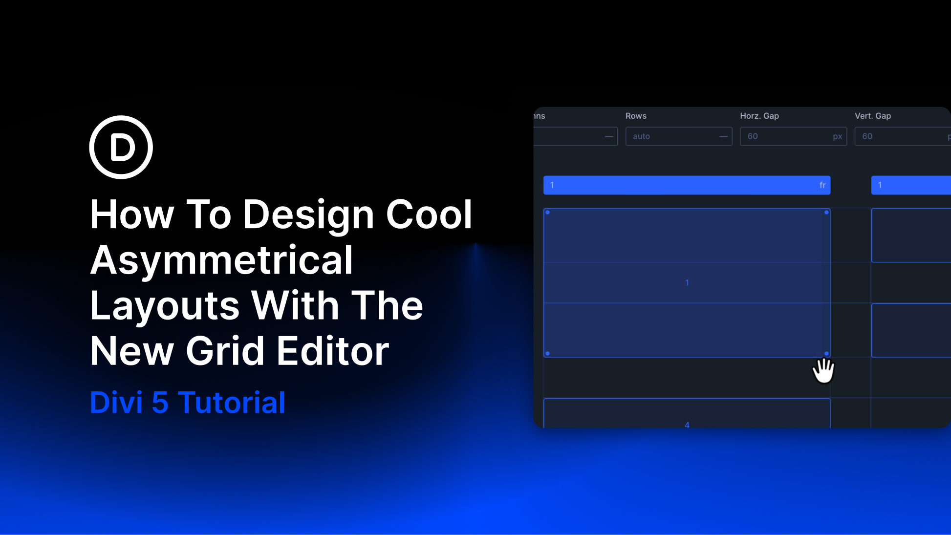
With Divi 5, that structure can begin with the CSS Grid system. The new Grid Editor adds a visual canvas where you can adjust tracks, gaps, placement, and spans while viewing the result directly in the Visual Builder.
In this post, we will use those tools to build four asymmetrical layouts: the Full-Left Banner, Z-Pattern Split, Weighted Corner, and Tetromino. Each design begins with a clear grid and introduces imbalance only where it supports the composition.
How Asymmetry Works As A Design Choice
Symmetrical layouts distribute visual weight evenly. They can feel stable, familiar, and easy to scan, which makes them a strong choice for many interfaces. Asymmetrical layouts use a different kind of balance. Instead of mirroring elements, they balance objects with different sizes, colors, positions, or amounts of negative space.
Consider a page where the Heading is centered, the images match on both sides, and the supporting content follows an even rhythm. The structure feels orderly because the visual weight remains close to the center.