
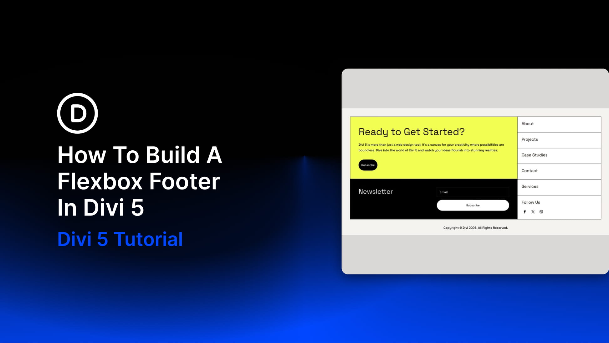
Footers often get built after the rest of the page is done, and that usually shows. Columns stop lining up, spacing feels inconsistent, and the layout starts to fall apart as soon as you check it on smaller screens.
Divi 5 gives you a better way to build footer layouts with its Flexbox controls. Instead of fixing alignment with one-off margins and padding, you can decide how footer sections stretch, stack, align, and reflow directly inside the builder.
In this tutorial, we’ll build a responsive footer with a CTA block, newsletter signup, navigation links, social links, and a copyright bar. We’ll use Design Variables for reusable styling and Flexbox for the structure, so the footer stays easier to adjust across desktop, tablet, and mobile.
Why Build A Flexbox Footer In Divi 5?
A footer might look simple, but it usually contains several different content types: calls to action, menus, signup forms, social icons, legal text, and sometimes contact details.
That mix can get messy fast. One column has more content than another. A form needs more space than the link list beside it. Social icons need to sit close together, but the whole group still needs to align with the rest of the footer. In older workflows, the fix often involved stacking manual margin and padding values until the footer looked right in one viewport. Then you checked tablet or mobile, and the layout needed another round of adjustments.
Divi 5’s Flexbox layout system handles those relationships at the container level. Instead of treating every module as an isolated object, you control how items behave inside Sections, Rows, Columns, and Module Groups. Three Flexbox controls do most of the work in this footer:
- Align Items: Controls how flex items align across the cross axis. In this build, Stretch helps columns fill the available height so the two sides of the footer stay visually balanced.
- Gap: Controls the spacing between flex items without relying on separate margin values on each module.
- Layout Direction: Controls whether items flow horizontally in a row or vertically in a column.
This footer also follows the same system-first approach we use across Divi 5 builds. Design Variables define repeated values, such as colors, spacing, and fluid font sizes. Flexbox controls the layout relationships between those styled elements.
That combination gives you a footer that is easier to maintain. If the accent color changes, update the variable. If the spacing needs more breathing room, adjust the shared spacing value. If the layout needs to stack differently on smaller screens, update the Flexbox settings instead of rebuilding the whole section.