A coffee cup can feel like a quick stop or an invitation to stay. Its shape and weight contribute to that impression, alongside the words and colors around it.
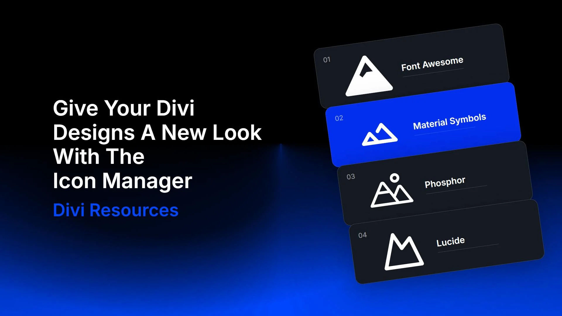
The new Icon Manager in Divi 5 makes it easier to bring another icon family into a design. You can import SVGs into a collection and choose them from the icon picker while you build.
Here are three sections with four icon styles each. The design stays fixed throughout each comparison, from the type and copy to the spacing between cards. Watch the icons change, then try the same approach in the Visual Builder.
Four Icon Styles, Three Different Designs
These examples cover three settings. A hotel’s amenity row, an adventure card, and a repair service’s process diagram give an icon different roles, so the examples below compare four families across all three:
- Font Awesome Solid: A bold baseline available among Divi’s included icons.
- Google Material Symbols Rounded: Rounded shapes with an extensive library of subjects.
- Phosphor Regular: A line-based style with room around its details.
- Lucide: A consistent outline family for another take on the same visual roles.
Font Awesome is separate from the original Elegant Icon Font included with Divi. The downloadable layouts use original ET icons as defaults. The comparisons also demonstrate separately imported SVGs.
The subjects vary between families. Lucide uses footprints for walking; Phosphor’s sailboat gives the water card a boating theme.