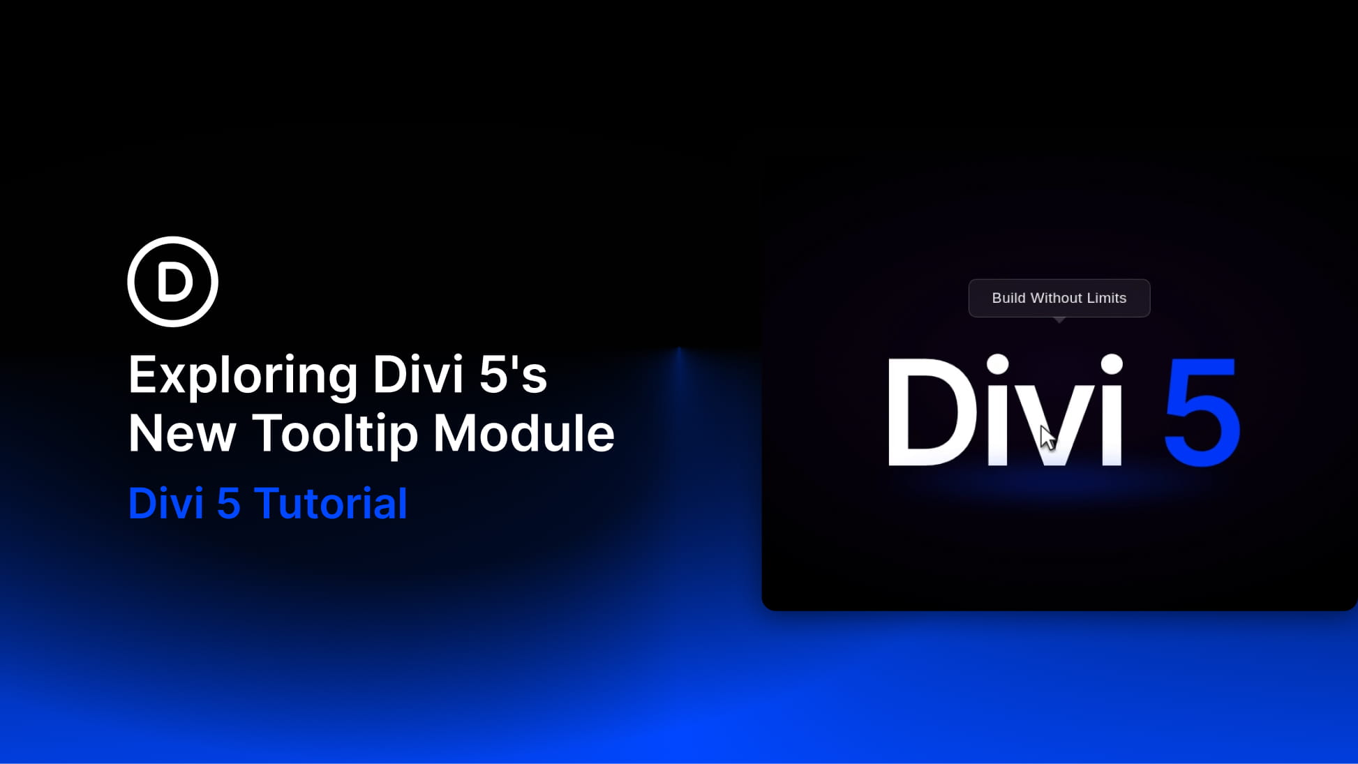
Divi 5 keeps turning common custom-code workflows into native builder features, and the new Tooltip module is a good example. It lets you add a floating popup panel beside another element and control its content, trigger, position, movement, arrow, timing, and styling visually.
Instead of wiring up a tooltip library by hand, you can place a Tooltip module inside the element it describes, add text or nested modules, and decide whether the tooltip appears on hover, on click, or always.
That makes it useful for short hints, feature explanations, product details, icon labels, mini promo cards, looped content, and contextual callouts that need more flexibility than a basic browser tooltip.
In this post, we’ll look at what the Tooltip module is, how to add it, how its settings work, and where it can improve a Divi 5 layout without adding clutter.
What Is The Tooltip Module In Divi 5?
The Tooltip module is a nestable content container that appears beside a parent element. The parent element becomes the tooltip’s anchor, and the Tooltip module holds the popup content.
In practical terms, you add the Tooltip module as a child of the element it should describe. That parent element might be a button, icon, image, text module, pricing feature, product card, or any other element that needs extra context.