
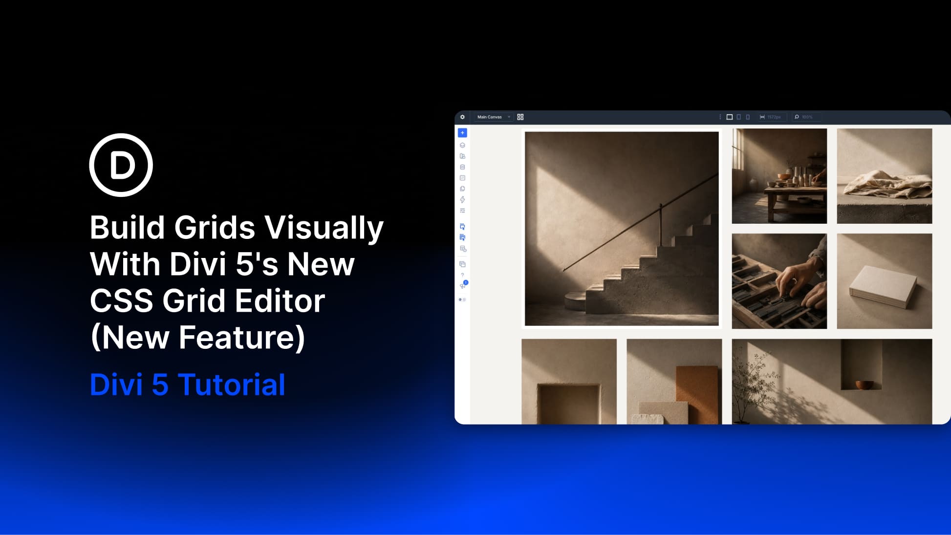
Divi 5 already gives you a complete CSS Grid system for building two-dimensional layouts inside the Visual Builder. You can define columns and rows, control gaps and track sizes, use premade grid structures, and create Grid Offset Rules for layouts where certain items need to span or move differently.
The new CSS Grid Editor adds a visual layer to that workflow. Instead of shaping an advanced grid through settings alone, you can open a live grid canvas, drag tracks to resize them, reposition items, change gaps, and pull corner handles to create row and column spans while watching the structure take shape.
In this tutorial, we’ll use the Grid Editor to build an asymmetric twelve-photo gallery across four columns. Along the way, we’ll also connect the layout to Grid Offset Rules, Number Variables, Presets, Extend Attributes, Aspect Ratio, and Image Framing so the finished gallery is reusable and responsive.
What The CSS Grid Editor Actually Does
CSS Grid is a two-dimensional layout system. You define columns and rows on a parent container, then the child elements flow into that structure. Individual positions can span multiple columns or rows, which makes Grid especially useful for galleries, editorial layouts, feature cards, product collections, and other designs where horizontal and vertical alignment need to work together.
Flexbox is designed primarily around one axis at a time, while Grid handles rows and columns together. A layout with one large image beside two smaller stacked images, with the surrounding edges remaining aligned, is a natural use case for Grid.