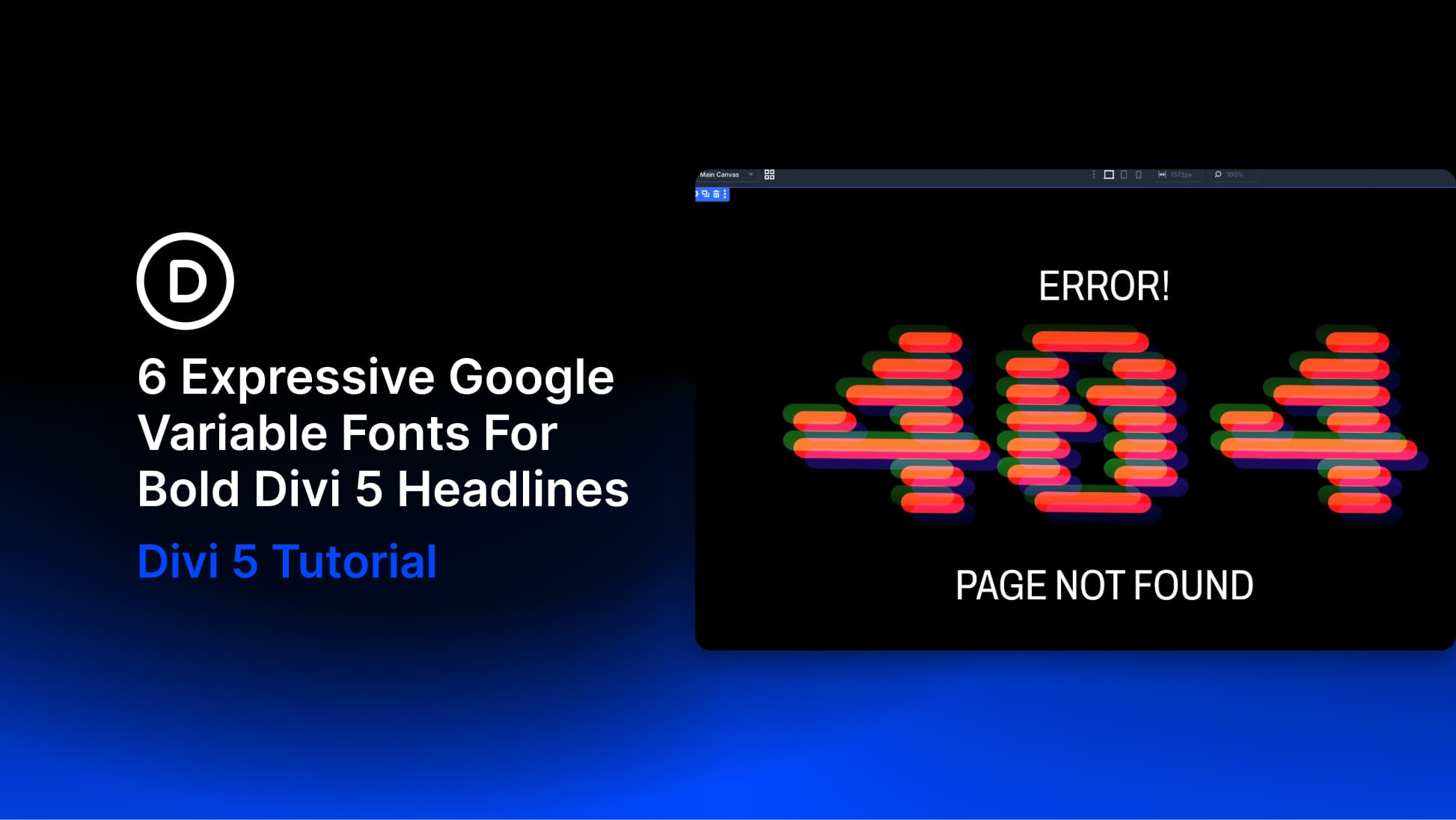
Open the font dropdown while editing text in almost any project, and you will probably scroll past many of the same reliable choices. That makes sense for body text, where readability across longer passages matters. Hero headings have a different job. With only a few words to communicate, they can afford to be more expressive.
Google Fonts includes several variable fonts that look too unusual for body copy but can work well as display type. The six designs below use expressive Google variable fonts in Divi 5, with each font assigned a specific role.
Why These Fonts Get Skipped
At first glance, it is easy to see why these fonts are often overlooked.
- Bitcount constructs its glyphs from repeated, pixel-like elements.
- Sixtyfour Convergence layers color and scanline-based elements to create CRT-inspired glyphs.
- Handjet builds glyphs from modular elements that can resemble an LED display.
- Shantell Sans uses its Bounce and Informality axes to create an irregular, hand-drawn feel.
- Kablammo combines a Morph axis with contextual alternates, allowing repeated characters to take different forms.
- Honk is a color font with built-in palettes and shadows.
At 16px, the more decorative fonts quickly lose clarity, while even the more readable options can feel too active across a long paragraph. That makes them easy to dismiss as novelty fonts. However, paragraph size is the wrong test for a hero heading. Body text has to stay readable across hundreds of words. A hero heading may only need to hold a few.