A layout can be carefully designed and still feel inconsistent once real content is added. Images arrive in different shapes. Team headshots come from different sources. Blog thumbnails, embeds, and dynamic content do not always reserve the space your layout expects.
That is where aspect ratio becomes useful. Instead of setting a fixed height, you define a relationship between width and height. The element can still resize across devices, but its proportions stay consistent.
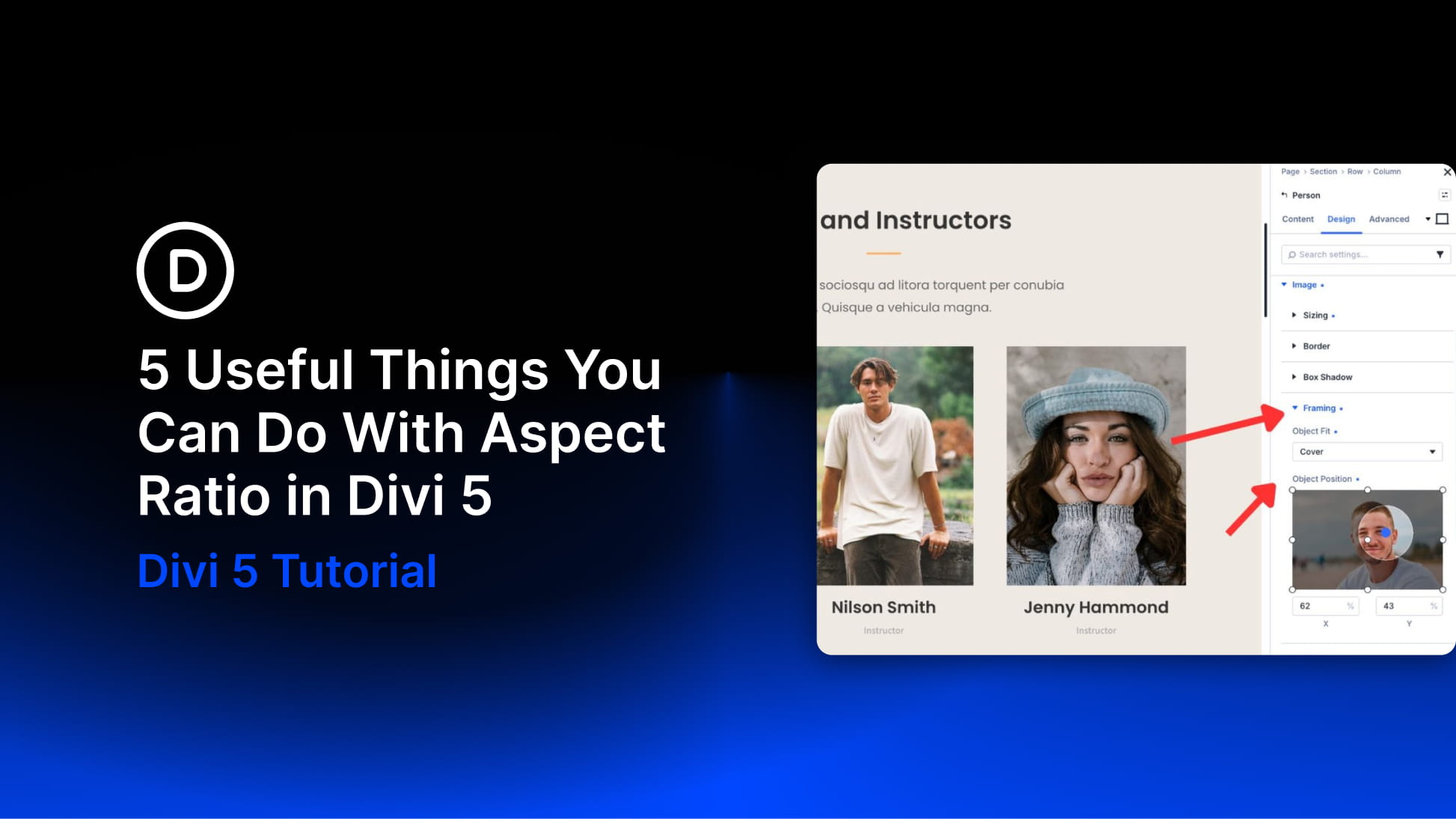
Divi 5 gives you Aspect Ratio and Image Framing controls that make this easier to manage visually. You can use them on images, modules, containers, and sub-elements that expose the Sizing option group.
In this post, we’ll look at five practical ways to use Aspect Ratio in Divi 5 to create cleaner grids, better crops, steadier layouts, reusable shapes, and more consistent social feeds.
What Is The Aspect Ratio Setting In Divi 5?
The Aspect Ratio field lives in the Sizing option group inside the Design tab. You enter a ratio in width-to-height format, such as 16:9, 1:1, 4:5, or 21:9.
Divi then calculates the element’s height from its rendered width. As the container becomes narrower or wider across screen sizes, the height adjusts automatically to keep the same proportion.