
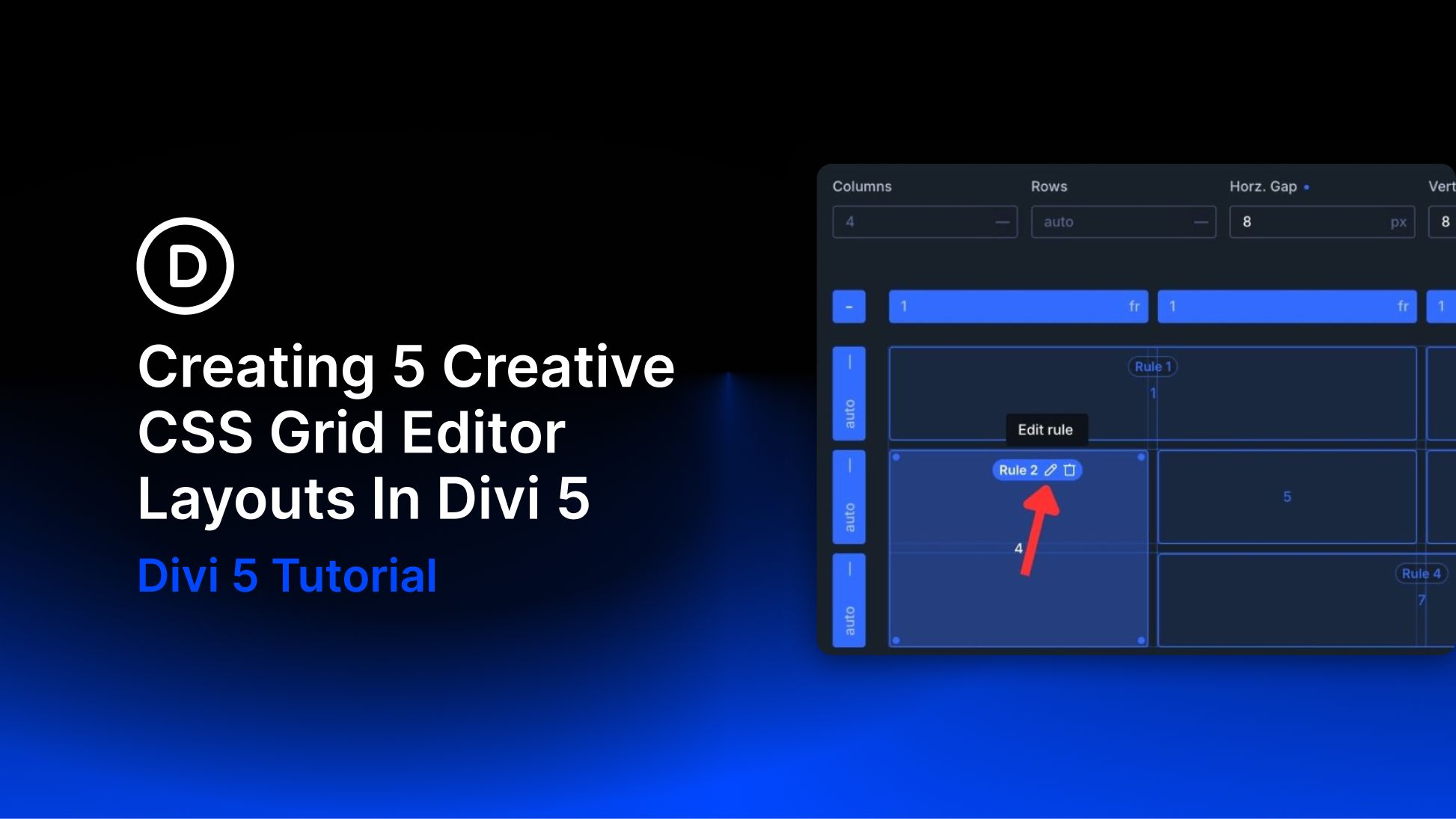
Perfectly even Grids are useful, but they are not always memorable. Stretch one card, deepen another, or build a diagonal that climbs across the page, and the layout begins to guide the eye with purpose. A few deliberate placement choices can change the entire composition.
Divi 5‘s Grid Editor makes those choices easy to explore. You can resize and reposition items directly on a visual canvas, then see how each change affects the layout before you move on.
In this guide, we will build five creative Grid layouts, each designed to direct attention in a different way.
How CSS Grid Works
Before CSS Grid, designers commonly built page layouts with tables, floats, positioning, and, later, Flexbox. Those methods still have valid uses, but complex two-dimensional layouts often required extra markup or careful workarounds.
CSS Grid provides a layout system built around columns and rows. Their intersections form cells, and child items can be placed automatically or assigned to specific positions within that structure. By default, items follow the Grid’s auto-placement behavior, but you can change their starting points, spans, and flow.