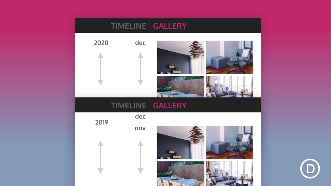
Creating a vertical sticky timeline can be extremely useful for categorizing content by year and/or month as the user scrolls down the page. The sticky date elements remain fixed beside the content for a convenient UX boost that users will appreciate.
In this tutorial, we are going to show you how to create a complete vertical sticky timeline layout in Divi. The keys to this design are (1) to give your columns a custom width so that the date elements don’t take up too much horizontal space on mobile and (2) to make the year and month sticky, with sticky limits on the section (for the year) and row (for the month).
Although this layout has multi-faceted applications, we are going to build a timeline layout for showcasing photo galleries categorized by month and year.


